10.10 Analyzing The Science
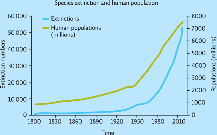
The following graph depicts the relationship between numbers of extinctions and human population size since the 19th century.
Interpretation
Question 10.12
Describe what is happening to:
the extinction rate over time.
human population growth over time.
Question 10.13
The two curves have been graphed together. What is the implication of presenting these data in this manner?
183
Advance your Thinking
Question 10.14
The y axis is labeled “Extinction numbers.” What taxonomic units are being measured? What if the taxonomic unit being evaluated here had been genus or family? Would you be more concerned about the trend of extinctions or less? Explain.
Question 10.15
What type of relationship is suggested by the figure (correlational or causal)? What additional data would you like to see to support the graph’s main point?