21.10 Analyzing The Science
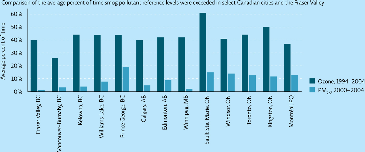
The graph below indicates levels of ground-level ozone and particulate matter that exceeded national reference levels (the level above which health or ecosystem problems occur) in areas and cities in Canada.
INTERPRETATION
Question 21.13
What does the y axis represent? Choose a city and describe the data for that city.
Question 21.14
The legend states that PM2.5 data is given for 4 years. PM stands for “particulate matter.” The number 2.5 represents the size of the particulate. From a health standpoint, why are the PM2.5 values reported?
Question 21.15
How many years of data are graphed for ozone? For particulate matter? Does the difference in the amount of time over which the data have been collected make a difference in your interpretation of these data?
ADVANCE YOUR THINKING
Question 21.16
Which city would be the worst for your health, based on its levels of pollution? Why?
Question 21.17
Based on the type of pollution present, what can you predict about the causes of pollution in Sault Ste. Marie versus Montréal? (Hint: Find the two cities on a map and compare the size of each city, their weather, and their primary industries.)
389