22.11 Analyzing The Science
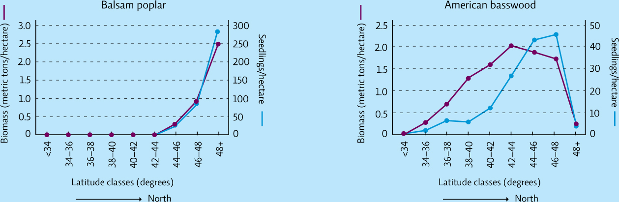
The graphs below show 2 of the 15 northern species evaluated in Chris Woodall’s study of tree-range migration mentioned in this chapter. The total standing biomass and the total number of seedlings of each species are shown at different latitudes within the study area.
INTERPRETATION
Question 22.13
What does the purple line on each graph represent? What does the blue line represent?
Question 22.14
There are 111 kilometres between two adjacent latitude lines. How far apart are the latitude classes shown here? How many kilometres wide is the study site (from latitude 34° to 48°)?
Question 22.15
Look at each graph to determine at which latitude class each species shows the most biomass per hectare. Which tree species has more standing biomass at its peak: balsam poplar or American basswood? How can you tell?
ADVANCE YOUR THINKING
Question 22.16
Is either of these tree populations exhibiting a range migration shift? Present the evidence for your conclusions.
Question 22.17
Of the two species shown here, which would you expect to see at higher altitudes on a mountainside and which at lower altitudes? Assuming both species could migrate, what do you predict will happen to the populations of these two species if the climate warms a little? If it warms a lot? Explain your answers.
413