23.11 Analyzing The Science
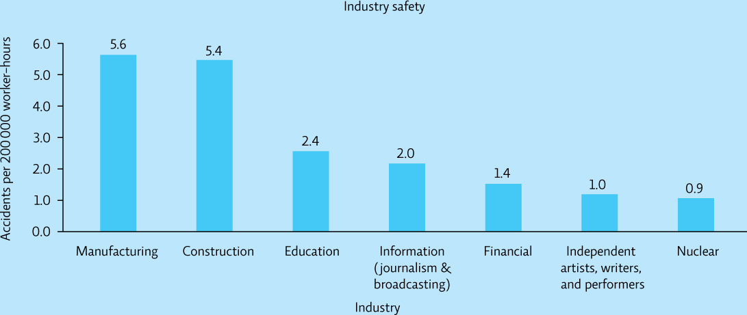
The following graph depicts the number of accidents that occur in a variety of industries in the United States.
433
INTERPRETATION
Question 23.13
What does the height of each bar represent?
Question 23.14
Based on the graph, which two industries have the highest accident rate?
Question 23.15
Based on the graph, which two industries have the lowest accident rate?
ADVANCE YOUR THINKING
Question 23.16
Is there bias in this graph? How would you decide? Think about and answer the following questions:
Which industries are represented? Are they comparable?
Do the data for nuclear workers include accidents that occur as a result of mining, processing, and production?
Which of these industries do you think has the strictest occupational health and safety regulations? regulations? Might that account for differences in the number of accidents?
Question 23.17
If you had access to safety data from all industries, which industries would you show in the graph to obtain a fair comparison to the nuclear industry?