2.8 Analyzing The Science
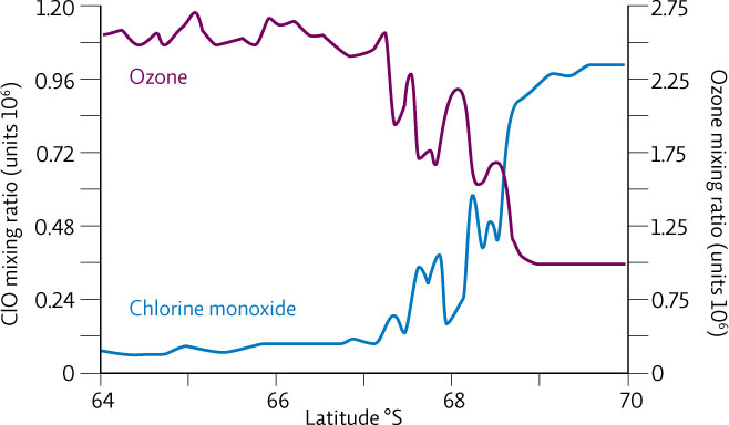
The graph below page comes from a study exploring the correlation between chlorine monoxide (ClO) and ozone. The data was collected by placing the measurement instrument on the wing of a plane and flying through the Antarctic ozone hole.
INTERPRETATION
Question 2.13
What does this graph show? Describe the pattern that you see.
Question 2.14
Looking at the levels of ozone relative to the levels of chlorine monoxide, which side of the graph do you think most likely represents the inside of the ozone hole? On what basis do you think this?
Question 2.15
Compare this graph to the graph in infographic 2.7 (Ozone Depletion and CFC Levels). Although both graphs show a similar pattern, they are about two different aspects of the CFC-ozone story. Compare and contrast the information presented in the two graphs.
37
ADVANCE YOUR THINKING
HINT: If you want to access the actual article, you can find it at: undsci.berkeley.edu/article/ozone_depletion_01
Question 2.16
Do the data in this graph show a correlation or a cause-and-effect relationship? Do they support the hypothesis that chlorine is the cause of ozone depletion? Explain your responses.
Question 2.17
How are these data similar to and/or different from the data collected by Susan Solomon’s team? And what do these data mean for the hypothesis that Solomon proposed?
Question 2.18
How does this research study support the idea that science is a community enterprise?A plot of chlorine monoxide and ozone concentrations from data collected by the aircraft.