4.9 Analyzing The Science
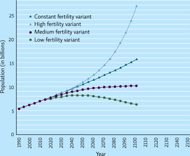
The graphs below come from the United Nations Population Division and are used in its population projections.
INTERPRETATION
Question 4.11
What are the population projections for each fertility variant in 2050? In 2100? What do you predict the population will be in 2150 for the constant fertility variant?
Question 4.12
What is the trend in the numbers in graph A for each line?
Question 4.13
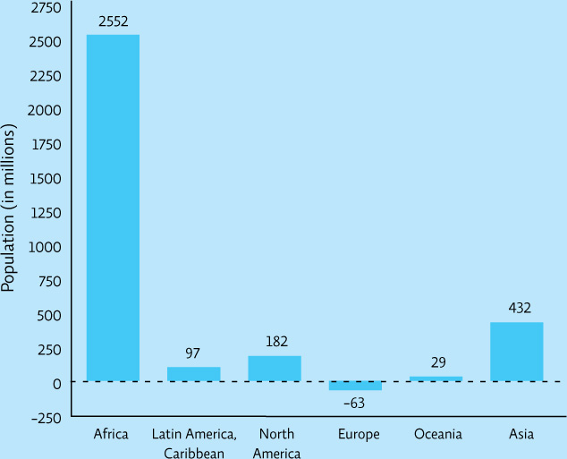
How does the information in graph A relate to that in graph B? Explain.
ADVANCE YOUR THINKING
Question 4.14
The three projections in graph A are based on different fertility variants. The medium fertility variant assumes global fertility rate will drop to replacement (2.1); the high fertility variant assumes global fertility rate will be 2.6; and the low fertility variant assumes global fertility rate will be 1.6. Explain why the U.N. might have three population projections based on different fertility rates.
Question 4.15
Why is Africa projected to have such large growth if population projections assume that gobal fertility rates will be at replacement? Use information from the chapter to support your conclusion.
Question 4.16
The following table shows 2010 population data for various world regions. Using this information as well as the data from graph B, calculate the total population in each region in 2100 as well as the distribution of the world population in each region for 2010 and 2100. According to your calculations, what are the significant changes in the distribution of the world population from 2010 to 2100?
| Region | Population in 2100 (in millions) | Population in 2010 (in millions) | Population change 2010–2100 | % of world population in 2010 | % of world population in 2100 |
| Africa | 1022 | ||||
| Asia | 4164 | ||||
| Europe | 738 | ||||
| Latin America & Caribbean | 590 | ||||
| North America | 345 | ||||
| Oceania | 37 | ||||
| World total | 6896 |
73