Question 10.15
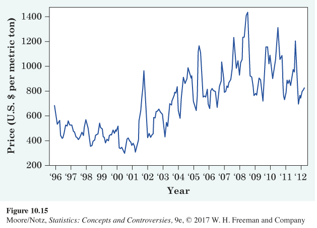
10.15 The cost of imported oranges. Figure 10.15 is a line graph of the average cost of imported oranges each month from July 1995 to April 2012. These data are the price in U.S. dollars per metric ton.
(a) The graph shows strong seasonal variation. How is this visible in the graph? Why would you expect the price of oranges to show seasonal variation?
(b) What is the overall trend in orange prices during this period, after we take account of the seasonal variation?
10.15 (a) Within each year, there is both a high point and a low point. This is expected due to the growing season of oranges. (b) After accounting for the seasonal variation, there is a gradual positive trend in the price of oranges.
Figure 10.15: Figure 10.15 The price of oranges, July 1995 to April 2012, Exercise 10.15.

[Leave] [Close]