CHAPTER 10 EXERCISES
Question 10.9
10.9 Lottery sales. States sell lots of lottery tickets. Table 10.2 shows where the money comes from in the state of Illinois. Make a bar graph that shows the distribution of lottery sales by type of game. Is it also proper to make a pie chart of these data? Explain.
10.9 A pie chart could be used because we are displaying the distribution of a categorical variable and we could compare parts of the whole.
Question 10.10
10.10 Consistency? Table 10.2 shows how Illinois state lottery sales are divided among different types of games. What is the sum of the amounts spent on the 11 types of games? Why is this sum not exactly equal to the total given in the table?
Question 10.11
10.11 Marital status. In the U.S. Census Bureau document America’s Families and Living Arrangements: 2011, we find these data on the marital status of American women aged 15 years and older as of 2011:
| Marital status | Count (thousands) |
|---|---|
| Never married | 34,963 |
| Married | 65,000 |
| Widowed | 11,306 |
| Divorced | 13,762 |
(a) How many women were not married in 2011?
(b) Make a bar graph to show the distribution of marital status.
(c) Would it also be correct to use a pie chart? Explain.
10.11 (a) The number of unmarried women is 34,963 + 11,306 + 13,762 = 60,031. (c) A pie chart could be used because we are displaying the distribution of a categorical variable and we could compare parts of the whole.
| Game | Sales (dollars) |
|---|---|
| Pick Three | 301,417,049 |
| Pick Four | 191,038,518 |
| Lotto | 111,158,528 |
| Little Lotto | 119,634,946 |
| Mega Millions | 221,809,484 |
| Megaplier5 | 848,077 |
| Pick N Play | 1,549,252 |
| Raffle | 19,999,460 |
| Powerball | 43,269,461 |
| Power Play | 8,469,680 |
| Instants | 1,190,109,917 |
| Total | 2,209,304,371 |
| Source: Illinois Lottery Fiscal Year 2010 Financial Release. | |
Question 10.12
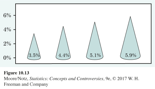
10.12 We pay high interest. Figure 10.13 shows a graph taken from an advertisement for an investment that promises to pay a higher interest rate than bank accounts and other competing investments. Is this graph a correct comparison of the four interest rates? Explain your answer.
Question 10.13
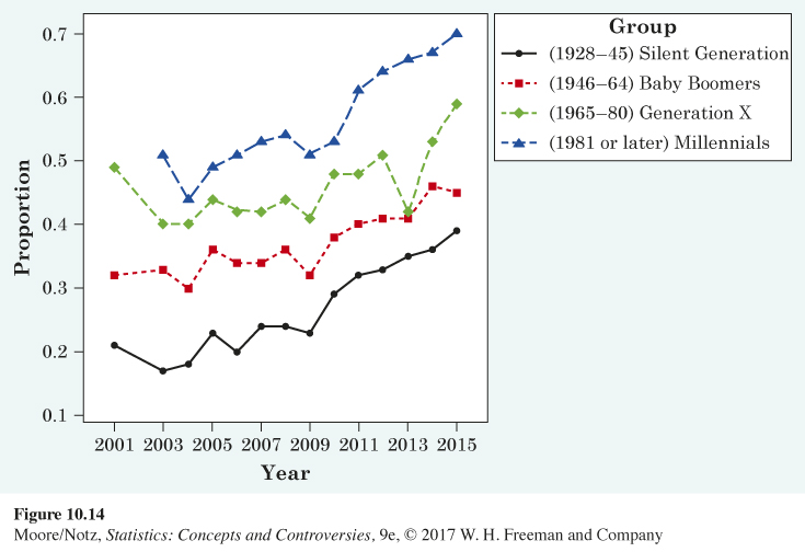
10.13 Attitudes on same-sex marriage. Attitudes on same-sex marriage have changed over time, but they also differ according to age. Figure 10.14 shows change in the attitudes on same-sex marriage for four generational cohorts. Comment on the overall trend in change in attitude. Explain how attitude on same-sex marriage differs according to generation.
10.13 The overall trend for all four generations is that the percent in favor of same-sex marriage has increased from 2001 to 2015. For every year from 2001 to 2015, the percent in favor of same-sex marriage is highest for Millennials, followed by Generation X, Baby Boomers, and the Silent Generation.
Question 10.14
10.14 Murder weapons. The 2010 Statistical Abstract of the United States reports FBI data on murders for 2007. In that year, 49.6% of all murders were committed with handguns, 18.4% with other firearms, 12.1% with knives or other cutting implements, 5.8% with a part of the body (usually the hands, fists, or feet), and 4.4% with blunt objects. Make a graph to display these data. Do you need an “other methods’’ category? Why?
Question 10.15
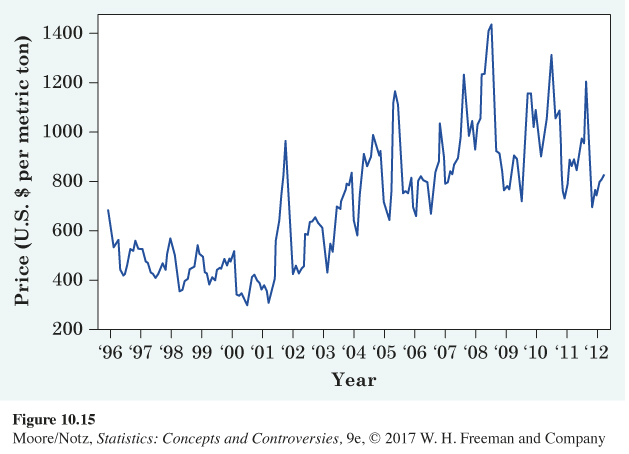
10.15 The cost of imported oranges. Figure 10.15 is a line graph of the average cost of imported oranges each month from July 1995 to April 2012. These data are the price in U.S. dollars per metric ton.
(a) The graph shows strong seasonal variation. How is this visible in the graph? Why would you expect the price of oranges to show seasonal variation?
(b) What is the overall trend in orange prices during this period, after we take account of the seasonal variation?
10.15 (a) Within each year, there is both a high point and a low point. This is expected due to the growing season of oranges. (b) After accounting for the seasonal variation, there is a gradual positive trend in the price of oranges.
Question 10.16
10.16 College freshmen. A survey of college freshmen in 2007 asked what field they planned to study. The results: 12.8%, arts and humanities; 17.7%, business; 9.2%, education; 19.3%, engineering, biological sciences, or physical sciences; 14.5%, professional; and 11.1%, social science.
(a) What percentage of college freshmen plan to study fields other than those listed?
(b) Make a graph that compares the percentages of college freshmen planning to study various fields.
Question 10.17
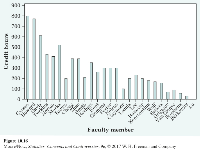
10.17 Decreasing trend? A common statistic considered by administration at universities is credit hour production. This is calculated by taking the credit hours for a course taught times the student enrollment. For example, a faculty member teaching two 3-credit courses with 50 students each would have produced 6 × 50 = 300 credit hours. Suppose you are the chair for the department of statistics and you give Figure 10.16 to your dean. The dean asks you to explain the disturbing decreasing trend. How should you respond?
10.17 The bar graph does not take into account a variety of factors including other responsibilities the faculty member may have (research, service, etc.), type of course (undergraduate vs. graduate), and whether teaching assistants are utilized in the administration of the course. Comparing only the number of credit hours produced is a poor measure of faculty contribution to the university’s overall goals.
ex10-18
Question 10.18
10.18 Civil disorders. The years around 1970 brought unrest to many U.S. cities. Here are government data on the number of civil disturbances in each three-month period during the years 1968 to 1972.
(a) Make a line graph of these data.
(b) The data show both a longer-term trend and seasonal variation within years. Describe the nature of both patterns. Can you suggest an explanation for the seasonal variation in civil disorders?
| Period | Count | Period | Count |
|---|---|---|---|
| 1968, Jan.–Mar. | 6 | 1970, July–Sept. | 20 |
| Apr.–June | 46 | Oct.–Dec. | 6 |
| July–Sept. | 25 | 1971, Jan.–Mar. | 12 |
| Oct.–Dec. | 3 | Apr.–June | 21 |
| 1969, Jan.–Mar. | 5 | July–Sept. | 5 |
| Apr.–June | 27 | Oct.–Dec. | 1 |
| July–Sept. | 19 | 1972, Jan.–Mar. | 3 |
| Oct.–Dec. | 6 | Apr.–June | 8 |
| 1970, Jan.–Mar. | 26 | July–Sept. | 5 |
| Apr.–June | 24 | Oct.–Dec. | 5 |
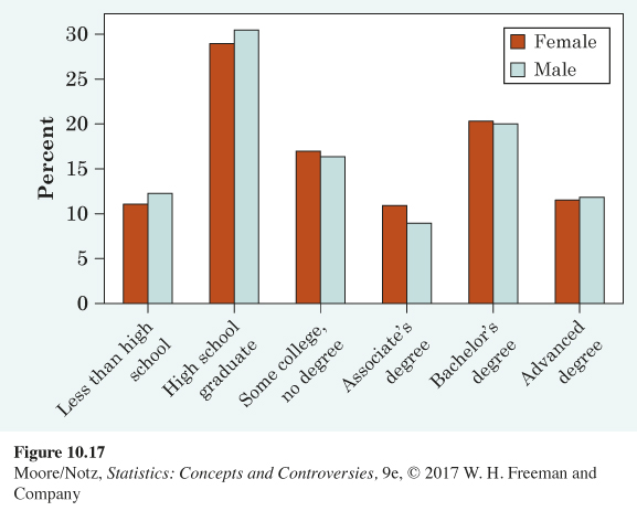
Question 10.19
10.19 Educational attainment by sex. Figure 10.17 is a side-by-side bar graph of educational attainment, by sex, for those aged 25 and older. These data were collected in the 2014 Current Population Survey. Compare educational attainment for males and females. Comment on any patterns you see.
10.19 A higher percent of males than females completed less than a high school degree, a high school degree, and advanced degrees. A higher percent of females than males completed some college but no degree, associate’s degrees, and bachelor’s degrees, although the difference is fairly small in each case (1%–2%). The most frequent category for both groups (male and female) is high school degree.
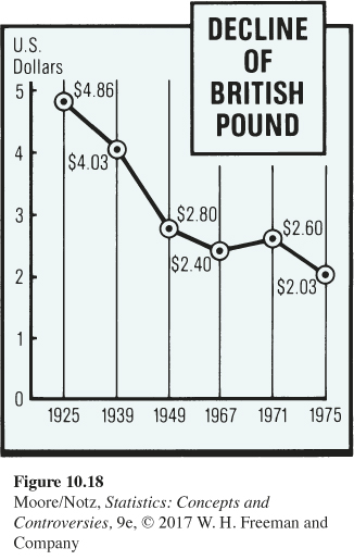
Question 10.20
 10.20 A bad graph? Figure 10.18 shows a graph that appeared in the Lexington (Ky.) Herald-Leader on October 5, 1975. Discuss the correctness of this graph.
Question 10.21
10.21 Seasonal variation. You examine the average temperature in Chicago each month for many years. Do you expect a line graph of the data to show seasonal variation? Describe the kind of seasonal variation you expect to see.
10.21 The temperature will rise and fall with the changing seasons. That is, there will be a 12-month repeating pattern, rising in the summer months and falling in winter.
Question 10.22
10.22 Sales are up. The sales at your new gift shop in December are double the November value. Should you conclude that your shop is growing more popular and will soon make you rich? Explain your answer.
Question 10.23
10.23 Counting employed people. A news article says:
The report that employment plunged in June, with nonfarm payrolls declining by 117,000, helped to persuade the Federal Reserve to cut interest rates yet again. . . . In reality, however, there were 457,000 more people employed in June than in May.
What explains the difference between the fact that employment went up by 457,000 and the official report that employment went down by 117,000?
10.23 The official report is adjusted for the expected seasonal variation due to high school and college students as well as other seasonal employees entering the workforce for the summer.
Question 10.24
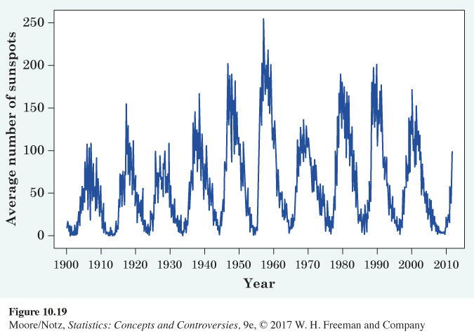
10.24 The sunspot cycle. Some plots against time show cycles of up-and-down movements. Figure 10.19 is a line graph of the average number of sunspots on the sun’s visible face for each month from 1900 to 2011. What is the approximate length of the sunspot cycle? That is, how many years are there between the successive valleys in the graph? Is there any overall trend in the number of sunspots?
ex10-25
Question 10.25
10.25 Trucks versus cars. Do consumers prefer trucks, SUVs, and minivans to passenger cars? Here are data on sales and leases of new cars and trucks in the United States. (The definition of “truck’’ includes SUVs and minivans.) Plot two line graphs on the same axes to compare the change in car and truck sales over time. Describe the trend that you see.
| Year: | 1981 | 1983 | 1985 |
| Cars (1000s): | 8,536 | 9,182 | 11,042 |
| Trucks (1000s): | 2,260 | 3,129 | 4,682 |
| Year: | 1987 | 1989 | 1991 |
| Cars (1000s): | 10,277 | 9,772 | 8,589 |
| Trucks (1000s): | 4,912 | 4,941 | 4,136 |
| Year: | 1993 | 1995 | 1997 | 1999 | 2001 |
| Cars (1000s): | 8,518 | 8,636 | 8,273 | 8,697 | 8,422 |
| Trucks (1000s): | 5,654 | 6,469 | 7,217 | 8,704 | 9,046 |
| Year: | 2003 | 2005 | 2007 | 2009 | |
| Cars (1000s): | 7,615 | 7,720 | 7,618 | 5,456 | |
| Trucks (1000s): | 9,356 | 9,725 | 8,842 | 5,145 |
10.25 Before 1999, the number of cars was greater than the number of trucks, but while car sales decreased between 1999 and 2005, truck sales increased during this same period. Both car and truck sales decreased from 2005 to 2009.
Question 10.26
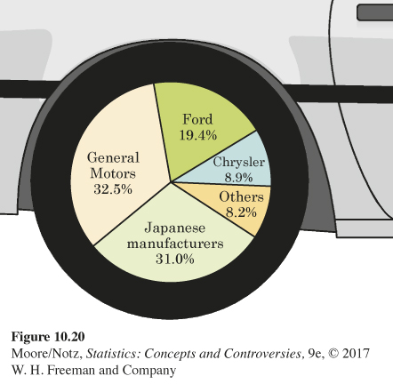
10.26 Who sells cars? Figure 10.20 is a pie chart of the percentage of passenger car sales in 1997 by various manufacturers. The artist has tried to make the graph attractive by using the wheel of a car for the “pie.’’ Is the graph still a correct display of the data? Explain your answer.
Question 10.27
10.27 Who sells cars? Make a bar graph of the data in Exercise 10.26. What advantage does your new graph have over the pie chart in Figure 10.20?
10.27 The bar graph makes it easier to see percents (without writing them in or next to the wedges, as was done with the pie chart). It is also easier to compare sizes of bars than wedge angles.
ex10-28
Question 10.28
10.28 The Border Patrol. Here are the numbers of deportable aliens caught by the U.S. Border Patrol for 1971 through 2009. Display these data in a graph. What are the most important facts that the data show?
| Year: | 1971 | 1973 | 1975 | 1977 | 1979 |
| Count (1000s): | 420 | 656 | 767 | 1042 | 1076 |
| Year: | 1981 | 1983 | 1985 | 1987 | 1989 |
| Count (1000s): | 976 | 1251 | 1349 | 1190 | 954 |
| Year: | 1991 | 1993 | 1995 | 1997 | 1999 |
| Count (1000s): | 1198 | 1327 | 1395 | 1536 | 1714 |
| Year: | 2001 | 2003 | 2005 | 2007 | 2009 |
| Count (1000s): | 1266 | 932 | 1189 | 877 | 556 |
Question 10.29
10.29 Bad habits. According to the National Household Survey on Drug Use and Health, when asked in 2012, 41% of those aged 18 to 24 years used cigarettes in the past year, 9% used smokeless tobacco, 36.3% used illicit drugs, and 10.4% used pain relievers or sedatives. Explain why it is not correct to display these data in a pie chart.
10.29 There is overlap between the groups: young adults could have two or more of these habits and would therefore be represented twice.
Question 10.30
10.30 Accidental deaths. In 2011 there were 130,557 deaths from unintentional injury in the United States. Among these were 38,851 deaths from poisoning, 33,804 from motor vehicle accidents, 30,208 from falls, 6,601 from suffocation, and 3,391 from drowning.
(a) Find the percentage of accidental deaths from each of these causes, rounded to the nearest percent. What percentage of accidental deaths were due to other causes?
(b) Make a well-labeled graph of the distribution of causes of accidental deaths.
Question 10.31
10.31 Yields of money market funds. Many people invest in money market funds. These are mutual funds that attempt to maintain a constant price of $1 per share while paying monthly interest. Table 10.3 gives the average annual interest rates (in percent) paid by all taxable money market funds from 1973 (the first full year in which such funds were available) to 2008.
(a) Make a line graph of the interest paid by money market funds for these years.
(b) Interest rates, like many economic variables, show cycles, clear but repeating up-and-down movements. In which years did the interest rate cycle reach temporary peaks?
(c) A plot against time may show a consistent trend underneath cycles. When did interest rates reach their overall peak during these years? Describe the general trend downward since that year.
10.31 (a) For example,
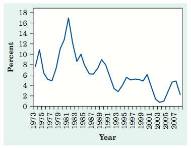
(b) From the line graph, we can see the interest rate cycle reached temporary high points in 1974, 1981, 1985, 1989, 1995, 2000, and 2007. (c) The interest rates had an overall peak in 1981 for the years 1973 to 2008. Since the overall peak, the interest rates have gradually decreased (ignoring the cycles).
ta10-03
| Year | Rate | Year | Rate | Year | Rate | Year | Rate | |||
|---|---|---|---|---|---|---|---|---|---|---|
| 1973 | 7.60 | 1982 | 12.23 | 1991 | 5.71 | 2000 | 5.89 | |||
| 1974 | 10.79 | 1983 | 8.58 | 1992 | 3.36 | 2001 | 3.67 | |||
| 1975 | 6.39 | 1984 | 10.04 | 1993 | 2.70 | 2002 | 1.29 | |||
| 1976 | 5.11 | 1985 | 7.71 | 1994 | 3.75 | 2003 | 0.64 | |||
| 1977 | 4.92 | 1986 | 6.26 | 1995 | 5.48 | 2004 | 0.82 | |||
| 1978 | 7.25 | 1987 | 6.12 | 1996 | 4.95 | 2005 | 2.66 | |||
| 1979 | 10.92 | 1988 | 7.11 | 1997 | 5.10 | 2006 | 4.51 | |||
| 1980 | 12.68 | 1989 | 8.87 | 1998 | 5.04 | 2007 | 4.70 | |||
| 1981 | 16.82 | 1990 | 7.82 | 1999 | 4.64 | 2008 | 2.05 | |||
| Source: Albert J. Fredman, “A closer look at money market funds,’’ American Association of Individual Investors Journal, February 1997, pp. 22–27; and the 2010 Statistical Abstract of the United States. | ||||||||||
Question 10.32
10.32 The Boston Marathon. Women were allowed to enter the Boston Marathon in 1972. The time (in minutes, rounded to the nearest minute) for each winning woman from 1972 to 2015 appears in Table 10.4.
ta10-04
| Year | Time | Year | Time | Year | Time | Year | Time | |||
|---|---|---|---|---|---|---|---|---|---|---|
| 1972 | 190 | 1983 | 143 | 1994 | 142 | 2005 | 145 | |||
| 1973 | 186 | 1984 | 149 | 1995 | 145 | 2006 | 144 | |||
| 1974 | 167 | 1985 | 154 | 1996 | 147 | 2007 | 149 | |||
| 1975 | 162 | 1986 | 145 | 1997 | 146 | 2008 | 145 | |||
| 1976 | 167 | 1987 | 146 | 1998 | 143 | 2009 | 152 | |||
| 1977 | 168 | 1988 | 145 | 1999 | 143 | 2010 | 146 | |||
| 1978 | 165 | 1989 | 144 | 2000 | 146 | 2011 | 143 | |||
| 1979 | 155 | 1990 | 145 | 2001 | 144 | 2012 | 152 | |||
| 1980 | 154 | 1991 | 144 | 2002 | 141 | 2013 | 146 | |||
| 1981 | 147 | 1992 | 144 | 2003 | 145 | 2014 | 139 | |||
| 1982 | 150 | 1993 | 145 | 2004 | 144 | 2015 | 145 | |||
| Source: See the website en.wikipedia.org/wiki/List_of_winners_of_the_Boston_Marathon. | ||||||||||
(a) Make a graph of the winning times.
(b) Give a brief description of the pattern of Boston Marathon winning times over these years. Have times stopped improving in recent years?

EXPLORING THE WEB
Follow the QR code to access exercises.