Pie charts and bar graphs
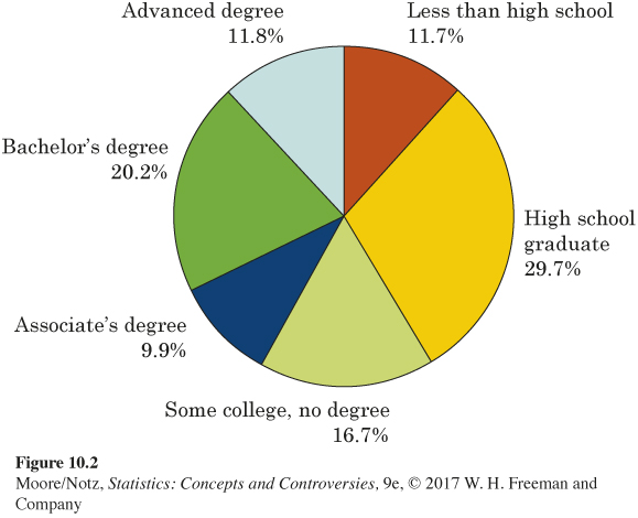
The variable displayed in Table 10.1, “level of education,’’ is a categorical variable. There are six possible values of the variable. To picture this distribution in a graph, we might use a pie chart. Figure 10.2 is a pie chart of the level of education of people aged 25 years and over. Pie charts show how a whole is divided into parts. To make a pie chart, first draw a circle. The circle represents the whole, in this case all people aged 25 years and over. Wedges within the circle represent the parts, with the angle spanned by each wedge in proportion to the size of that part. For example, 20.2% of those in this age group and over have a bachelor’s degree but not an advanced degree. Because there are 360 degrees in a circle, the “bachelor’s degree’’ wedge spans an angle of
0.202 × 360 = 72.72 degrees

Pie charts force us to see that the parts do make a whole. However, it is much easier for our eyes to compare the heights of the bars on a bar graph than it is to compare the size of the angles on a pie chart.
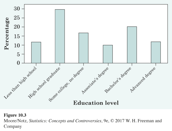
Figure 10.3 is a bar graph of the same data. There is a single bar for each education level. The height of each bar shows the percentage of people aged 25 years and over who have attained that level of education. Notice that each bar has the same width—this is always the case with a bar graph. Also, there is a space between the bars. It is obvious on either the pie chart or bar graph that the largest category is “High school graduate.’’ However, smaller differences are much more subtle on a pie chart. It is very clear on the bar graph that “Bachelor’s degree’’ is the second largest category. This is not as clear on the pie chart. Bar graphs are better for making comparisons of the sizes of categories. In addition, if there is a natural ordering of the variable, such as how much education a person has, this order can be displayed along the horizontal axis of the bar graph but cannot be displayed in an obvious way in a pie chart.

Pie charts and bar graphs can show the distribution (either counts or percentages) of a categorical variable such as level of education. A pie chart usually displays the percentage for each category (rather than the count) and only works if you have all the categories (the percentages add to 100). A bar graph can display an entire distribution or can be used to display only a few categories. A bar graph can also compare the size of categories that are not parts of one whole. If you have one number to represent each category, you can use a bar graph.
EXAMPLE 3 High taxes?
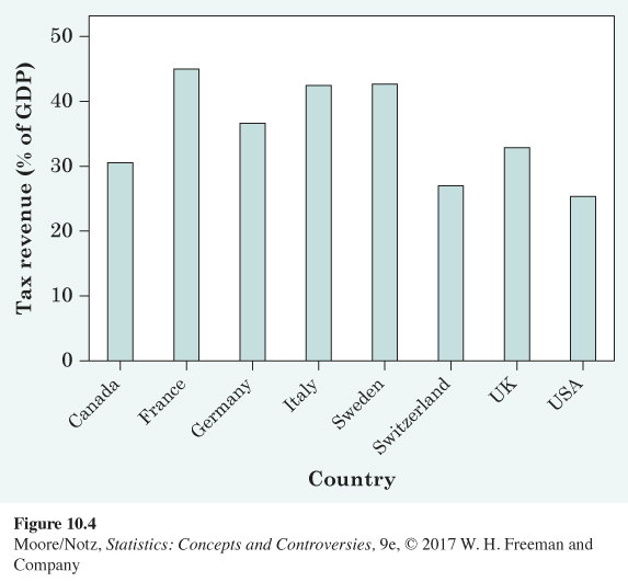
Figure 10.4 compares the level of taxation in eight democratic nations. Each democratic nation is a category and each category is described by one value, so a bar graph is a good choice for a graphical display of these data. The heights of the bars show the percentages of each nation’s gross domestic product (GDP, the total value of all goods and services produced) that is taken in taxes. Americans accustomed to complaining about high taxes may be surprised to see that the United States, at 25.4% of GDP, is at the bottom of the group. Notice that a pie chart is not possible for these data because we are displaying eight separate quantities, not the parts of a whole.

NOW IT’S YOUR TURN
Question 10.1
10.1 Taxes. There are currently seven states in the United States that do not collect income tax. The accompanying table contains the combined state and average local sales tax in 2014 for these seven states as computed by the Tax Foundation.
| State | State and average local sales tax |
|---|---|
| Alaska | 1.69 |
| Florida | 6.62 |
| Nevada | 7.93 |
| South Dakota | 5.83 |
| Texas | 8.15 |
| Washington | 8.88 |
| Wyoming | 5.49 |
Is the variable “state’’ categorical or quantitative? Should you use a pie chart or a bar graph to display the state and average local sales tax for these states? Why?
10.1 The “state” variable is a categorical variable. For categorical variables, we should use either a bar graph or a pie chart. However, because we are not comparing parts of a whole and the percents do not add up to 100%, a bar graph is more appropriate.
EXAMPLE 4 Government tax revenue breakdown
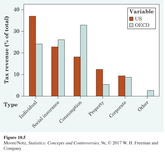
Governments generate tax revenue through various means. In its 2014 report, the Tax Foundation analyzed data for 2011 from the Organisation for Economic Co-operation and Development (OECD). The United States’ tax revenue comprises individual income tax (37.1%), social insurance tax (22.8%), consumption tax (18.3%), property tax (12.4%), and corporate income tax (9.4%). A bar graph is appropriate to display these data because we have one value to explain the size of each tax category. Notice, a pie graph is appropriate as well, because these are all the parts of a whole. What if we wanted to compare the distribution of tax revenue for the United States to the average for all the other OECD countries? Pie charts are not good for comparisons. Figure 10.5 is a bar graph for the distribution of government tax revenue for the United States with a second set of bars representing the average for all other OECD nations adjacent to the bars for the United States. This is called a side-by-side bar graph. A side-by-side bar graph is useful for making comparisons. It is now clear that the United States relies more heavily on individual income tax, while the other countries rely more heavily on consumption taxes.
