Beware the pictogram
Bar graphs compare several quantities by means of the differing heights of bars that represent the quantities. Our eyes, however, react to the area of the bars as well as to their height. When all bars have the same width, the area (width × height) varies in proportion to the height and our eyes receive the right impression. When you draw a bar graph, make the bars equally wide. Artistically speaking, bar graphs are a bit dull. It is tempting to replace the bars with pictures for greater eye appeal.
EXAMPLE 5 A misleading graph

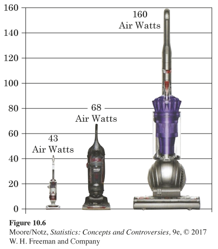
Figure 10.6 is a pictogram. It is a bar graph in which pictures replace the bars. The graph is aimed at consumers shopping for a vacuum. It claims that a Dyson vacuum has more than twice the suction of any other vacuum. The numbers above the vacuums show the calculated air watts for three vacuums. We see the Dyson vacuum (far right) has roughly four times the air watts (160 is roughly 4 times 43) of the vacuum on the far left. However, this graphic makes it appear as though there is a much larger difference. Why is this?
To magnify a picture, the artist must increase both height and width to avoid distortion of the image. By increasing both the height and width of the Dyson vacuum, it appears to be 4 × 4 = 16 times larger. Remember a bar graph should have bars of equal width—only the heights of the bars should vary. Replacing the bars on a bar graph with pictures is tempting, but it is difficult to keep the “bar” width equal without distorting the picture.