Change over time: Line graphs
Many quantitative variables are measured at intervals over time. We might, for example, measure the height of a growing child or the price of a stock at the end of each month. In these examples, our main interest is change over time. To display how a quantitative variable changes over time, make a line graph.
Line graph
A line graph of a quantitative variable plots each observation against the time at which it was measured. Always put time on the horizontal scale of your plot and the variable you are measuring on the vertical scale. Connect the data points by lines to display the change over time.
When constructing a line graph, make sure to use equally spaced time intervals on the horizontal axis to avoid distortion. Line graphs can also be used to show how a quantitative variable changes over time, broken down according to some other categorical variable. Use a separate line for each category.

EXAMPLE 6 Unemployment by education level
How has unemployment changed over time? Figure 10.7 is a line graph of the monthly national unemployment rate, by education level, for the United States from October 2008 through October 2014. For example, the unemployment rate for October 2009 was 15.2% for those with less than a high school diploma, 11% for those with a high school diploma, 8.7% for those with some college, and 4.7% for those with a bachelor’s degree or higher.
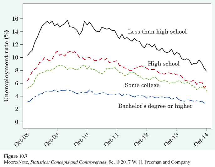
It would be difficult to see patterns in a long table of numbers. Figure 10.7 makes the patterns clear. What should we look for?
![]() The Vietnam effect Folklore says that during the Vietnam War, many men went to college to avoid being drafted. Statistician Howard Wainer looked for traces of this Vietnam effect’’ by plotting data against time. He found that scores on the Armed Forces Qualifying Test (an IQ test given to recruits) dipped sharply during the war, then rebounded. Scores on the SAT exams, taken by students applying to college, also dropped at the beginning of the war. It appears that the men who chose college over the army lowered the average test scores in both places.
The Vietnam effect Folklore says that during the Vietnam War, many men went to college to avoid being drafted. Statistician Howard Wainer looked for traces of this Vietnam effect’’ by plotting data against time. He found that scores on the Armed Forces Qualifying Test (an IQ test given to recruits) dipped sharply during the war, then rebounded. Scores on the SAT exams, taken by students applying to college, also dropped at the beginning of the war. It appears that the men who chose college over the army lowered the average test scores in both places.
• First, look for an overall pattern. For example, a trend is a long-term upward or downward movement over time. Unemployment was at its highest for all education groups in 2009 and 2010, due to the Great Recession. Since then, the overall trend is showing a decrease in the unemployment rate for all education levels (each line is generally decreasing).
• Next, look for striking deviations from the overall pattern. There is a noticeable increase from 2008 to the beginning of 2009. This was a side effect of the recession economy. Unemployment hovered around these record highs through 2010, when the rates finally started their decline to the current levels. There is a striking deviation in the unemployment rate for those with less than a high school degree around mid-2010. As the overall pattern of a generally decreasing trend begins, there is a much more drastic dip in mid-2010 for those with less than a high school degree.
Page 225• Change over time often has a regular pattern of seasonal variation that repeats each year. Calculating the unemployment rate depends on the size of the workforce and the number of those in the workforce who are working. For example, the unemployment rate rises every year in January as holiday sales jobs end and outdoor work slows in the north due to winter weather. It would cause confusion (and perhaps political trouble) if the government’s official unemployment rate jumped every January. These are regular and predictable changes in unemployment. As such, the Bureau of Labor Statistics makes seasonal adjustments to the monthly unemployment rate before reporting it to the general public.
Seasonal variation, seasonal adjustment
A pattern that repeats itself at known regular intervals of time is called seasonal variation. Many series of regular measurements over time are seasonally adjusted. That is, the expected seasonal variation is removed before the data are published.
The line graph of Figure 10.7 shows the unemployment rate for four different education levels. A line graph may have only one line or more than one, as was the case in Figure 10.7. Picturing the unemployment rate for all four groups over this time period gives an additional message. We see that unemployment is always lower with more education—a strong argument for a college education! Also, the increase in unemployment was much more drastic during the Great Recession for the lower education levels. It appears that the unemployment rate is much more stable for those with higher education levels and much more variable for those with lower education levels.
NOW IT’S YOUR TURN
Question 10.2
10.2 Food stamp participation. The Supplemental Nutrition Assistance Program (SNAP), formerly known as the Food Stamp Program, is a federal program that provides money to be spent on food to eligible low-income individuals and families. The following table gives the percent of the population receiving benefits.

| Date | Rate (%) | Date | Rate (%) |
|---|---|---|---|
| 1970 | 2.12 | 1980 | 9.28 |
| 1972 | 5.29 | 1982 | 9.37 |
| 1974 | 6.01 | 1984 | 8.84 |
| 1976 | 8.51 | 1986 | 8.09 |
| 1978 | 7.19 | 1988 | 7.63 |
| 1990 | 8.04 | 2004 | 8.13 |
| 1992 | 9.96 | 2006 | 8.90 |
| 1994 | 10.55 | 2008 | 9.28 |
| 1996 | 9.63 | 2010 | 13.03 |
| 1998 | 7.32 | 2012 | 14.85 |
| 2000 | 6.09 | 2014 | 14.59 |
| 2002 | 6.64 |
Make a line graph of these data and comment on any patterns you observe.
10.2
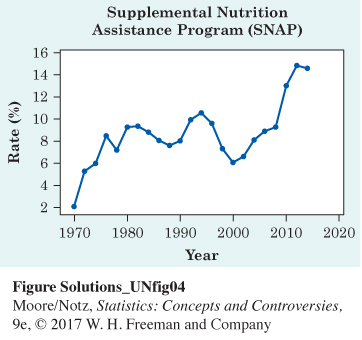
The percent of the population receiving SNAP benefits rose sharply between 1970 and 1976, then remained relatively stable (rising and falling slightly) until 1994. From 1994 to 2000, there was a sharp decline, followed by a sharp increase in participation through 2014.