Making good graphs
Graphs are the most effective way to communicate using data. A good graph will reveal facts about the data that would be difficult or impossible to detect from a table. What is more, the immediate visual impression of a graph is much stronger than the impression made by data in numerical form. Here are some principles for making good graphs:
• Make sure labels and legends tell what variables are plotted, their units, and the source of the data.
• Make the data stand out. Be sure that the actual data—not labels, grids, or background art—catch the viewer’s attention. You are drawing a graph, not a piece of creative art.
• Pay attention to what the eye sees. Avoid pictograms and be careful choosing scales. Avoid fancy “three-dimensional’’ effects that confuse the eye without adding information. Ask if a simple change in a graph would make the message clearer.
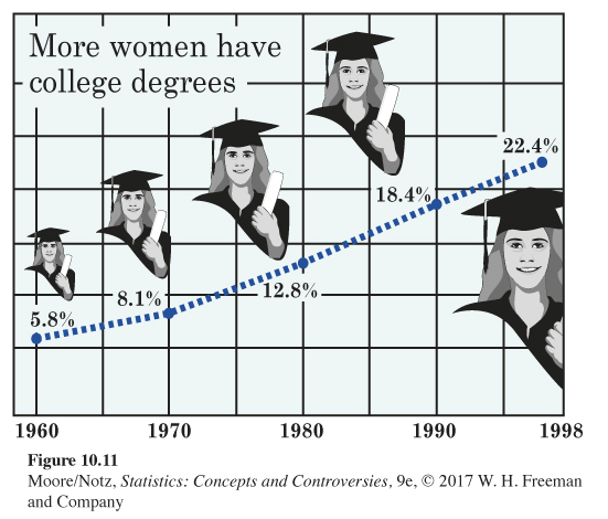
EXAMPLE 9 The rise in college education
Figure 10.11 shows the rise in the percentage of women aged 25 years and over who have at least a bachelor’s degree. There are only five data points, so a line graph should be simple. Figure 10.11 isn’t simple. The artist couldn’t resist a nice background sketch and also cluttered the graph with grid lines. We find it harder than it should be to see the data. Using pictures of the female graduate at each time point distorts the values in the same way as a pictogram. Grid lines on a graph serve no purpose—if your audience must know the actual numbers, give them a table along with the graph. A good graph uses no more ink than is needed to present the data clearly. In statistical graphics, decoration is always a distraction from the data, and sometimes an actual distortion of the data.
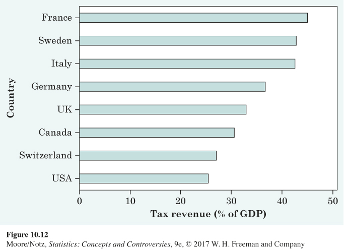
EXAMPLE 10 High taxes, reconsidered
Figure 10.4 is a respectable bar graph comparing taxes as a percentage of gross domestic product in eight countries. The countries are arranged alphabetically. Wouldn’t it be clearer to arrange them in order of their tax burdens? Figure 10.12 does this. This simple change improves the graph by making it clearer where each country stands in the group of eight countries. Figure 10.12 also demonstrates the ability to display a bar graph horizontally.