Normal Distributions
13
Normal Distributions

CASE STUDY Bar graphs and histograms are definitely old technology. Using bars to display data goes back to William Playfair (1759–1823), an English economist who was an early pioneer of data graphics. Histograms require that we choose classes, and their appearance can change with different choices. Surely modern software offers a better way to picture distributions?
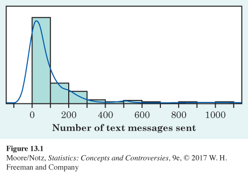
Software can replace the separate bars of a histogram with a smooth curve that represents the overall shape of a distribution. Look at Figure 13.1. The data are the number of text messages reported as being sent on a particular day in 2013 by a random sample of 447 high school seniors. The curve is generated from statistical software as a way of replacing the histogram. The software doesn’t start from the histogram—it starts with the actual observations and cleverly draws a curve to describe their distribution.
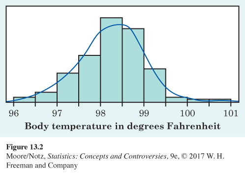
In Figure 13.1, the software has caught the overall shape and shows the ripples in the long right tail more effectively than does the histogram. It struggles a bit with the peak: it has extended the curve beyond zero in an attempt to smooth out the sharp peak. In Figure 13.2, we apply the same software to a set of data with a more regularly shaped distribution. These are the body temperatures from a sample of 130 healthy adults. The software draws a curve that shows a distinctive symmetric, single-peaked bell shape.
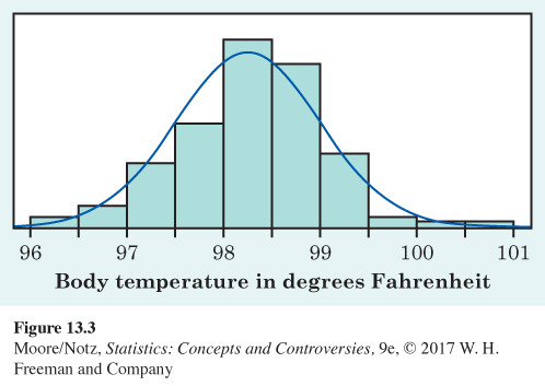
For the irregular distribution in Figure 13.1, we can’t do better. In the case of the very symmetric sampling data in Figure 13.2, however, there is another way to get a smooth curve. The distribution can be described by a specific kind of smooth curve called a Normal curve. Figure 13.3 shows the Normal curve for these data. The curve looks a lot like the one in Figure 13.2, but a close look shows that it is smoother. The Normal curve is much easier to work with and does not require clever software.
In this chapter, we will learn that Normal curves have special properties that help us use them and think about them. By the end of this chapter, you will be able to use these properties to answer questions about the underlying distributions represented in Figures 13.2 and 13.3 that cannot easily be determined from the histograms.


We now have a kit of graphical and numerical tools for describing distributions. What is more, we have a clear strategy for exploring data on a single quantitative variable:
1. Always plot your data: make a graph, usually a histogram or a stemplot.
2. Look for the overall pattern (shape, center, variability) and for striking deviations such as outliers.
3. Choose either the five-number summary or the mean and standard deviation to briefly describe center and variability in numbers.
Here is one more step to add to this strategy:
4. Sometimes, the overall pattern of a large number of observations is so regular that we can describe it by a smooth curve.