Histograms
Categorical variables record group membership, such as the marital status of a man or the race of a college student. We can use a pie chart or bar graph to display the distribution of categorical variables because they have relatively few values. What about quantitative variables such as the SAT scores of students admitted to a college or the income of families? These variables take so many values that a graph of the distribution is clearer if nearby values are grouped together. The most common graph of the distribution of a quantitative variable is a histogram.
EXAMPLE 1 How to make a histogram
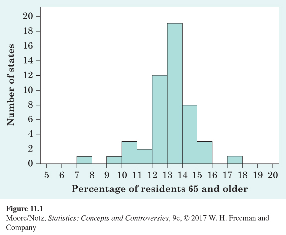
Table 11.1 presents the percentage of residents aged 65 years and over in each of the 50 states. To make a histogram of this distribution, proceed as follows.
Step 1. Divide the range of the data into classes of equal width. The data in Table 11.1 range from 7.3 to 17.4, so we choose as our classes
7.0 ≤ percentage over 65 < 8.0
8.0 ≤ percentage over 65 < 9.0
.
.
.
17.0 ≤ percentage over 65 < 18.0
Be sure to specify the classes precisely so that each individual falls into exactly one class. In other words, be sure that the classes are exclusive (no individual is in more than one class) and exhaustive (every individual appears in some class). A state with 7.9% of its residents aged 65 or older would fall into the first class, but 8.0% fall into the second.
ta11-01
| State | Percent | State | Percent | State | Percent |
|---|---|---|---|---|---|
| Alabama | 13.8 | Louisiana | 12.3 | Ohio | 13.7 |
| Alaska | 7.3 | Maine | 15.1 | Oklahoma | 13.5 |
| Arizona | 13.3 | Maryland | 12.1 | Oregon | 13.3 |
| Arkansas | 14.3 | Massachusetts | 13.4 | Pennsylvania | 15.4 |
| California | 11.2 | Michigan | 13.0 | Rhode Island | 14.1 |
| Colorado | 10.4 | Minnesota | 12.5 | South Carolina | 13.3 |
| Connecticut | 13.7 | Mississippi | 12.7 | South Dakota | 14.4 |
| Delaware | 13.9 | Missouri | 13.6 | Tennessee | 13.2 |
| Florida | 17.4 | Montana | 14.2 | Texas | 10.2 |
| Georgia | 10.1 | Nebraska | 13.5 | Utah | 9.0 |
| Hawaii | 14.8 | Nevada | 11.4 | Vermont | 14.0 |
| Idaho | 12.0 | New Hampshire | 12.9 | Virginia | 12.1 |
| Illinois | 12.2 | New Jersey | 13.3 | Washington | 12.0 |
| Indiana | 12.8 | New Mexico | 13.1 | West Virginia | 15.7 |
| Iowa | 14.8 | New York | 13.4 | Wisconsin | 13.3 |
| Kansas | 13.1 | North Carolina | 12.4 | Wyoming | 12.3 |
| Kentucky | 13.3 | North Dakota | 14.7 | ||
| Source: 2010 Statistical Abstract of the United States; available online at www.census.gov/library/publications/2009/compendia/statab/129ed.html. | |||||
Step 2. Count the number of individuals in each class. Here are the counts:
| Class | Count | Class | Count | Class | Count |
|---|---|---|---|---|---|
| 7.0 to 7.9 | 1 | 11.0 to 11.9 | 2 | 15.0 to 15.9 | 3 |
| 8.0 to 8.9 | 0 | 12.0 to 12.9 | 12 | 16.0 to 16.9 | 0 |
| 9.0 to 9.9 | 1 | 13.0 to 13.9 | 19 | 17.0 to 17.9 | 1 |
| 10.0 to 10.9 | 3 | 14.0 to 14.9 | 8 |
Step 3. Draw the histogram. Mark on the horizontal axis the scale for the variable whose distribution you are displaying. That’s “percentage of residents aged 65 and over” in this example. The scale runs from 5 to 20 because that range spans the classes we chose. The vertical axis contains the scale of counts. Each bar represents a class. The base of the bar covers the class, and the bar height is the class count. There is no horizontal space between the bars unless a class is empty, so that its bar has height zero. Figure 11.1 is our histogram.
![]() What the eye really sees We make the bars in bar graphs and histograms equal in width because the eye responds to their area. That’s roughly true. Careful study by statistician William Cleveland shows that our eyes “see” the size of a bar in proportion to the 0.7 power of its area. Suppose, for example, that one figure in a pictogram is both twice as high and twice as wide as another. The area of the bigger figure is 4 times that of the smaller. But we perceive the bigger figure as only 2.6 times the size of the smaller because 2.6 is 4 to the 0.7 power.
What the eye really sees We make the bars in bar graphs and histograms equal in width because the eye responds to their area. That’s roughly true. Careful study by statistician William Cleveland shows that our eyes “see” the size of a bar in proportion to the 0.7 power of its area. Suppose, for example, that one figure in a pictogram is both twice as high and twice as wide as another. The area of the bigger figure is 4 times that of the smaller. But we perceive the bigger figure as only 2.6 times the size of the smaller because 2.6 is 4 to the 0.7 power.
Just as with bar graphs, our eyes respond to the area of the bars in a histogram. Be sure that the classes for a histogram have equal widths. There is no one right choice for the number of classes. Some people recommend between 10 and 20 classes but suggest using fewer when the size of the data set is small. Too few classes will give a “skyscraper” histogram, with all values in a few classes with tall bars. Too many classes will produce a “pancake” graph, with most classes having one or no observations. Neither choice will give a good picture of the shape of the distribution. You must use your judgment in choosing classes to display the shape. Statistics software will choose the classes for you and may use slightly different rules than those we have discussed. The computer’s choice is usually a good one, but you can change it if you want. When using statistical software, it is good practice to check what rules are used to determine the classes.
NOW IT’S YOUR TURN
Question 11.1
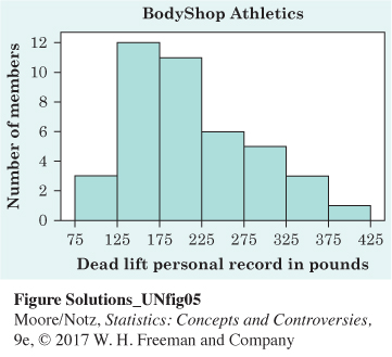
11.1 Personal record for weightlifting. Bodyshop Athletics keeps a dry erase board for members to keep track of their personal record for various events. The “dead lift’’ is a weightlifting maneuver where a barbell is lifted from the floor to the hips. The following data are the personal records for members at Bodyshop Athletics in pounds lifted during the dead lift.
| Member | Weight | Member | Weight | Member | Weight |
|---|---|---|---|---|---|
| Baker, B. | 175 | G.T.C. | 250 | Pender | 205 |
| Baker, T. | 100 | Harper | 155 | Porth | 215 |
| Birnie | 325 | Horel | 215 | Ross | 115 |
| Bonner | 155 | Hureau | 285 | Stapp | 190 |
| Brown | 235 | Ingram | 165 | Stokes | 305 |
| Burton | 155 | Johnson | 175 | Taylor, A. | 165 |
| Coffey, L. | 135 | Jones, J. | 195 | Taylor, Z. | 305 |
| Coffey, S. | 275 | Jones, L. | 205 | Thompson | 285 |
| Collins, C. | 215 | LaMonica | 235 | Trent | 135 |
| Collins, E. | 95 | Lee | 165 | Tucker | 245 |
| Dalick, B. | 225 | Lord | 405 | Watson | 155 |
| Dalick, K. | 335 | McCurry | 165 | Wind, J. | 350 |
| Edens | 255 | Moore | 145 | Wind, K. | 185 |
| Flowers | 205 | Morrison | 145 |
Make a histogram of this distribution following the three steps described in Example 1. Create your classes using 75 ≤ weight < 125, then 125 ≤ 175, and so on.
Step 1: Divide the range of the data into classes of equal width. The data in the table range from 95 to 405, so we choose as our classes
75 ≤ weight < 125
125 ≤ weight < 175
. . .
375 ≤ weight < 425
Step 2: Count the number of individuals in each class. For example, there are three members in the first class, 12 members in the second class, and so on, up to one member in the final class.
Page 629
Step 3: Draw the histogram. Mark on the horizontal axis the scale for the variable whose distribution you are displaying. That’s “Dead Lift Personal Record in Pounds” here. The scale runs from 75 to 425 because that range spans the classes we chose. The vertical axis contains the scale of counts. Here that is “Number of Members.” Each bar represents a class. The base of the bar covers the class, and the bar height is the class count. There is no horizontal space between bars unless a class is empty, so that its bar has height zero. The following figure is our histogram.