Interpreting histograms
Making a statistical graph is not an end in itself. The purpose of the graph is to help us understand the data. After you (or your computer) make a graph, always ask, “What do I see?” Here is a general strategy for looking at graphs.
Pattern and deviations
In any graph of data, look for an overall pattern and also for striking deviations from that pattern.
We have already applied this strategy to line graphs. Trend and seasonal variation are common overall patterns in a line graph. The more drastic decrease in unemployment in mid-2010 for those with less than a high school degree, seen in Figure 10.7 (page 226), is deviating from the overall pattern of small dips and increases apparent throughout the rest of the line. This is an example of a striking deviation from the general pattern that one observes for the rest of the time period. In the case of the histogram of Figure 11.1, it is easiest to begin with deviations from the overall pattern of the histogram. Two states stand out as separated from the main body of the histogram. You can find them in the table once the histogram has called attention to them. Alaska has 7.3% and Florida 17.4% of its residents over age 65. These states are clear outliers.
Outliers
An outlier in any graph of data is an individual observation that falls outside the overall pattern of the graph.
Is Utah, with 9.0% of its population over 65, an outlier? Whether an observation is an outlier is, to some extent, a matter of judgment, although statisticians have developed some objective criteria for identifying possible outliers. Utah is the smallest of the main body of observations and, unlike Alaska and Florida, is not separated from the general pattern. We would not call Utah an outlier. Once you have spotted outliers, look for an explanation. Many outliers are due to mistakes, such as typing 4.0 as 40. Other outliers point to the special nature of some observations. Explaining outliers usually requires some background information. It is not surprising that Alaska, the northern frontier, has few residents 65 and over and that Florida, a popular state for retirees, has many residents 65 and over.
To see the overall pattern of a histogram, ignore any outliers. Here is a simple way to organize your thinking.
Overall pattern of a distribution
To describe the overall pattern of a distribution:
• Describe the center and the variability.
• Describe the shape of the histogram in a few words.
We will learn how to describe center and variability numerically in Chapter 12. For now, we can describe the center of a distribution by its midpoint, the value at roughly the middle of all the values in the distribution. We can describe the variability of a distribution by giving the smallest and largest values, ignoring any outliers.
EXAMPLE 2 Describing distributions
Look again at the histogram in Figure 11.1. Shape: The distribution has a single peak. It is roughly symmetric—that is, the pattern is similar on both sides of the peak. Center: The midpoint of the distribution is close to the single peak, at about 13%. Variability: The variability is about 9% to 18% if we ignore the outliers.

eg11-03
EXAMPLE 3 Tuition and fees in Illinois
There are 116 colleges and universities in Illinois. Their tuition and fees for the 2009–2010 school year run from $1974 at Moraine Valley Community College to $38,550 at the University of Chicago. Figure 11.2 is a histogram of the tuition and fees charged by all 116 Illinois colleges and universities. We see that many (mostly community colleges) charge less than $4000. The distribution extends out to the right. At the upper extreme, two colleges charge between $36,000 and $40,000.
The distribution of tuition and fees at Illinois colleges, shown in Figure 11.2, has a quite different shape from the distribution in Figure 11.1. There is a strong peak in the lowest cost class. Most colleges charge less than $8000, but there is a long right tail extending up to almost $40,000. We call a distribution with a long tail on one side skewed. The center is roughly $8000 (half the colleges charge less than this). The variability is large, from $1974 to more than $38,000. There are no outliers—the colleges with the highest tuition just continue the long right tail that is part of the overall pattern.
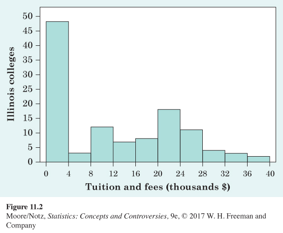
When you describe a distribution, concentrate on the main features. Look for major peaks, not for minor ups and downs in the bars of the histogram like those in Figure 11.2. Look for clear outliers, not just for the smallest and largest observations. Look for rough symmetry or clear skewness.
Symmetric and skewed distributions
A distribution is symmetric if the right and left sides of the histogram are approximately mirror images of each other.
A distribution is skewed to the right if the right side of the histogram (containing the half of the observations with larger values) extends much farther out than the left side. It is skewed to the left if the left side of the histogram extends much farther out than the right side.
A distribution is symmetric if the two sides of a figure like a histogram are exact mirror images of each other. Data are almost never exactly symmetric, so we are willing to call histograms like that in Figure 11.1 roughly symmetric as an overall description. The tuition distribution in Figure 11.2, on the other hand, is clearly skewed to the right. Here are more examples.
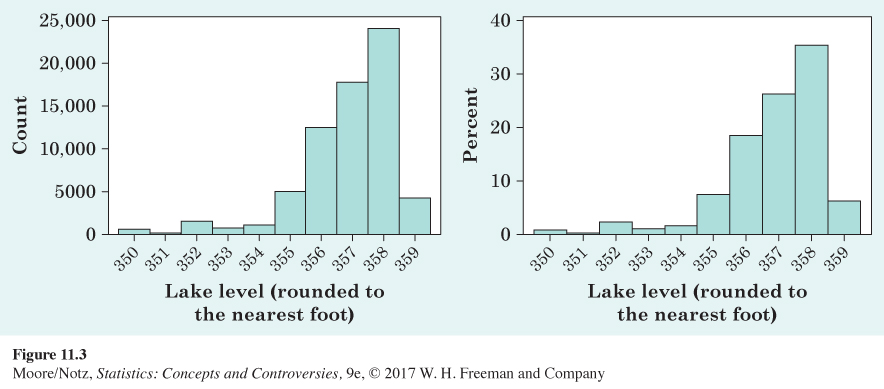
EXAMPLE 4 Lake elevation levels
Lake Murray is a manmade reservoir located in South Carolina. It is used mainly for recreation, such as boating, fishing, and water sports. It is also used to provide backup hydroelectric power for South Carolina Electric and Gas. The lake levels fluctuate with the highest levels in summer (for safe boating and good fishing) and the lowest levels in winter (for water quality). Water can be released at the dam in the case of heavy rains or to let water out to maintain winter levels. The U.S. Geological Survey (USGS) monitors water levels in Lake Murray. The histograms in Figure 11.3 were created using 67,810 hourly elevation levels from November 1, 2007, through August 11, 2015.
The two histograms of lake levels were made from the same data set, and the histograms look identical in shape. The shape of the distribution of lake levels is skewed left because the left side of the histogram is longer. The minimum lake level is 350 feet, and the maximum is 359 feet. Using the histogram on the right, by adding the height of the bar for 358 and 359 feet elevations, we see the lake level is at 358 or 359 roughly 40% of the time. Using this information, it appears that a lake level of 357 feet is the midpoint of the distribution.
Let’s examine the difference in the two histograms. The histogram on the left puts the count of observations on the vertical axis (this is called a frequency histogram), while the histogram on the right uses the percentage of times the lake reaches a certain level (this is called a relative frequency histogram). The frequency histogram tells us the lake reached an elevation of 358 feet approximately 24,000 times (24,041, to be exact!). If a fisherman considering a move to Lake Murray cares about how often the lake reaches a certain level, it is more illustrative to use the relative frequency histogram on the right, which reports the percentage of times the lake reached 358 feet. The height of the bar for 358 feet is 35, so the fisherman would know the lake is at the 358 foot elevation roughly 35% of the time.
It is not uncommon in the current world to have very large data sets. Google uses big data to rank web pages and provide the best search results. Banks use big data to analyze spending patterns and learn when to flag your debit or credit card for fraudulent use. Large firms use big data to analyze market patterns and adapt marketing strategies accordingly. Our data set of size 67,810 is actually small in the realm of “big data” but is still big enough to see that it is almost always better to use a relative frequency histogram when sample sizes grow large. A relative frequency histogram is also a better choice if one wants to make comparisons between two distributions.
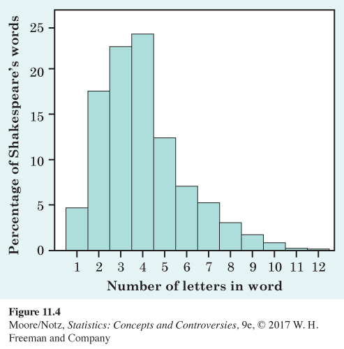
EXAMPLE 5 Shakespeare’s words
Figure 11.4 shows the distribution of lengths of words used in Shakespeare’s plays. This distribution has a single peak and is somewhat skewed to the right. There are many short words (three and four letters) and few very long words (10, 11, or 12 letters), so that the right tail of the histogram extends out farther than the left tail. The center of the distribution is about 4. That is, about half of Shakespeare’s words have four or fewer letters. The variability is from 1 letter to 12 letters.
Notice that the vertical scale in Figure 11.4 is not the count of words but the percentage of all of Shakespeare’s words that have each length. A histogram of percentages rather than counts is convenient because this was a large data set. Different kinds of writing have different distributions of word lengths, but all are right-skewed because short words are common and very long words are rare.
The overall shape of a distribution is important information about a variable. Some types of data regularly produce distributions that are symmetric or skewed. For example, the sizes of living things of the same species (like lengths of crickets) tend to be symmetric. Data on incomes (whether of individuals, companies, or nations) are usually strongly skewed to the right. There are many moderate incomes, some large incomes, and a few very large incomes. It is very common for data to be skewed to the right when they have a strict minimum value (often 0). Income and the lengths of Shakespeare’s words are examples. Likewise, data that have a strict maximum value (such as 100, as in student test scores) are often skewed to the left. Do remember that many distributions have shapes that are neither symmetric nor skewed. Some data show other patterns. Scores on an exam, for example, may have a cluster near the top of the scale if many students did well. Or they may show two distinct peaks if a tough problem divided the class into those who did and didn’t solve it. Use your eyes and describe what you see.
NOW IT’S YOUR TURN
Question 11.2
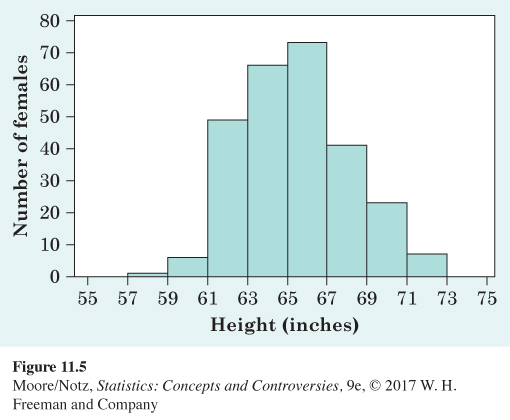
11.2 Height distribution. Height distributions generally have a predictable pattern. In a large introductory statistics class, students were asked to report their height. The histogram in Figure 11.5 displays the distribution of heights, in inches, for 266 females from this class. Describe the shape, center, and variability of this distribution. Are there any outliers?
11.2 The distribution is mostly symmetric (perhaps slightly left skewed), with a center between 65 and 67 inches. The data are spread between 57 and 73 inches, with no outliers.