STATISTICS IN SUMMARY
Chapter Specifics
• The distribution of a variable tells us what values the variable takes and how often it takes each value.
• To display the distribution of a quantitative variable, use a histogram or a stemplot. We usually favor stemplots when we have a small number of observations and histograms for larger data sets. Make sure to choose the appropriate number of classes so that the distribution shape is displayed accurately. For really large data sets, use a histogram of percents (relative frequency histogram).
256
• When you look at a graph, look for an overall pattern and for deviations from that pattern, such as outliers.
• We can characterize the overall pattern of a histogram or stemplot by describing its shape, center, and variability. Some distributions have simple shapes, such as symmetric, skewed left, or skewed right, but others are too irregular to describe by a simple shape.
 In Chapter 10, we learned how to use tables and graphs to see what data tell us. In this chapter, we looked at two additional graphs—histograms and stemplots—that help us make sense of large collections of numbers. These graphics are pictures of the distribution of a single quantitative variable. Although the bar graphs in Chapter 10 look much like histograms, the difference is that bar graphs are used to display the distribution of a categorical variable, while histograms display the distribution of a quantitative variable. The overall pattern (shape, center, and variability) and deviations from this pattern (outliers) are important features of the distribution of a variable. We will look more carefully at these features in future chapters. In addition, these features will figure prominently in some of the conclusions that we will draw about a variable from data.
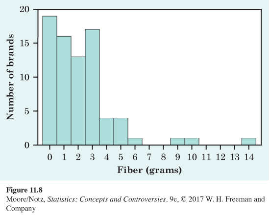
CASE STUDY EVALUATED Figure 11.8 is a histogram of the distribution of the amount of dietary fiber in 77 brands of cereal found on the shelves of a grocery store. Use what you have learned in this chapter to answer the following questions.
1. Describe the overall shape, the center, and the variability of the distribution.
2. Are there any outliers?
3. Wheaties has 3 grams of dietary fiber. Is this a low, high, or typical amount?
![]() Online Resources
Online Resources
• The StatBoards video Creating and Interpreting a Histogram, describes how to construct a histogram.
• The Snapshots video Visualizing Quantitative Data, discusses stemplots and histograms in the setting of two real examples.
257