The five-number summary and boxplots
The smallest and largest observations tell us little about the distribution as a whole, but they give information about the tails of the distribution that is missing if we know only the median and the quartiles. To get a quick summary of both center and variability, combine all five numbers.
The five-number summary
The five-number summary of a distribution consists of the smallest observation, the first quartile, the median, the third quartile, and the largest observation, written in order from smallest to largest. In symbols, the five-number summary is
Minimum Q1 M Q3 Maximum
These five numbers offer a reasonably complete description of center and variability. The five-number summaries of home run counts are
10 26 34 44 47
for Aaron and
5 25 34 45 73
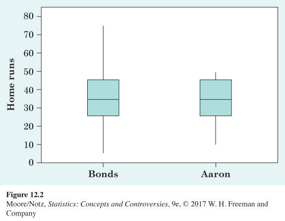
for Bonds. The five-number summary of a distribution leads to a new graph, the boxplot. Figure 12.2 shows boxplots for the home run comparison.
Boxplot
A boxplot is a graph of the five-number summary.
• A central box spans the quartiles.
• A line in the box marks the median.
• Lines extend from the box out to the smallest and largest observations.
You can draw boxplots either horizontally or vertically. Be sure to include a numerical scale in the graph. When you look at a boxplot, first locate the median, which marks the center of the distribution. Then look at the variability. The quartiles (more precisely, the difference between the two quartiles) show the variability of the middle half of the data, and the extremes (the smallest and largest observations) indicate the variability of the entire data set. We see from Figure 12.2 that Bonds’s usual performance, as indicated by the median and the box that marks the middle half of the distribution, is similar to that of Aaron. We also see that the distribution for Aaron is less variable than the distribution for Bonds.
NOW IT’S YOUR TURN
ex12-02
Question 12.2
12.2 Babe Ruth. Here are Babe Ruth’s home run counts for his 22 years in Major League Baseball, arranged in order from smallest to largest:
| 0 | 2 | 3 | 4 | 6 | 11 | 22 | 25 | 29 | 34 | 35 |
| 41 | 41 | 46 | 46 | 46 | 47 | 49 | 54 | 54 | 59 | 60 |
Draw a boxplot of this distribution. How does it compare with those of Barry Bonds and Hank Aaron in Figure 12.2?
12.2
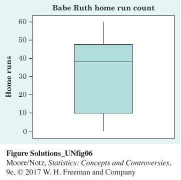
The median (38) and the third quartile (47) for Ruth are slightly larger than for Bonds and Aaron. The distribution for Ruth appears more skewed (left-skewed) than for Bonds and Aaron. If one examines Ruth’s career, one finds that he was a pitcher for his first six seasons, and during those seasons, he did not have many plate appearances. Hence, he has six seasons of very low home run counts, resulting in a left-skewed distribution.
Because boxplots show less detail than histograms or stemplots, they are best used for side-by-side comparison of more than one distribution, as in Figure 12.2. For such small numbers of observations, a back-to-back stemplot is better yet (see Exercise 11.22, page 265). It would make clear, as the boxplot cannot, that Bonds’s record 73 home runs in 2001 is an outlier in his career. Let us look at an example where boxplots are more genuinely useful.
EXAMPLE 3 Income inequality
To investigate income inequality, we compare household incomes of Hispanics, blacks, and whites. The Census Bureau website provides information on income distribution by race. Figure 12.3 compares the income distributions for Hispanics, blacks, and whites in 2013. This figure is a variation on the boxplot idea. The largest income among several million people will surely be very large. Figure 12.3 uses the 95% points (the values representing where the top 5% of incomes start) in the distributions instead of the single largest incomes. So, for example, the line above the box for the Hispanic group extends only to $144,040 rather than to the highest income. Many statistical software packages allow you to produce boxplots that suppress extreme values, but the rules for what constitutes an extreme value usually do not use the 95% point in the distribution instead of the single largest value.
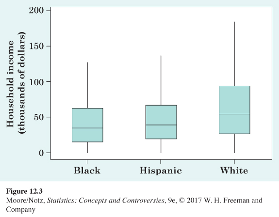
Figure 12.3 gives us a clear and simple visual comparison. We see that the median and middle half are slightly greater for Hispanics than for blacks and that for whites the median and middle half are greater than for both blacks and Hispanics. The income of the bottom 5% stays small because there are some people in each group with no income or even negative income, perhaps due to illness or disability. The 95% point, marking off the top 5% of incomes, is greater for whites than for either blacks or Hispanics, and the 95% point of incomes for Hispanics is greater than for blacks. Overall, incomes for whites tend to be larger than those for Hispanics and blacks, highlighting racial inequities in income.
Figure 12.3 also illustrates how boxplots often indicate the symmetry or skewness of a distribution. In a symmetric distribution, the first and third quartiles are equally distant from the median. In most distributions that are skewed to the right, on the other hand, the third quartile will be farther above the median than the first quartile is below it. The extremes behave the same way. Even with the top 5% not present, we can see the right-skewness of incomes for all three races.
STATISTICAL CONTROVERSIES
Income Inequality
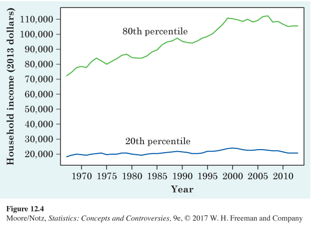
During the prosperous 1980s and 1990s, the incomes of all American households went up, but the gap between rich and poor grew. Figure 12.4 and 12.5 give two views of increasing inequality. Figure 12.4 is a line graph of household income, in dollars adjusted to have the same buying power every year. The lines show the 20th and 80th percentiles of income, which mark off the bottom fifth and the top fifth of households. The 80th percentile (up 47% between 1967 and 2013) is pulling away from the 20th percentile (up about 14%).
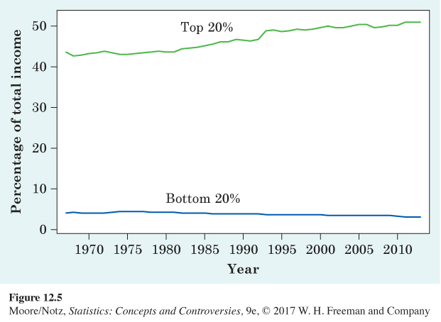
Figure 12.5 looks at the share of all income that goes to the top fifth and the bottom fifth. The bottom fifth’s share has drifted down, to 3.2% of all income in 2013. The share of the top fifth grew to 51% (up 16.4% between 1967 and 2013). Although not displayed in the figure, the share of the top 5% grew even faster, from 17.5% in 1967 to 22.2% of the income of all households in the country in 2013. This is a 26.8% increase between 1967 and 2013. Income inequality in the United States is greater than in other developed nations and has been increasing.
Are these numbers cause for concern? And do they accurately reflect the disparity between the wealthy and the poor? For example, as people get older, their income increases. Perhaps these numbers reflect only the disparity between younger and older wage earners. What do you think?
