Choosing numerical descriptions
The five-number summary is easy to understand and is the best short description for most distributions. The mean and standard deviation are harder to understand but are more common. How can we decide which of these two descriptions of center and variability to use? Let’s start by comparing the mean and the median. “Midpoint’’ and “arithmetic average’’ are both reasonable ideas for describing the center of a set of data, but they are different ideas with different uses. The most important distinction is that the mean (the average) is strongly influenced by a few extreme observations and the median (the midpoint) is not.
ta12-01
| Player | Salary ($) | Player | Salary ($) |
|---|---|---|---|
| LeBron James | 20.6 million | Iman Shumpert | 2.6 million |
| Kevin Love | 15.7 million | Brendan Haywood | 2.2 million |
| Anderson Varejao | 9.7 million | James Jones | 1.4 million |
| Kyrie Irving | 7.1 million | Shawn Marion | 1.4 million |
| J.R. Smith | 6.0 million | Joe Harris | 0.9 million |
| Tristan Thompson | 5.1 million | Matthew Dellavedova | 0.8 million |
| Timofey Mozgov | 4.7 million | Kendrick Perkins | 0.4 million |
| Mike Miller | 2.7 million | ||
| Source: The salaries are estimates from www.spotrac.com/nba/rankings/2014/base/cleveland-cavaliers/. | |||
EXAMPLE 6 Mean versus median
Table 12.1 gives the approximate salaries (in millions of dollars) of the 15 members of the Cleveland Cavaliers basketball team for the 2014–2015 season. You can calculate that the mean is ˉx=$5.5 million and that the median is M=$2.7 million. No wonder professional basketball players have big houses.
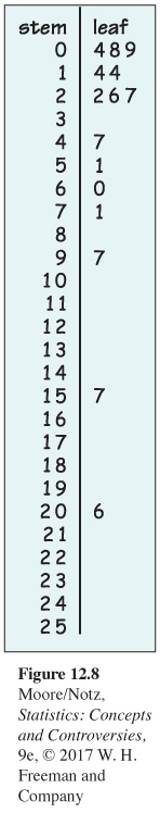
Why is the mean so much higher than the median? Figure 12.8 is a stemplot of the salaries, with millions as stems. The distribution is skewed to the right, and there are two high outliers. The very high salaries of LeBron James and Kevin Love pull up the sum of the salaries and so pull up the mean. If we drop the outliers, the mean for the other 13 players is only $3.5 million. The median doesn’t change nearly as much: it drops from $2.7 million to $2.6 million.
We can make the mean as large as we like by just increasing LeBron James's salary. The mean will follow one outlier up and up. But to the median, LeBron’s salary just counts as one observation at the upper end of the distribution. Moving it from $20.6 million to $206 million would not change the median at all.
![]() Poor New York? Is New York a rich state? New York’s mean income per person ranks seventh among the states, right up there with its rich neighbors Connecticut and New Jersey, which rank first and second. But while Connecticut and New Jersey rank third and second in median household income, New York stands 17th. What’s going on? Just another example of mean versus median. New York has many very highly paid people, who pull up its mean income per person. But it also has a higher proportion of poor households than do Connecticut and New Jersey, and this brings the median down. New York is not a rich state—it’s a state with extremes of wealth and poverty.
Poor New York? Is New York a rich state? New York’s mean income per person ranks seventh among the states, right up there with its rich neighbors Connecticut and New Jersey, which rank first and second. But while Connecticut and New Jersey rank third and second in median household income, New York stands 17th. What’s going on? Just another example of mean versus median. New York has many very highly paid people, who pull up its mean income per person. But it also has a higher proportion of poor households than do Connecticut and New Jersey, and this brings the median down. New York is not a rich state—it’s a state with extremes of wealth and poverty.
The mean and median of a symmetric distribution are close to each other. In fact, ˉx and M are exactly equal if the distribution is exactly symmetric. In skewed distributions, however, the mean runs away from the median toward the long tail. Many distributions of monetary values—incomes, house prices, wealth—are strongly skewed to the right. The mean may be much larger than the median. For example, we saw in Example 3 that the distribution of incomes for blacks, Hispanics, and whites is skewed to the right. The Census Bureau website gives the mean incomes for 2013 as $49,629 for blacks, $54,644 for Hispanics, and $75,839 for whites. Compare these with the corresponding medians of $34,598, $40,963, and $55,257. Because monetary data often have a few extremely high observations, descriptions of these distributions usually employ the median.
You should think about more than symmetry versus skewness when choosing between the mean and the median. The distribution of selling prices for homes in Middletown is no doubt skewed to the right—but if the Middletown City Council wants to estimate the total market value of all houses in order to set tax rates, the mean and not the median helps them out because the mean will be larger. (The total market value is just the number of houses times the mean market value and has no connection with the median.)
The standard deviation is pulled up by outliers or the long tail of a skewed distribution even more strongly than the mean. The standard deviation of the Lakers’ salaries is s=$5.8 million for all 18 players and only s=$3.2 million when the outlier is removed. The quartiles are much less sensitive to a few extreme observations. There is another reason to avoid the standard deviation in describing skewed distributions. Because the two sides of a strongly skewed distribution have different amounts of variability, no single number such as s describes the variability well. The five-number summary, with its two quartiles and two extremes, does a better job. In most situations, it is wise to use ˉx and s only for distributions that are roughly symmetric.
Choosing a summary
The mean and standard deviation are strongly affected by outliers or by the long tail of a skewed distribution. The median and quartiles are less affected.
The five-number summary is usually better than the mean and standard deviation for describing a skewed distribution or a distribution with outliers. Use ˉx and s only for reasonably symmetric distributions that are free of outliers.
Why do we bother with the standard deviation at all? One answer appears in the next chapter: the mean and standard deviation are the natural measures of center and variability for an important kind of symmetric distribution, called the Normal distribution.
Do remember that a graph gives the best overall picture of a distribution. Numerical measures of center and variability report specific facts about a distribution, but they do not describe its entire shape. Numerical summaries do not disclose the presence of multiple peaks or gaps, for example. Always start with a graph of your data.