Scatterplots
14
Describing Relationships: Scatterplots and Correlation

CASE STUDY The news media have a weakness for lists. Best places to live, best colleges, healthiest foods, worst-dressed women . . . a list of best or worst is sure to find a place in the news. When the state-by-state SAT scores come out each year, it’s therefore no surprise that we find news articles ranking the states from best (North Dakota in 2014) to worst (District of Columbia in 2014) according to the average Mathematics SAT score achieved by their high school seniors. Unfortunately, such reports leave readers believing that schools in the District of Columbia must be much worse than those in North Dakota. Where does your home state rank? And do you believe the ranking reflects the quality of education you received?
The College Board, which sponsors the SAT exams, doesn’t like this practice at all. “Comparing or ranking states on the basis of SAT scores alone is invalid and strongly discouraged by the College Board,” says the heading on their table of state average SAT scores. To see why, let’s look at the data.
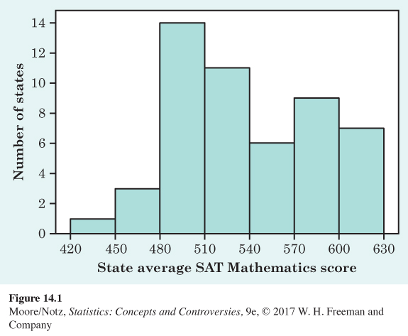
Figure 14.1 shows the distribution of average scores on the SAT Mathematics exam for the 50 states and the District of Columbia. North Dakota leads at 620, and the District of Columbia trails at 438 on the SAT scale of 200 to 800. The distribution has an unusual shape: it has one clear peak and perhaps a second, small one. This may be a clue that the data mix two distinct groups. But, we need to explore the data further to be sure that this is the case.
In this chapter, we will learn that to understand one variable, such as SAT scores, we must look at how it is related to other variables. By the end of this chapter, you will be able to use what you have learned to understand why Figure 14.1 has such an unusual shape and to appreciate why the College Board discourages ranking states on SAT scores alone.
fig14-01
A medical study finds that short women are more likely to have heart attacks than women of average height, while tall women have the fewest heart attacks. An insurance group reports that heavier cars are involved in fewer fatal accidents per 10,000 vehicles registered than are lighter cars. These and many other statistical studies look at the relationship between two variables. To understand such a relationship, we must often examine other variables as well. To conclude that shorter women have higher risk from heart attacks, for example, the researchers had to eliminate the effect of other variables such as weight and exercise habits. Our topic in this and the following chapters is relationships between variables. One of our main themes is that the relationship between two variables can be strongly influenced by other variables that are lurking in the background.
Most statistical studies examine data on more than one variable. Fortunately, statistical analysis of several-variable data builds on the tools we used to examine individual variables. The principles that guide our work also remain the same:
• First plot the data, then add numerical summaries.
• Look for overall patterns and deviations from those patterns.
• When the overall pattern is quite regular, there is sometimes a way to describe it very briefly.