Interpreting scatterplots
To interpret a scatterplot, apply the usual strategies of data analysis.
Examining a scatterplot
In any graph of data, look for the overall pattern and for striking deviations from that pattern.
You can describe the overall pattern of a scatterplot by the direction, form, and strength of the relationship.
An important kind of deviation is an outlier, an individual value that falls outside the overall pattern of the relationship.
![]() After you plot your data, think! Abraham Wald (1902–1950), like many statisticians, worked on war problems during World War II. Wald invented some statistical methods that were military secrets until the war ended. Here is one of his simpler ideas. Asked where extra armor should be added to airplanes, Wald studied the location of enemy bullet holes in planes returning from combat. He plotted the locations on an outline of the plane. As data accumulated, most of the outline filled up. Put the armor in the few spots with no bullet holes, said Wald. That’s where bullets hit the planes that didn’t make it back.
After you plot your data, think! Abraham Wald (1902–1950), like many statisticians, worked on war problems during World War II. Wald invented some statistical methods that were military secrets until the war ended. Here is one of his simpler ideas. Asked where extra armor should be added to airplanes, Wald studied the location of enemy bullet holes in planes returning from combat. He plotted the locations on an outline of the plane. As data accumulated, most of the outline filled up. Put the armor in the few spots with no bullet holes, said Wald. That’s where bullets hit the planes that didn’t make it back.
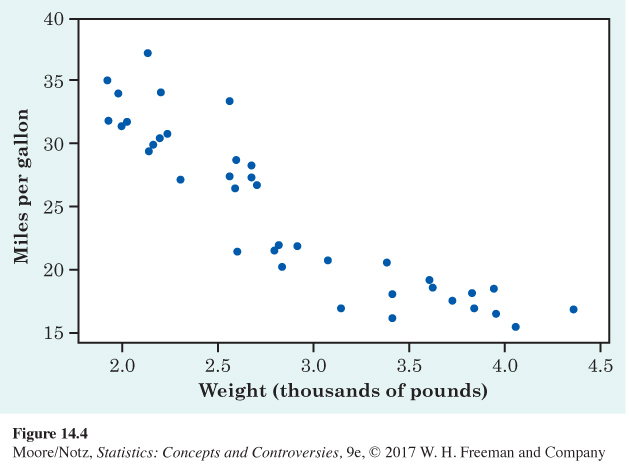
Both Figure 14.2 and 14.3 have a clear direction: recession velocity goes up as distance from the earth increases, and life expectancy generally goes up as GDP increases. We say that Figure 14.2 and 14.3 show a positive association. Figure 14.4 is a scatterplot of the gas mileages (in miles per gallon) and the engine size (or engine displacement, in liters) of 1252 model-year 2015 cars. The response variable is gas mileage and the explanatory variable is engine size. We see that gas mileage decreases as engine size goes up. We say that Figure 14.4 shows a negative association.
fig14-04
Positive association, negative association
Two variables are positively associated when above-average values of one tend to accompany above-average values of the other and below-average values also tend to occur together. The scatterplot slopes upward as we move from left to right.
Two variables are negatively associated when above-average values of one tend to accompany below-average values of the other, and vice versa. The scatterplot slopes downward from left to right.
Each of our scatterplots has a distinctive form. Figure 14.2 shows a roughly straight-line trend, and Figure 14.3 shows a curved relationship. Figure 14.4 shows a slightly curved relationship. The strength of a relationship in a scatterplot is determined by how closely the points follow a clear form. The relationships in Figure 14.2 and 14.3 are not strong. Galaxies with similar distances from the earth show quite a bit of scatter in their recession velocities, and nations with similar GDPs can have quite different life expectancies. The relationship in Figure 14.4 is moderately strong. Here is an example of a stronger relationship with a simple form.

eg14-03
EXAMPLE 3 Classifying fossils
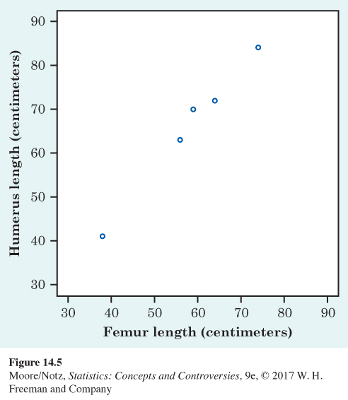
Archaeopteryx is an extinct beast having feathers like a bird but teeth and a long bony tail like a reptile. Only six fossil specimens are known. Because these fossils differ greatly in size, some scientists think they are different species rather than individuals from the same species. We will examine data on the lengths in centimeters of the femur (a leg bone) and the humerus (a bone in the upper arm) for the five fossils that preserve both bones. Here are the data:
| Femur: | 38 | 56 | 59 | 64 | 74 |
| Humerus: | 41 | 63 | 70 | 72 | 84 |
Because there is no explanatory-response distinction, we can put either measurement on the x axis of a scatterplot. The plot appears in Figure 14.5.
The plot shows a strong, positive, straight-line association. The straight-line form is important because it is common and simple. The association is strong because the points lie close to a line. It is positive because as the length of one bone increases, so does the length of the other bone. These data suggest that all five fossils belong to the same species and differ in size because some are younger than others. We expect that a different species would have a different relationship between the lengths of the two bones, so that it would appear as an outlier.
NOW IT’S YOUR TURN
ex14-02
Question 14.2
14.2 Brain size and intelligence. For centuries, people have associated intelligence with brain size. A recent study used magnetic resonance imaging to measure the brain size of several individuals. The IQ and brain size (in units of 10,000 pixels) of six individuals are as follows:
| Brain size: | 100 | 90 | 95 | 92 | 88 | 106 |
| IQ: | 140 | 90 | 100 | 135 | 80 | 103 |
Make a scatterplot of these data if you have not already done so. What is the form, direction, and strength of the association? Are there any outliers?
14.2 There is a weak positive association. There is no pronounced form other than evidence of a weak positive association. There are no outliers.