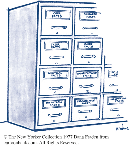
Is there a hidden agenda?
Lots of people feel strongly about various issues, so strongly that they would like the numbers to support their feelings. Often, they can find support in numbers by choosing carefully which numbers to report or by working hard to squeeze the numbers into the shape they prefer. Here are two examples.
EXAMPLE 13 Heart disease in women

A highway billboard says simply, “Half of all heart disease victims are women.” What might be the agenda behind this true statement? Perhaps the billboard sponsors just want to make women aware that they do face risks from heart disease. (Surveys show that many women underestimate the risk of heart disease.)
On the other hand, perhaps the sponsors want to fight what some people see as an overemphasis on male heart disease. In that case, we might want to know that although half of heart disease victims are women, they are on the average much older than male victims. Roughly 50,000 women under age 65 and 100,000 men under age 65 die from heart disease each year. The American Heart Association says, “Risk of death due to coronary heart disease in women is roughly similar to that of men 10 years younger.”
EXAMPLE 14 Income inequality
During the economic boom of the 1980s and 1990s in the United States, the gap between the highest and lowest earners widened. In 1980, the bottom fifth of households received 4.3% of all income, and the top fifth received 43.7%. By 1998, the share of the bottom fifth had fallen to 3.6% of all income, and the share of the top fifth of households had risen to 49.2%. That is, the top fifth’s share was almost 14 times the bottom fifth’s share.
Can we massage the numbers to make it appear that the income gap is smaller than it actually is? An article in Forbes (a magazine read mainly by rich people) tried. First, according to data from the Current Population Survey, household income tends to be larger for larger households, so let’s change to income per person. The rich pay more taxes, so look at income after taxes. The poor receive food stamps and other assistance, so let’s count that. Finally, high earners work more hours than low earners, so we should adjust for hours worked. After all this, the share of the top fifth is only three times that of the bottom fifth. Of course, hours worked are reduced by illness, disability, care of children and aged parents, and so on. If Forbes’s hidden agenda is to show that income inequality isn’t important, we may not agree.
Yet other adjustments are possible. Income, in these U.S. Census Bureau figures, does not include capital gains from, for example, selling stocks that have gone up. Almost all capital gains go to the rich, so including them would widen the income gap. Forbes didn’t make this adjustment. Making every imaginable adjustment in the meaning of “income,” says the U.S. Census Bureau, gives the bottom fifth of households 4.7% of total income in 1998 and the top fifth 45.8%.
The gap between the highest and lowest earners continues to widen. In 2012, according to the U.S. Census Bureau, the bottom fifth of households received 3.2% of all income and the top fifth received 51.0%.