EXAMPLE 1.28
IQ scores. In Example 1.14 (page xx), we used a histogram to examine the distribution of a sample of 60 IQ scores. A boxplot for these data is given in Figure 1.14. Note that the mean is marked with a “+” and appears very close to the median. The two quartiles are each approximately the same distance from the median, and the two whiskers are approximately the same distance from the corresponding quartiles. All these characteristics are consistent with a symmetric distribution, as illustrated by the histogram in Figure 1.8.
IQ
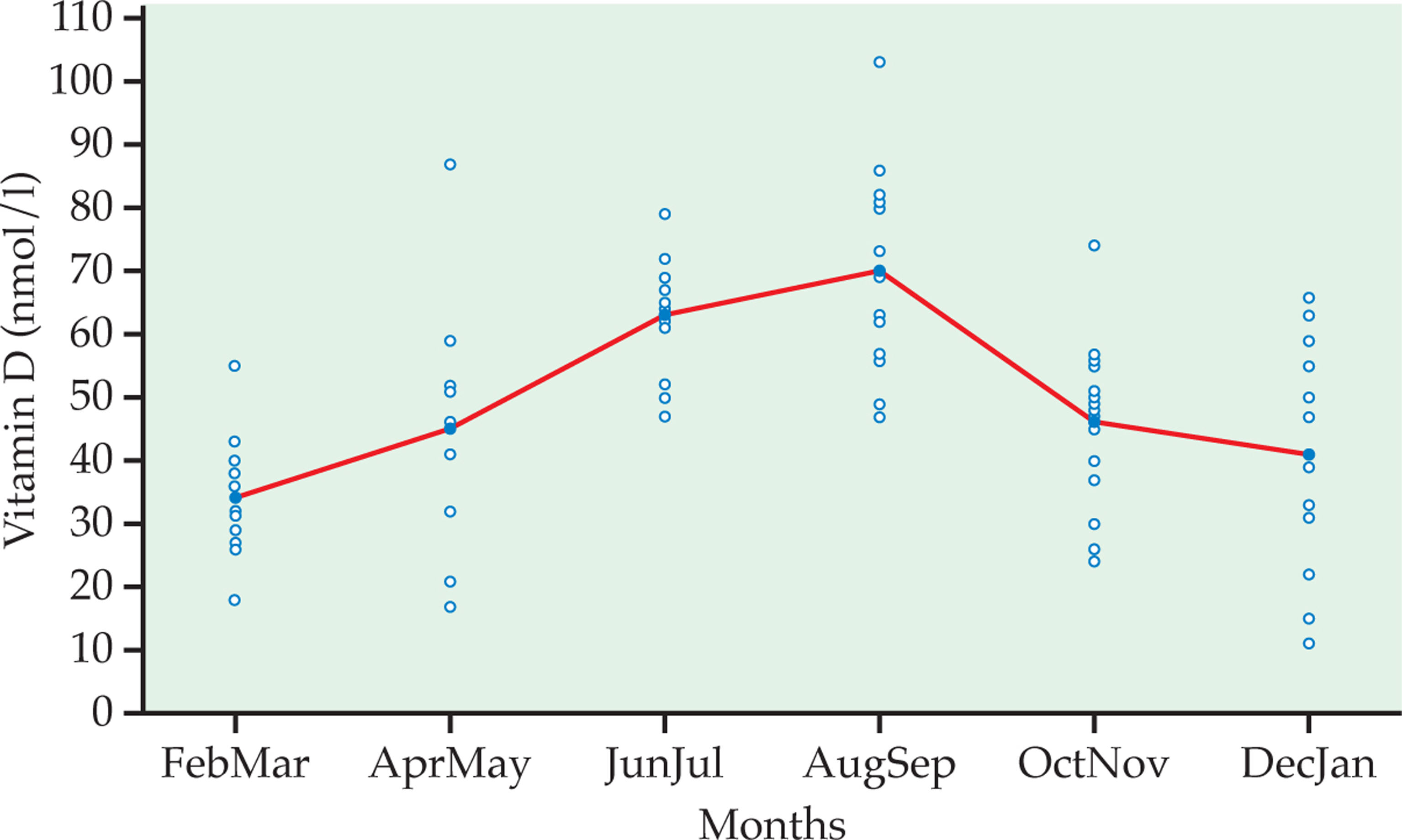
Figure 1.6: FIGURE 1.12 Plot of vitamin D versus months of the year, Example 1.22.
Figure 1.12 at 15% larger than main screen
Figure 1.12 at 25% larger than main screen
Figure 1.12 at 35% larger than main screen
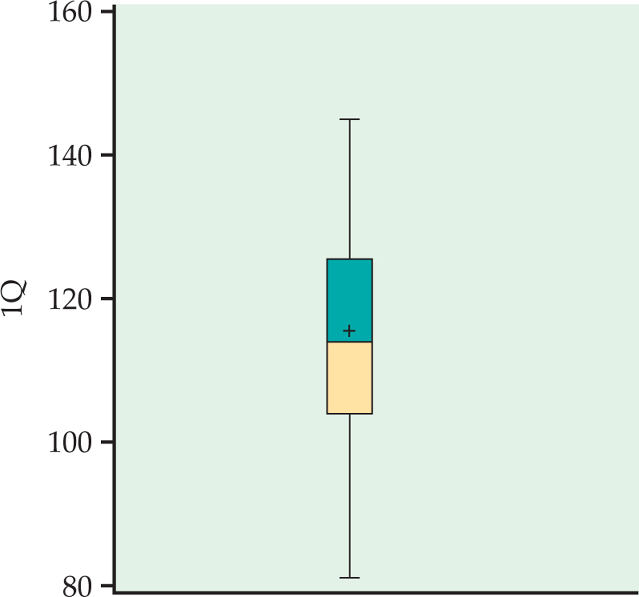
Figure 1.7: FIGURE 1.14 Boxplot for sample of 60 IQ scores, Example 1.28.