The Presentation of Data
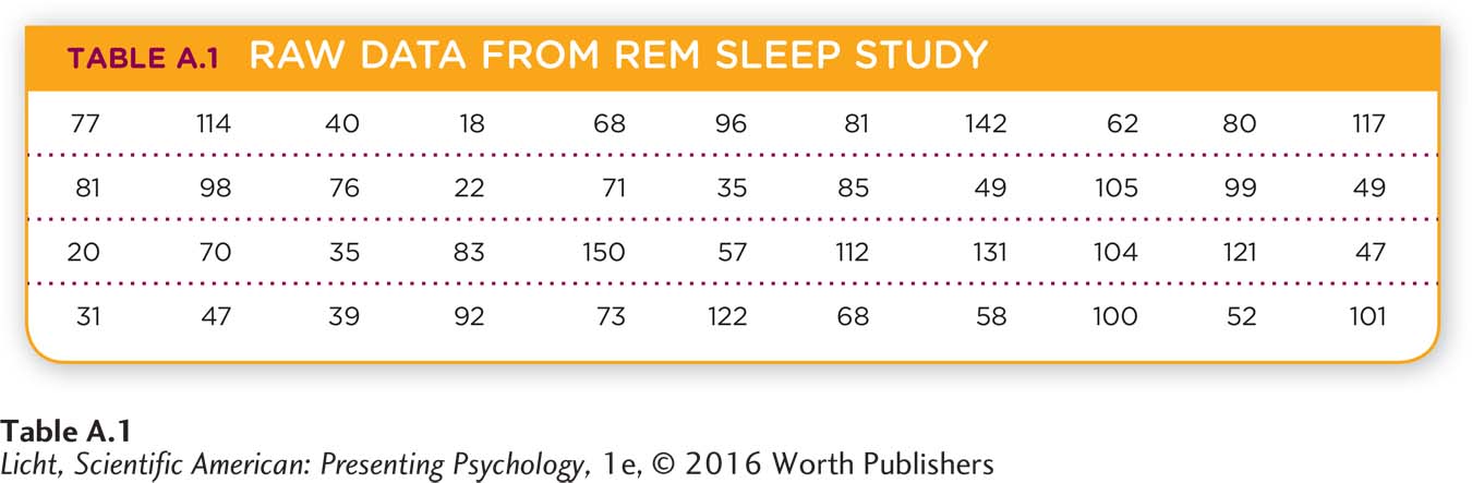
Conducting an experiment is a major accomplishment, but it has little impact if researchers cannot devise an effective way to present their data. If they just display raw data in a table, others will find it difficult to draw any useful conclusions. Imagine you have collected the data presented in Table A.1, which represents the number of minutes of REM sleep (the dependent variable) each of your 44 participants (n = 44; n is the symbol for sample size) had during one night spent in your sleep lab. Looking at this table, you can barely tell what variable is being studied.
Quantitative Data Displays
frequency distribution A simple way to portray data that displays how often various values in a data set are present.
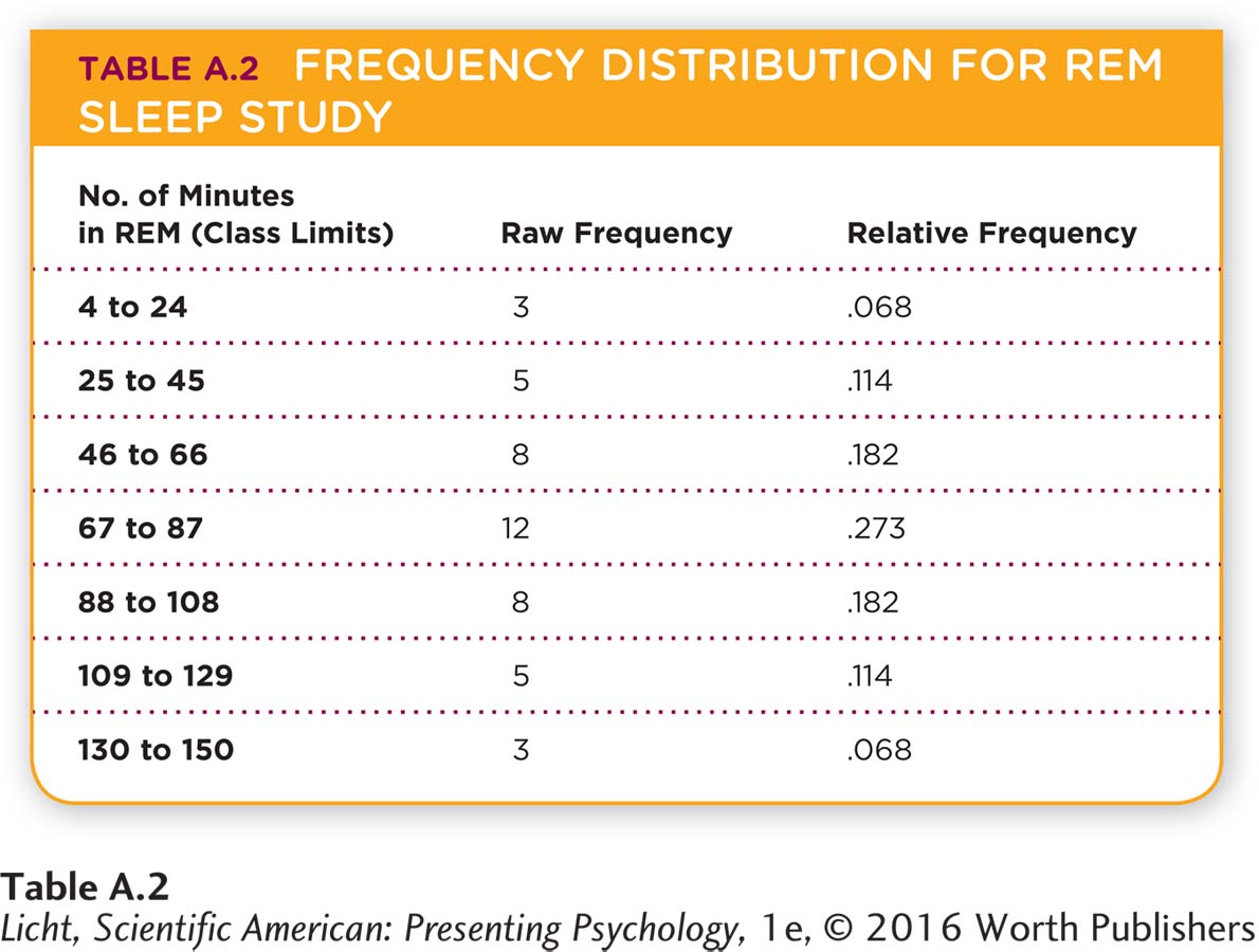
A common and simple way to display data is to use a frequency distribution, which shows how often the various values in a data set are present. In Table A.2, we have displayed the data in seven classes, or groups, of equal width. The frequency for each class is tallied up and appears in the middle column. The first class goes from 4 to 24 minutes, and in our sample of 44 participants, only 3 had a total amount of REM in this class (18, 20, 22 minutes). The greatest number of participants experienced between 67 and 87 minutes of REM sleep. By looking at the frequency for each class, you begin to see patterns. In this case, the greatest number of participants had REM sleep within the middle of the distribution, and fewer appear on the ends. We will come back to this pattern shortly.
histogram Displays classes of a variable on the x-
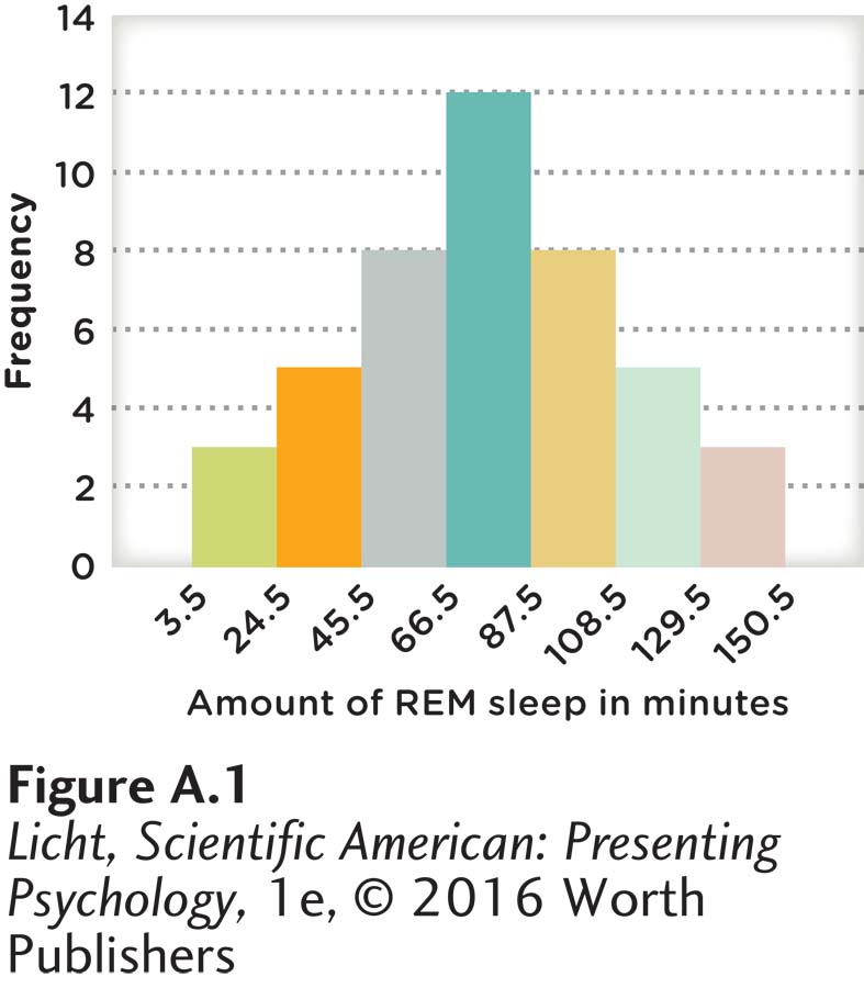
Frequency distributions can also be presented with a histogram, which displays the classes of a variable on the x-
frequency polygon A type of graphic display that uses lines to represent the frequency of data values.
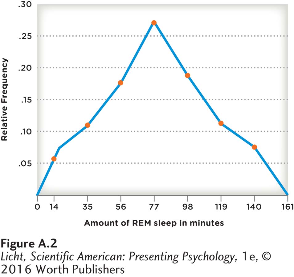
Similar to a histogram is a frequency polygon, which uses lines instead of bars to represent the frequency of the data values. The same data displayed in the histogram (Figure A.1) appear in the frequency polygon in Figure A.2. We see the same general shape in the frequency polygon, but instead of raw frequency we have used the relative frequency to represent the proportion of participants in each of the classes (see Table A.2, right column). Thus, rather than saying 12 participants had 67 to 87 minutes of REM sleep, we can state that the proportion of participants in this class was approximately .27, or 27%. Relative frequencies are especially useful when comparing data sets with different sample sizes. Imagine we wanted to compare two different studies examining REM sleep: one with a sample size of 500, and the other with a sample size of 44. The larger sample might have a greater number of participants in the 67-
stem-
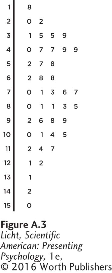
Another common way to display quantitative data is through a stem-
Distribution Shapes
distribution shape How the frequencies of the values are shaped along the x-
Once the data have been displayed on a graph, researchers look very closely at the -distribution shape, which is just what it sounds like—
skewed distribution Nonsymmetrical frequency distribution.
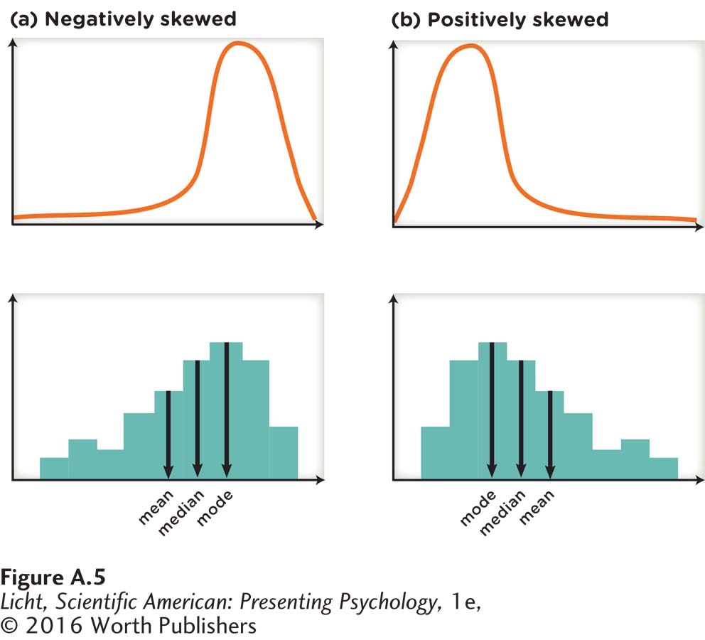
negatively skewed A nonsymmetric distribution with a longer tail to the left side of the distribution; left-
positively skewed A nonsymmetric distribution with a longer tail to the right side of the distribution; right-
Some data will have a skewed distribution, which is not symmetrical. As you can see in Figure A.5a, a negatively skewed or left-
Qualitative Data Displays
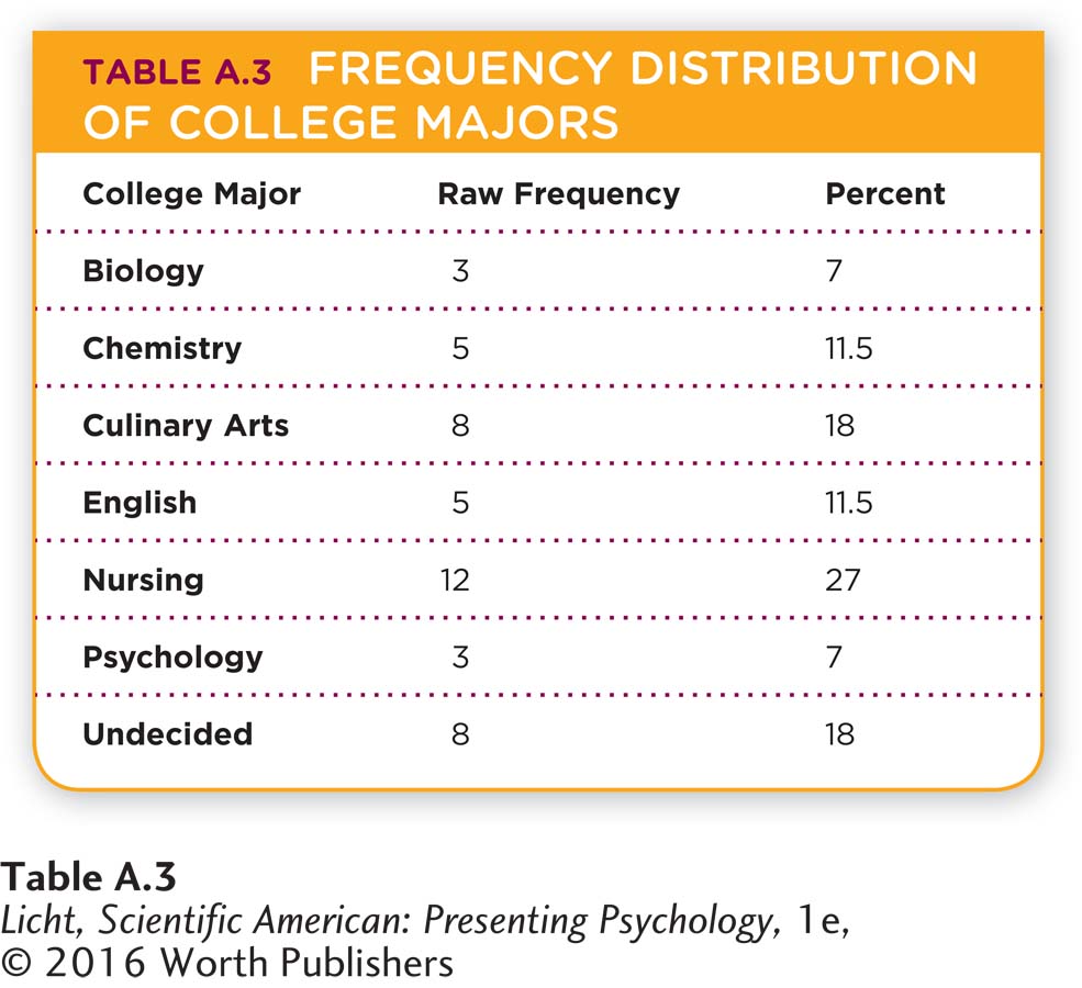
Thus far, we have discussed several ways to represent quantitative data. With qualitative data, a frequency distribution lists the various categories and the number of members in each. For example, if we wanted to display the college major data on 44 students interviewed at the library, we could use a frequency distribution (Table A.3).
bar graph Displays qualitative data with categories of interest on the x-
Another common way to display qualitative data is through a bar graph, which displays the categories of interest on the x-
pie chart Displays qualitative data with categories of interest represented by slices of the pie.
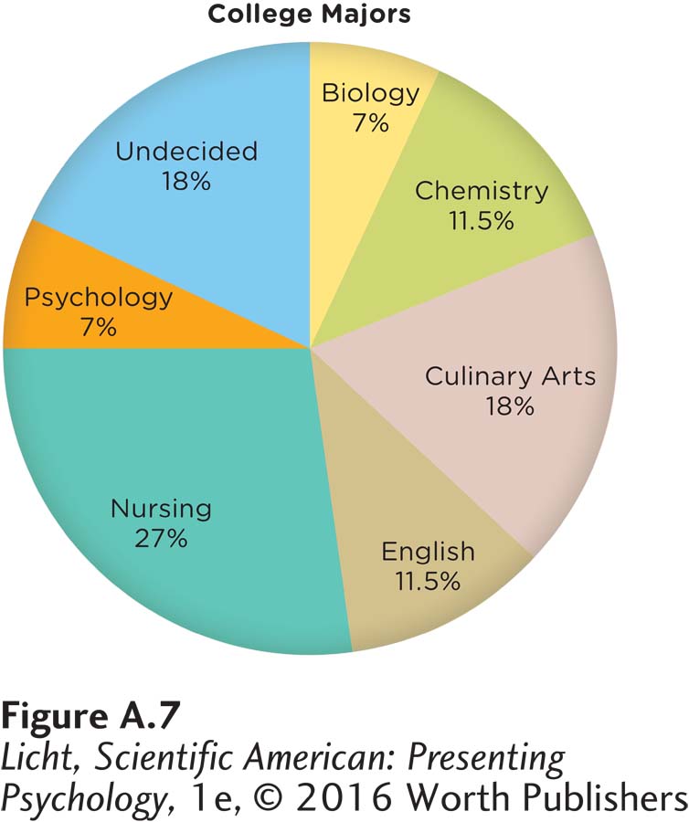
Pie charts can also be used to display qualitative data, with pie slices representing the proportion of the data set belonging to each category (Figure A.7). As you can see, the biggest percentage is nursing (27%), followed by culinary arts (18%), and undecided (18%). The smallest percentage is shared by biology and psychology (both 7%). Often researchers use pie charts to easily display data for which it is important to know the relative proportion of each category (for example, a psychology department trying to gain support for funding its courses might want to be able to display the relative number of psychologists in particular subfields; see Figure 1.1, page 4).
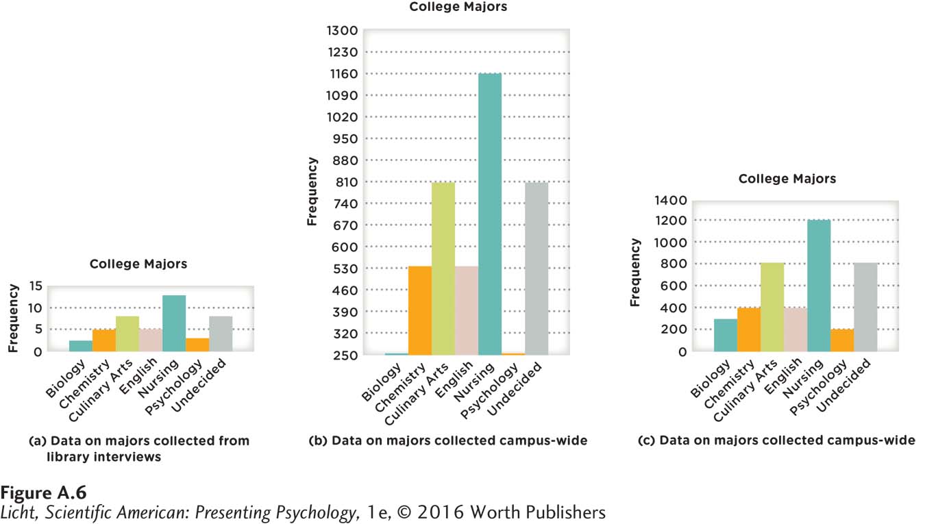
With any type of data display, one must be on the lookout for misleading portrayals. In Figure A.6a, we display data for the 44 students interviewed in the library. Notice that, while Figures A.6b and A.6c look different, they display the same data for the same campus of 4,400 students. Quickly look at (b) and (c) of the figure and decide, if you were head of the psychology department, which bar chart you would use to demonstrate the popularity of the psychology major. In (b), the size of the department (as measured by number of students) looks fairly small compared to that of other departments, particularly the nursing program. But notice that the scale on the y-axis starts at 250 in (b), whereas it begins at 0 in (c). In this third bar chart, it appears that the student count for the psychology program is not far behind that for other programs like chemistry and English, for example. An important aspect of critical thinking is being able to evaluate the source of evidence, something one must consider when reading graphs and charts. (For example, does the author of the bar chart in Figure A.6b have a particular agenda to reduce funding for the psychology and biology departments?) It is important to recognize that manipulating the presentation of data can lead to faulty interpretations (the data on the 4,400 students are valid, but the way they are presented is not).