7.1 
How Does the Scale of the Data Affect the Map (and Vice Versa)?
geographic scale the real-world size or extent of an area
map scale a metric used to determine the relationship between measurements made on a map and their real-world equivalents
RF representative fraction—a value indicating how many units of measurement in the real world are equivalent to how many of the same units of measurement on a map
large-scale map a map with a higher value for its representative fraction. Such maps will usually show a small amount of geographic area
small-scale map a map with a lower value for its representative fraction. Such maps will usually show a large amount of geographic area
A basic map item should be information about the scale of the map—and there are a couple of different ways of thinking about scale. First, there’s the geographic scale of something—things that take up a large area on the ground (or have large boundaries) would be considered large in terms of geographic scale. Study of a global phenomenon occurs on a much larger geographic scale than study of something that exists at a city level, which would be a much smaller geographic scale. Something different is map scale, a value representing that x number of units of measurement on the map equals y number of units in the real world. This relationship between the real world and the map can be expressed as a representative fraction (RF). An example of an RF would be a map scale of 1:24000—a measure of one unit on the map would be equal to 24,000 units in the real world. For instance, measuring one inch on the map would be the same as 24,000 inches in the real world, or one foot on the map is equal to 24,000 feet in the real world (and so on).
200
Maps are considered large-scale maps or small-scale maps depending on that representative fraction. Large-scale maps show a smaller geographic area and have a larger RF value. For instance, a 1:4000-scale map is considered a large-scale map—due to the larger scale, it shows a smaller area. The largest-scale map you can make is 1:1—where one inch on the map is equal to one inch of measurement in the real world (that is, the map will be the same size as the ground you’re actually mapping—a map of a classroom will be the same size as the classroom itself). Conversely, a small-scale map has a smaller RF value (such as 1:250,000) and shows a much larger geographic area.
For instance, on a very small-scale map (such as one that shows the entire United States), cities will be represented by points, and likely only major cities will be shown. On a slightly larger-scale map (one that shows all of the state of New York), more cities are likely to be shown as points, along with other major features (additional roads can be shown as lines, for example). On a larger-scale map (one that shows only Manhattan), the map scale allows for more detail to be shown—points will now show the locations of important features and many more roads will be shown with lines. On an even larger-scale map (one that shows only a section of lower Manhattan) buildings may now be shown as polygon shapes (to show the outline or footprint of the buildings) instead of points, and additional smaller roads may also be shown with lines.
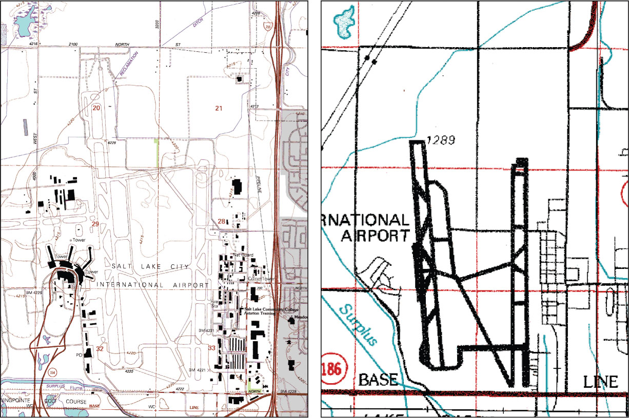
The choice of scale will influence how much information the map will be able to convey and what symbols and features can be used in creating the map in GIS. Figure 7.1 shows a comparison between how a feature (in this case, Salt Lake City International Airport) is represented on large-scale and small-scale maps. The actual sizes of the maps greatly vary, but you can see that more detail and definition of features is available on the larger-scale map than on the smaller-scale one (also see Hands-on Application 7.1: Powers of 10 – A Demonstration of Scale for a cool example of visualizing different scales).
cartographic generalization the simplification of representing items on a map
The same holds true for mapping of data—for instance, the smaller-scale map of the whole state of New York could not possibly show point locations of all of the buildings in Manhattan. However, as the map scale grows larger, different types of information can be conveyed. For instance, in Figure 7.1, the large-scale map can convey much more detail concerning the dimensions of the airport runways, while the smaller-scale map has to represent the airport as a set of simplified lines. This kind of cartographic generalization (or the simplification of representing items on a map) is going to affect the kind of GIS data you’re able to derive from it. For instance, if you digitize the lines of the airport runways, you’ll end up with two very different datasets (one more detailed, one very generalized).
201
This relationship between the scale of a map and data that can be derived from a map can be a critical issue when you’re dealing with geospatial data. For instance, say you’re using GIS for mapping a university campus. At this small geographic scale, you’re going to require detailed information that fits your scale of analysis. If the hydrologic and transportation data you’re working with is derived from 1:250,000-scale maps, it’s likely going to be way too coarse to use. Data generated from smaller-scale maps is probably going to be incompatible with the small geographic scale you’re working at. For instance, digitized features on a small-scale map (like a 1:250,000 scale) are going to be much more generalized than data derived from larger-scale maps (like a 1:24,000 scale), or from sources such as aerial photos taken at a larger scale (for example, 1:6000). See Chapter 9 for more information on using aerial photos for analysis.
202
 HANDS-ON APPLICATION 7.1
Powers of 10 — A Demonstration of Scale
Though it’s not a map, an excellent demonstration of scale and how new items appear as the scale changes is available at http://micro.magnet.fsu.edu/primer/java/scienceopticsu/powersof10.
This Website (which requires Java on a computer for it to run properly) shows a view of Earth starting from 10 million light years away. Then the scale changes to a view of 1 million light years away, and then 100,000 light years away (a factor of ten each time). The scale continues changing until it reaches Earth—and then continues all the way down to sub-atomic particles. Let it play through, and then use the manual controls to step through the different scales for a better view of the process.
Expansion Questions:

Question
Examine the video at the following scales: 1000km, 100km, 10km, 1km, and 100m. The imagery at each of these scales could be used as a basemap for digitizing GIS data—what kinds of features and phenomena would be most appropriate to map at each scale?
-
Question
Using the same five scales as the previous question, what kinds of features and phenomena would be the least appropriate to map at each scale?