7.2 
What Are Some Design Elements Included in Maps?
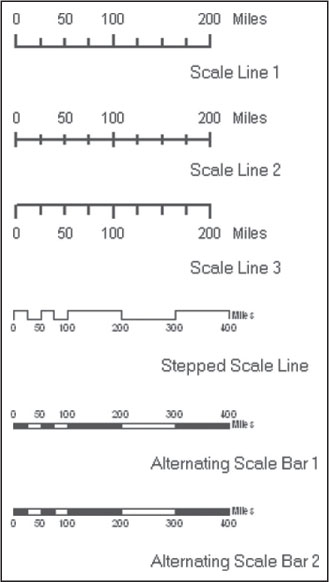
scale bar a graphical device used on a map to represent map scale
There are several elements that should show up on a good map. For instance, someone reading a map should be able to quickly figure out what scale the map is. A map element might simply be text of the RF (such as 1:24,000, 1:100,000, or whatever the map scale might be). A scale bar is a graphical representation of equivalent distances shown on a map (Figure 7.2). The scale bar provides a means of measuring the map scale itself, except that a measurement of x distance on the scale bar is equal to y units of distance in the real world.
203
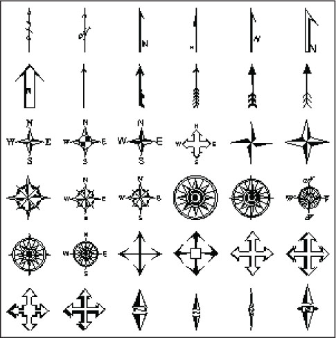
north arrow a graphical device on a map used to show the orientation of the map
A second map element is a north arrow, a graphical device used to orient the direction of the map. However the map is oriented, the north arrow is used to point in the direction that is due north. A north arrow may sometimes be drawn as a compass rose, which shows all cardinal directions on the map. North arrows can be as simple as an arrow with the letter “n” attached, or as complex as a work of art. See Figure 7.3 for examples of north arrows used in map design.
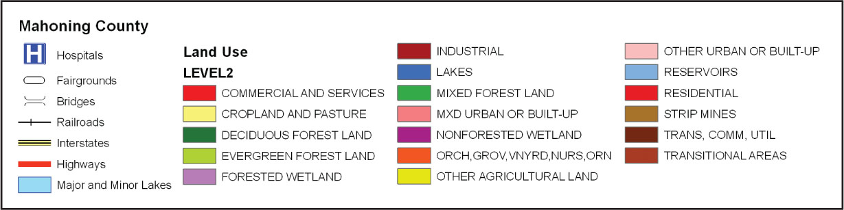
legend a graphical device used on a map that explains what the various map symbols and color represent
Another item is the map’s legend—a guide to what the various colors and symbols on the map represent. A good legend should be a key to the symbology of the map (see Figure 7.4 for an example of a map legend). Since the legend is the part of the map where you can explain things to the map’s reader, you may want to call it something other than “legend.” Instead, consider calling the legend something more useful like “park trail guide” or “county population change.”
type the lettering used on a map
label text placed on a map to identify features
The choice of type used on the map is also important, as it’s used for such things as the title, the date of the map’s creation, the name of the map’s creator, the origin of the data sources used to make the map, and the lettering attached to the map’s features. GIS programs will usually allow you to label map features (adding things like the names of rivers, roads, or cities to the map) using an automatic placement tool or allowing you interactively to select, move, and place map labels.
204
fonts various styles of lettering used on maps
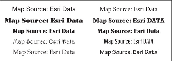
When you’re selecting the type to use for particular map elements, a variety of different fonts (or lettering styles) are available. GIS programs (like word-processing programs such as Microsoft Word) will often have a large number of fonts to select from—everything from common fonts (like “Arial” or “Times New Roman”) to much flashier fonts (such as “Mistral” or “Papyrus”). See Figure 7.5 for some examples of different versions of type fonts available from Esri. Often, a map will contain only two different fonts, carefully selected to fit well with each other without clashing. Using too many fonts, or crafting a map’s type out of several of the more elaborate fonts, is likely to make a map difficult to read and reduce its usefulness. See Hands-on Application 7.2: TypeBrewer Online for a tool you can use as an aid in selecting appropriate type for a map.
 HANDS-ON APPLICATION 7.2
TypeBrewer Online
TypeBrewer is a very neat (and free) online utility that allows you to examine different font styles and combinations used on maps. With TypeBrewer, you can interactively change font size, density, or appearance. Open your Web browser and go to http://www.typebrewer.org to get started (you’ll need to have Adobe Flash Player installed on your computer for it to work properly). With TypeBrewer, you can select from several different pre-set styles of type on a map, then alter aspects of the type (such as its size, density, and tracking) to see the effects of those changes on the map. The aim of TypeBrewer is to examine different forms of map type so you can apply them to your own maps. Try looking at several different formats of the type, then decide on what the most appropriate ones would be and why.
Expansion Questions:

Question
Examine the three options for the Formal, Informal, Classic, and Contemporary mapping templates. What are the fonts being used for each of them?
-
Question
Adjust the size, density, and tracking of the fonts being used for the 12 different options. How does the presentation of the map change when you adjust these to different settings? What does it mean for map appearance to change size, or to change density, or to change tracking?
205
layout the assemblage and placement of various map elements used in constructing a map
map template a pre-made arrangement of items in a map layout
In GIS, a map is put together by assembling all of the elements together in a layout. A good way to think of a layout is as a digital version of a blank piece of paper on which you’ll arrange the various map elements together in a cartographic design to create a version of what will ultimately be your map. Sometimes, the software (such as ArcGIS) will include several map templates, which provide pre-created designs for your use. Using a template will take your GIS data and place things like the title, legend, and north arrow at pre-determined locations and sizes on the layout. Templates are useful for creating a quick printable map layout, but GIS will also allow you to design a map the way you want it with regard to size, type, and placement of elements.
When you’re designing a layout, it’s important to not simply slap a bunch of elements on the map and decide that the map’s ready. Balancing the placement of items is important, partly so as not to overload the map with too much information, but also to provide a useful, readable map. Good map balance provides a means of filling in the “empty” spaces on the map, so it doesn’t have all its information crammed into the top or bottom and leave other parts of the map blank. Items should be of uniform size (instead of, say, making the north arrow gigantic just to fill in some empty space) and placed in proportion to one another (see Figure 7.6 for an example of trying to balance out the placement, size, and proportion of items in a map layout with a template).