7.3 
How Is Data Displayed on a GIS Map?
reference map a map that serves to show the location of features, rather than thematic information
There are several different types of maps that can be made using GIS tools. The purpose of a reference map (like you’d see in an atlas or a road map) is to give location information and to highlight different features. A map of park trails, a Manhattan restaurant guide map, a map of the casinos on the Las Vegas Strip, or a zoning map of your neighborhood are all examples of reference maps. Topographic maps (that also show landforms) are another example of reference maps (and we’ll deal with them in Chapter 13).
206
 HANDS-ON APPLICATION 7.3
Presidential Election Thematic Maps
The results of a U.S. Presidential election by state can be presented as a thematic map. A state would either be colored red if its electoral college votes favored the Republican candidate or blue if they favored the Democrat candidate. Presidential election thematic maps can be seen online here: http://www.votenight.com. For the 2012 Presidential election between Barack Obama and Mitt Romney, you can click on a state to mark its status as red, blue, or grey (undecided). From the U.S. Presidential election history pull-down menu, you can examine thematic maps of past Presidential elections going back to 1932. Check out the various thematic maps (and voter distributions) over the last 80 years of elections.
Expansion Questions:

Question
Which Presidential elections have shown the greatest difference between the numbers of electoral college votes received by each candidate?
-
Question
Under the electoral college system, the candidate with the greatest number of electoral votes is the winner, not the candidate who wins the greatest number of states. Turn on the option to display the number of electoral votes per state and re-examine the Presidential election thematic maps over the years. Which elections saw the winning candidate take a smaller number of states but a larger number of electoral votes?
-
Question
From a mapping context, would it be more informative to map Presidential election results as red states and blue states, or should the states be mapped according to their electoral vote count?
thematic map a map that displays a particular theme or feature
graduated symbols the use of different sized symbology to convey thematic information on a map
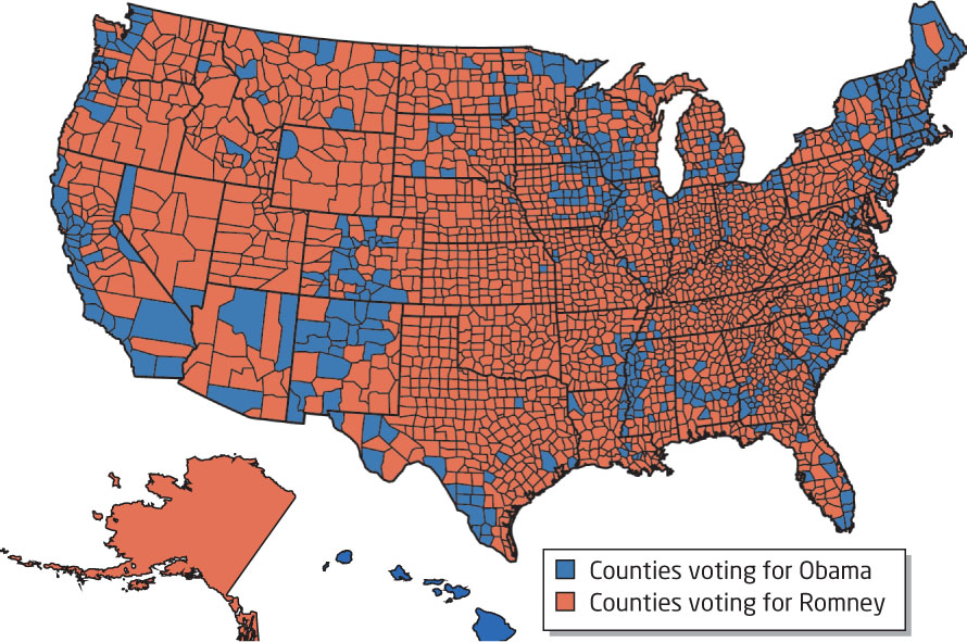
Another main type of map is the thematic map, which is geared toward conveying one particular theme to the reader. Thematic maps can be used to show things such as the state-by-state increase in U.S. population, over a particular period, or Presidential election results county by county (see Hands-on Application 7.3: Presidential Election Thematic Maps for examples of types of thematic maps online). In GIS, a layer’s attributes are used for displaying information on the map. For instance, to create a map of the 2012 U.S. Presidential election results by county, each polygon representing that county will have an attribute designating whether Barack Obama or Mitt Romney had a higher number of votes in that county (colored red for counties won by Romney and blue for counties won by Obama). This attribute will then be the data being displayed on the map (Figure 7.7). Other thematic maps may use graduated symbols for display. In this case, points (or other symbols) of differing sizes are plotted to represent the thematic factors.
choropleth map a type of thematic map in which data is displayed according to one of several different classifications
data classification various methods used for grouping together (and displaying) values on a choropleth map
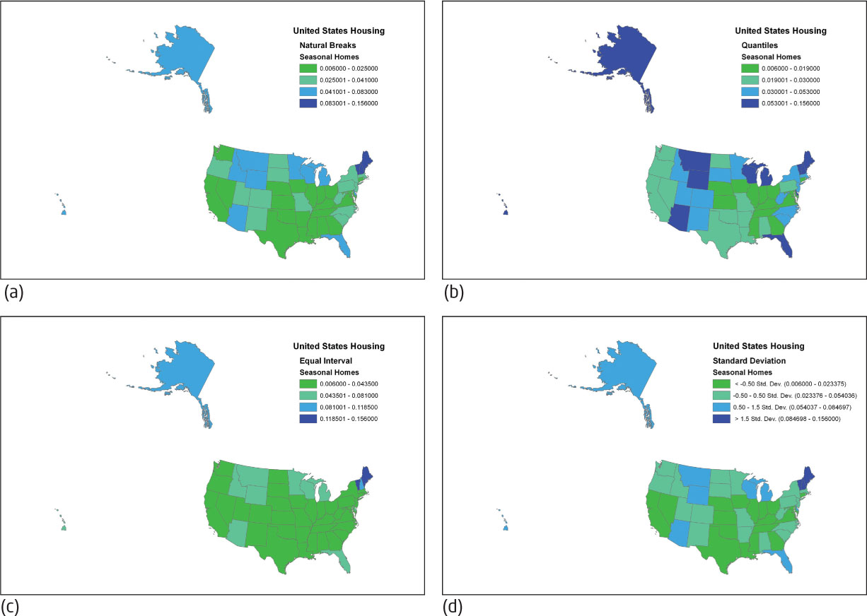
Of course, many thematic maps don’t rely on a simple two-choice attribute like the election map (in which each county will be marked Obama or Romney—or else contain no data). Attributes such as the percentage of colleges and universities per state that are using this textbook in a class (or some other values) are mapped using a type of thematic map called a choropleth map. In order to best display this information on a map, the data will have to be classified or divided into a few categories. GIS gives several options for data classification of multiple values—each method classifies data differently, and can thus result in some very different results being displayed on the maps. (See Figure 7.8 for four different maps of the percentage of the total number of houses per state that are considered seasonal homes or vacation homes by census, each created using a different data classification technique.) Note that each map has the data broken into the same number of classes (four) for comparison purposes. Also keep in mind that choropleth maps already have the boundaries of their polygons set in place (elements such as the states’ boundaries being already defined) and the attributes being mapped do not define these boundaries. For instance, the states’ boundaries are already delineated and the choropleth map is showing a classification of a value of seasonal home percentages utilizing all of these pre-determined boundaries.
207
natural breaks a data classification method that selects class break levels by searching for spaces in the data values
The first of these data classification methods is called natural breaks (also referred to as the Jenks optimization). Like the name implies, this method takes all of the values being mapped and looks at how they’re grouped together. The spaces in between the data values are used to make different classes (or ranges of data) that are displayed. This is shown in Figure 7.8 a—states with the lowest percentages of seasonal homes values (such as Nebraska, Oklahoma, and Texas) end up in one class, and states with the highest percentages of seasonal homes (such as Maine, Vermont, and New Hampshire) end up together in another class.
208
quantile a data classification method that attempts to place an equal number of data values in each class
The map in Figure 7.8b shows the results of using the quantile method of data classification. This method takes the total number of data values to be mapped and splits them up into a number of classes. It tries to distribute values so that each range has a similar number of values in it. For instance, with 50 states being mapped (plus the District of Columbia as a 51st area), each of the four ranges will have about 13 counties’ worth of data being shown in each class. Since the break points between the ranges are based on the total number of items being mapped (that is, the number of states ending up in each range), rather than the actual data values being mapped, the Quantile method causes a relatively even distribution of values on the map.
equal interval a data classification method that selects class break levels by taking the total span of values (from highest to lowest) and dividing by the number of desired classes
The third method (shown in the map in Figure 7.8c) uses equal intervals for data classification. It works like it sounds—it creates a number of equally sized ranges and then splits the data values among these ranges. The size of each range is based on the total span of values to be mapped. For instance, in the seasonal home map, the data is divided into four classes, and the range of values goes from the state with the lowest seasonal home percentage (0.6% of the total housing stock in Illinois) to the state with the highest seasonal home percentage (15.6% in Maine). Equal Interval takes the complete span of data values (there is 15% separating the lowest and highest values) and divides it by the number of classes (in this case, four), and that value (in this case, 3.75%) is used to compute the breaking point between classes. So the first class represents states that have a seasonal home value of 3.75% more than at lowest end (for instance, the first class would have values between 0.6% and 4.35%). Note that this method simply classifies data based on the range of all values (including the highest and lowest) but does not take into account clusters of data or how the data is distributed. As such, only a few states end up in the upper class because their percentages of seasonal homes were greater than three-fourths of the total span of values.
209
standard deviation a data classification method that computes class break values by using the mean of the data values and the average distance a value is away from the mean
The final method uses the concept of standard deviation, (see Figure 7.8d). A standard deviation is the average distance that a single data value is away from the mean (the average) of all data values. The breakpoints for each range are based on these statistical values. For instance, the GIS would calculate the average of all United States seasonal home values (3.9%) and the standard deviation for them (3.1%). So when it comes to the percentage of the total housing stock that is seasonal, each state’s percentage is an average of 3.1% away from the average state’s percentage. These values for the mean and standard deviation of the values are used to set up the breakpoints. For instance, the breakpoint of the first range is of all states whose seasonal home values are less than half a standard deviation value lower than the mean—those states with a seasonal home percentage of less than the mean minus 0.5 times the standard deviation (1.55%), or 2.34%. The fourth range consists of those counties with a value greater than 1.5 times the standard deviation away from the mean. The other ranges are similarly defined by the mean and standard deviation values of the housing data.
As Figure 7.8 shows, the same data can produce choropleth maps that look very different and carry different messages, depending on which method is used to classify the data. For instance, the map in Figure 7.8d (Standard Deviation) shows that most states have roughly an average (or below average) percentage of seasonal homes, while the other maps show various distinctions between the states that are classified as having a higher or lower percentage of seasonal homes. Thus, the same data can result in different maps, depending on the chosen method of classification. When you’re selecting a method, having information about the nature of the data itself (that is, if it is evenly distributed, skewed toward low or high numbers, or all very similar values) will help you to determine the best kind of mapping.
You should keep in mind that while different data classification methods can affect the end result shown on the choropleth map, the type of data values being mapped can also greatly affect the outcome of the choropleth map. An issue involved with choropleth mapping is displaying the values of data that can be counted (for instance, the total population values per state, or the total number of housing sales per county) when the sizes of the areas being mapped are very different. If you’re mapping the number of vacation homes in each state, a very large state like California is probably going to have a larger number of homes (12,214,549 homes in total, with 239,062 of them classified as seasonal, according to the 2000 Census) than a smaller state like Rhode Island (439,837 homes in total with 13,002 of them classified as seasonal). Thus, if you’re making a choropleth map of the number of vacation homes in each state, California will show many more vacation homes than Rhode Island, just because it has a lot more houses (because of its much larger area and population).
210
normalized altering count data values so that they are at the same level of representing the data (such as using them as percentages instead of regular count values)
A better measure to map is the percentage of the total number of houses that are vacation homes—in this way, the big difference in housing counts between California and Rhode Island won’t be a factor in the map. Instead, you’ll be mapping a phenomenon that can be comparably measured between the two states. When you map the percentages of the total housing that are considered vacation homes, California’s seasonal homes only make up about 2% of the total, while Rhode Island’s seasonal homes make up about 3%. To make a choropleth map of count data, the data must first be normalized—that’s to say, it must have all count values brought onto the same level. For instance, dividing the number of seasonal homes by the total number of houses would be a way of normalizing the data. See Hands-on Application 7.4: Interactive Thematic Mapping Online for an online tool that is used for creating thematic maps.
HANDS-ON APPLICATION 7.4
Interactive Thematic Mapping Online
It’s now time to start making your own thematic maps. Open your Web browser and go to http://thematicmapping.org/engine. This is the Website of the Thematic Mapping Engine, which allows you to create numerous kinds of thematic maps of data from a variety of topics. First, select an indicator (start with something simple like Population) and choose a year (say, 2010). Choose Choropleth for the technique and pick a set of colors. For the Classification method, choose Quantiles. Lastly, click on the Preview button to see a thematic map of world population displayed in an interactive Google Earth interface in your Web browser (alternatively, you can select the Download option to actually download the thematic map as a new layer in Google Earth). After the Quantile map is set up, try the same settings, but using the Equal Interval classification method, to check out what kind of map is generated.
Try some of the other indicators (such as CO2 emissions, GDP per capita, Infant mortality rate, or Mobile phone subscribers) over a range of years. These thematic maps can be created using graduated symbols, choropleth maps, or even 3D-style prism maps (we’ll use the Thematic Mapping Engine again in Chapter 14 with these types of maps). You can specify which data classification method to use, and finally display the mapped results, using Google Earth or the online preview.
Expansion Questions:
-
Question
For creating a choropleth map of 2010 world population, which classification method would be more appropriate—quantiles or equal interval—and why?
-
Question
What were the CO2 emissions per capita in the year 2000 in Brazil, China, India, and the United States? What were the CO2 emissions per capita in the year 1980 for the same countries?
-
Question
What was the number of Internet users per 100 persons in the year 2005 in Brazil, China, India, and the United States? What was the number of Internet users per 100 persons in 1999 for the same countries?
211