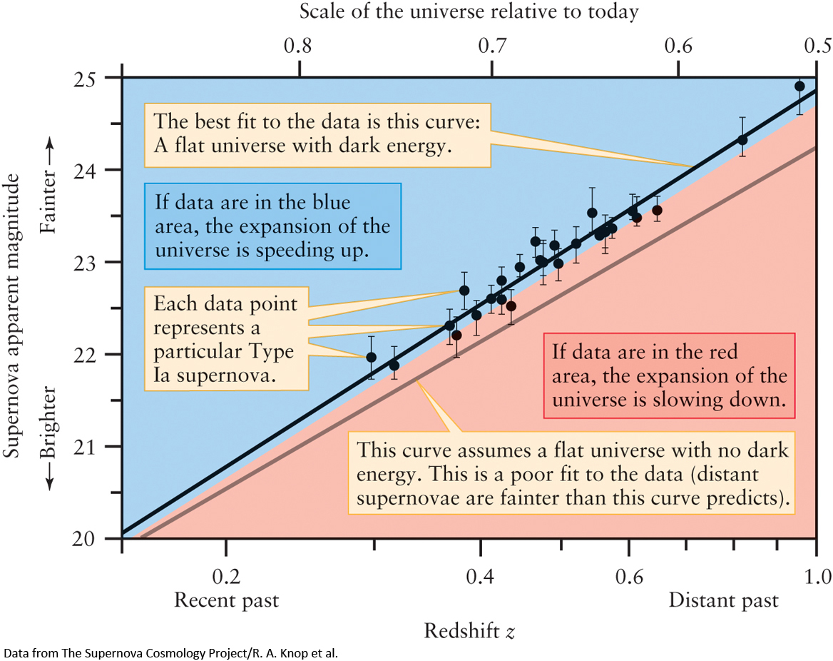
Figure 15-20 The Hubble Diagram for Distant Supernovae This graph shows apparent magnitude versus redshift for supernovae in distant galaxies. The greater the apparent magnitude, the dimmer the supernova and the greater the distance to it and its host galaxy. If the expansion of the universe is speeding up, the data will lie in the blue area; if it is slowing down, the data will lie in the red area. The data show that the expansion is in fact speeding up.