You must read each slide, and complete any questions on the slide, in sequence.
BP: Gulf Oil Collection Increasing?
Synopsis
In April of 2010, a huge explosion occurred on the Deepwater Horizon, an oil drilling unit in the Gulf of Mexico. The result was the largest oil spill in history.
A massive cleanup ensued, led by BP (the owners of the rig) and government agencies.
Click the Next button to start this activity
1.1BP: Gulf Oil Collection Increasing?
BP made numerous press updates about the progress of the cleanup. Go to this link http://bp.concerts.com/gom/kentwells_update24052010.htm and watch the video from 4:12- 5:00. Listen carefully to the explanation.
What was the message from Kent Wells during this segment of the video?
A.
B.
C.
D.
_max_tries:4
What is the title of the graph?
_feedback: While the title is “Cumulative Oil Collected, bbls” (the data is correct) that is not what Wells implies with his verbal description. This is spin.
1.2BP: Gulf Oil Collection Increasing?
A different view of the same data is provided by Stephen Few (http://www.perceptualedge.com/blog/?p=790).
What is the take-home message?
A.
B.
C.
D.
4
This is one example of how data interpretation can lead to false conclusions, and why we need to critically examine data that is presented to us. The focus of this unit is Misleading Data. We will examine some common ways that data may be misrepresented.
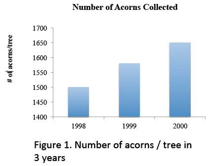
1.3Scaling of Axes
The way in which axes are scaled can dramatically change the appearance of a graph.
What is your conclusion about Figure 1?
A.
B.
C.
_max_tries:3
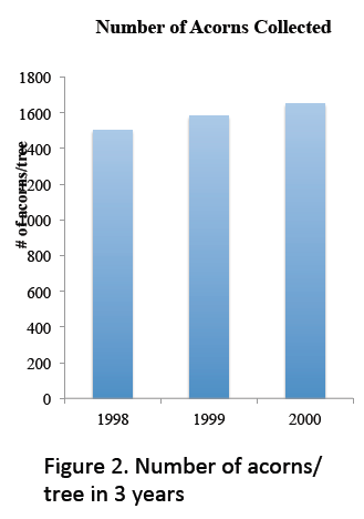
1.4Scaling of Axes
Now, examine Figure 2.
What is your conclusion about acorns per tree per year?
A.
B.
C.
_max_tries:3
1.5Scaling of Axes
The data in Figures 1 and 2 are exactly the same. Why are the figures different?
A.
B.
C.
_max_tries:3
A key to making good bar graphs is to begin both the x and y axis at 0. But people often “adjust” values so that a graph will better reflect the message they are trying to communicate.
1.6Scaling of Axes
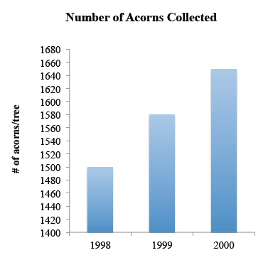
Another way to change the appearance of the data is to alter the scale of either axis. In Figure 3, the same data are presented as are found in Figures 1 and 2, but the units on the y-axis have been decreased.
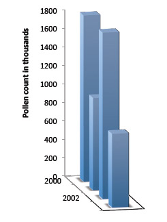
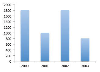
1.7Dimensional Effects
But look at the same data presented in 2-D. Notice that years 2000 and 2002 actually had the same pollen count. Scientific data is usually presented in 2-D for this reason.
Based on this graph, what had the highest pollen count?
A.
B.
C.
D.
_max_tries:4
1.8Bubble and Pie Graphs
Bubble graphs are often used as a quick visual to give someone a sense of changes in magnitude. For example, look at this example of a graphic depicting the size increase in the battery of the new iPad (http://gizmodo.com/5893738/holy-fck-the-new-ipad-has-a-gigantic-70+percent-larger-battery).
The new battery is 70% bigger than the old one, according to the website. But in the graphic, does the new battery represent a 70% increase?
A.
B.
C.
_max_tries:3
1.9Bubble and Pie Graphs
A more accurate representation of the battery size comparison between the old and new iPad batteries.
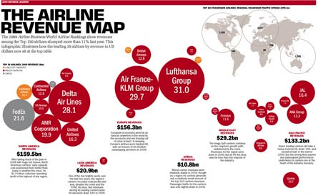
Another Example: The size of the bubbles in the following graphic represent revenue of major airlines. Questions to ask yourself:
Are the bubbles proportionate? Compare British Airways and Air France/KLM.
Is the number of passengers accounted for? If you did this, what would the bubbles for the same revenue look like in China (population 2 billion) vs. Europe (population 50 million)?
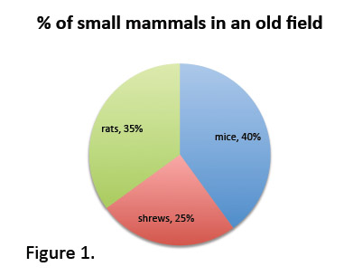
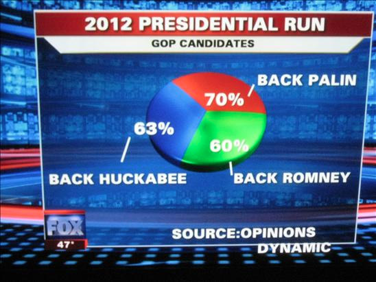
Pie charts, especially those that represent percentages, should add up to 100. Compare the following graphs:
1.12Pie Charts
A real-life example—how did the cartographer come up with these figures?
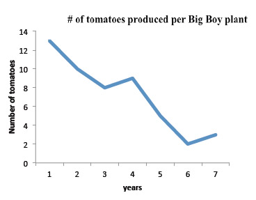
1.13Using Snippets of Long-term Data
Another way that data is often misrepresented is to overemphasize a small piece of a larger data set.
Based on these data, what do you think is happening to tomato production over time?
A.
B.
C.
_max_tries:3
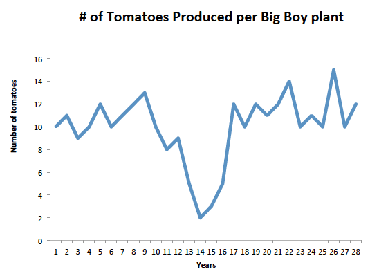
1.14Using Snippets of Long-term Data
The following graph presents the same data, but includes data for all possible years.
Now what do you think about tomato production over time?
A.
B.
C.
_max_tries:3
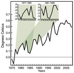
1.15Pie Charts
This type of misrepresentation is common in climate science reporting, as illustrated here. Some authors use examples of decade-long cooling trends as evidence that climate change isn't real, but when you look at all years combined, those patterns do not persist.
Finally, data are often presented with a lack of reference. For example, in a column in Newsweek (April 9, 2010), George Will wrote the following:
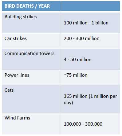
“Wind power involves gargantuan ‘energy sprawl.'" To produce 20 percent of America's power by wind, which the Obama administration dreamily proposes, would require 186,000 tall turbines -- 40 stories tall, their flashing lights can be seen for 20 miles -- covering an area the size of West Virginia. The amount of electricity that would be produced by wind turbines extending the entire 2,178 miles of the Appalachian Trail can be produced by four reactors occupying four square miles of land. And birds beware: the American Bird Conservancy estimates that the existing 25,000 turbines kill between 75,000 and 275,000 birds a year. Imagine the toll that 186,000 turbines would take.”
After reading this, what is your conclusion about Will's opinion about the effects of wind farms and birds?
A.
B.
C.
_max_tries:3
Based on the data in this table, what is the largest source of annual mortality of birds?
A.
B.
C.
D.
E.
_max_tries:4
1.18Analyze Data Carefully
In this tutorial, you've examined examples of misleading data and graphs. These examples include verbal misrepresentation, improper scaling of axes, improper use of 3-D, improper proportional scaling, pie charts than don't add up to 100%, picking out small pieces of data from a larger database, and not providing the viewer with a reference point.
A final caution—data can be represented in many ways and what you see may not be the best way.
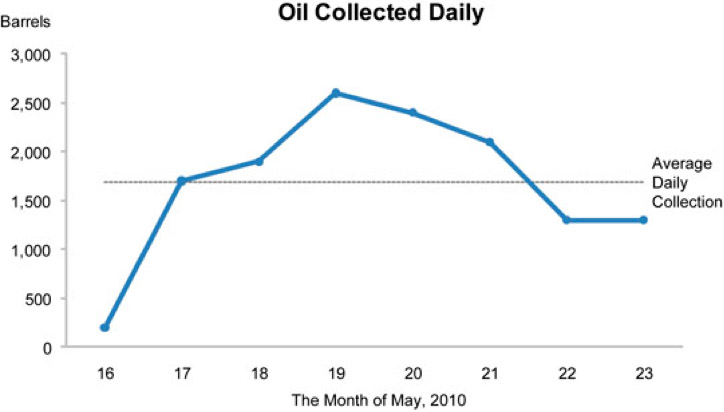
1.19Analyze Data Carefully
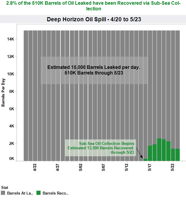
Let's return to the BP oil spill data. BP emphasized how much oil they were recovering on a daily basis, but they did not show a simultaneous representation of what was leaking per day. When you graph these data, you get the following: