Introduction
20
Analyzing Visuals

We live in a highly visual world. Every day we are deluged with a seemingly endless stream of images from television, magazines, billboards, books, Web pages, newspapers, flyers, storefront signs, and more, all of them competing for our attention, and all of them loaded with information and ideas. Forms of communication that traditionally used only the written word (letters, books, term papers) or the spoken word (telephone conversations, lectures) are today increasingly enhanced with visual components (PowerPoint slides, cell-phone graphics, video, photos, illustrations, graphs, and the like) for greater impact. And most of us would agree that visuals do, indeed, have an impact: A picture, as the saying goes, is worth a thousand words.
In part because of their potentially powerful effect on us, visuals and visual texts* should be approached the way we approach written texts: analytically and critically. Whether their purpose is to sell us an idea or a car, to spur us to action or inspire us to dream, visuals invite analysis both of their key components and their rhetorical context. As we “read” a visual, therefore, we should ask ourselves a series of questions: Who created it? Where was it published? What audience is it addressing? What is it trying to get this audience to think and feel about the subject? How does it attempt to achieve this purpose?
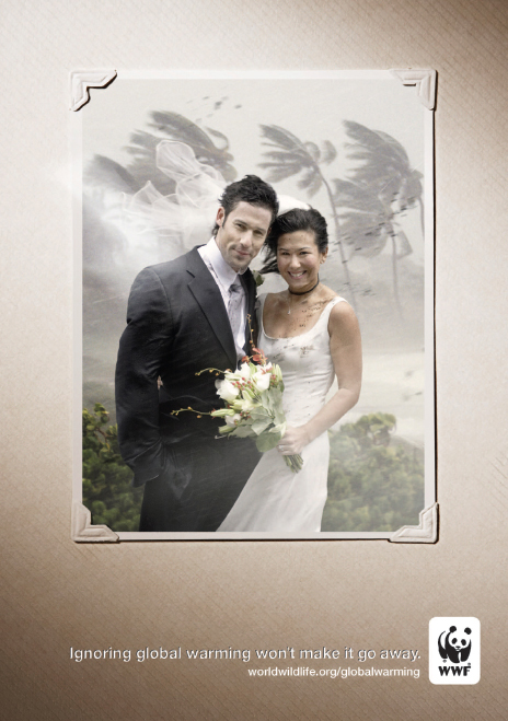
Let’s look, for example, at the visual text on the following page: a public service announcement (PSA) from the World Wildlife Fund (WWF).

The central image in this PSA is a photo of an attractive, smiling young couple. Most of us will immediately recognize the dress, posture, and facial expressions of the young man and woman as those of a newly married couple; the photo-mounting corners make the image seem like a real wedding album photo, as opposed to an ad agency’s creation (which would be easier to ignore). After noting these things, however, we are immediately struck by what is wrong with the picture: a hurricane rages in the background, blowing hair, clothing, and the bride’s veil forcefully to one side showering the bride’s pure white dress with spots (of rain? mud?) and threatening to rip the bridal bouquet from her hand.
So what do we make of the disruption of the convention (the traditional wedding photo) on which the PSA image is based? In trying to decide, most of us will look next to the text below the image: “Ignoring global warming won’t make it go away.” The disjunction between the couple’s blissful expression and the storm raging around them turns out to be the point of the PSA: Like the young couple in the picture, the PSA implies, we are all blithely ignoring the impending disaster that global warming represents. The reputable, nonprofit WWF’s logo and URL, which constitute its “signature,” are meant to be an assurance that this threat is real, and not just an idea a profit-seeking ad agency dreamt up to manipulate us.
People continue to argue about how urgent the problem of climate change is and what, if anything, we need to do about it. The WWF suggests that, like the clueless young couple, too many of us have adopted a “head-in-the-sand” attitude about the problem. Lest the implied criticism be construed as an outright insult and alienate viewers, the implied connection to the couple also flatters us by implying that we are attractive, hopeful, and well intentioned. Global warming, in the WWF’s view, threatens the bright future we all like to imagine we have ahead of us.
Not everyone will be convinced by this PSA to support the work of the WWF, and some viewers may feel manipulated by the visual image. They may disagree that the problem is as dire as the depiction implicitly claims it is. They may feel that our resources and energy would be better directed toward other problems facing the world. Nevertheless, most people would agree that with a single cleverly constructed image, a single line of text, and a logo, the PSA delivers its message clearly and forcefully.