The Impact of Document Design
When we read a well-designed document, part of the meaning we take away from it is attributable to design. When we read a poorly designed document, however, it may be difficult to discern its meaning at all. We can probably all agree that effectively written documents are easy to navigate, and their meanings are accessible to the intended audience. Good design should accordingly make readability easier and make the intended meaning clearer and more vivid.
The ways in which design affects the way we read documents can be illustrated fairly simply. Consider the following familiar phrase, rendered in four different ways:
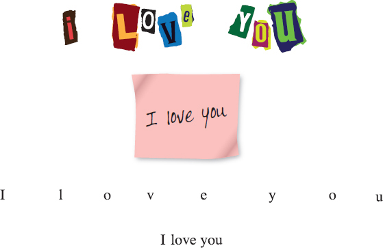
The words in each rendering are the same, but the different uses of fonts, colors, and white space encourage us to read them very differently. The first message is vaguely unsettling (is that a ransom note? a message from a stalker?); the second seems conventionally sweet; the third carries no emotional or context clues, but the spacing makes it irritatingly difficult to read; and the fourth offers no tone or context clues at all (though this in itself might strike us as odd, given the meaning of the words). Thus, design does far more than add visual interest: It actually directs how we read and, to a certain extent, determines the meaning we derive from texts.
The freedom you have in terms of using design elements and visuals in your college writing projects will vary quite a bit, depending on your instructors’ preferences and the nature of the projects. As you write, however, you should always remain aware of the impact document design can have on your reader. And any time you read a document—whether it is a textbook, a blog, or even an ad on the bus—you should stop to think about how that document was designed and how that design affects your reading of it.