Choose readable fonts.
Typography is a design term for the letters and symbols that make up the print on a page or a screen. You are already using important aspects of typography when you use capital letters, italics, boldface, or different sizes of type to signal a new sentence, identify the title of a book, or distinguish a heading from body text.
Word processing programs enable you to use dozens of different fonts, or typefaces; bold and italic versions of these fonts; and a range of font sizes. Fortunately, you can rely on some simple design principles to make good typographic choices for your documents.
Perhaps the most important advice for working with typography is to choose fonts that are easy to read. Some fonts are meant for decorative or otherwise very minimal use, and are hard to read in extended passages. Font style, font size, and combinations of style and size are features that can add to or detract from readability.
Considering Font Style For most academic and business writing, you will probably want to choose a traditional font that is easy to read, such as Arial or Times New Roman. This book is set in Calisto. Sentences and paragraphs printed in fonts that imitate  (typically called script fonts) or those that mimic
  are not only difficult to read but also too informal in appearance for most academic and business purposes.
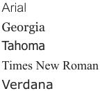
Some Fonts Appropriate for Academic and Business Writing
Considering Font Size To ensure that your documents can be read easily, you also need to choose an appropriate font size (traditionally measured in units called points). For most types of academic writing, a 12-point font is standard for the main (body) text. For Web pages, however, you should consider using a slightly larger font to compensate for the difficulty of reading from a computer monitor. For computer-projected displays, you should use an even larger font size (such as 32-point, and typically no smaller than 18-point) to ensure that the text can be read from a distance.
Combining Font Styles and Sizes Although computers now make hundreds of font styles and sizes available to writers, you should avoid confusing readers with too many different fonts in one document. Limit the fonts in a document to one or two that complement each other well. A common practice, for instance, is to choose one font for all titles and headings (such as Arial, 14-pt, boldface) and another for the body text (such as Times New Roman, 12-pt), as shown in the example here.
This Is an Example Heading
This is body text. This is body text.
This is body text. This is body text.
This is body text. This is body text.
This Is an Example Heading
This is body text. This is body text.
This is body text. This is body text.
This is body text. This is body text.