Keep Your Aids Simple and Clear
Printed Page 424
Consider the following suggestions for making your presentation aids simple and clear:

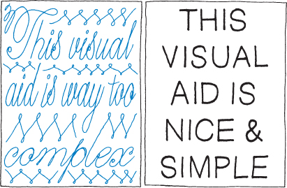
- Keep your aids simple. A presentation aid works best when audience members can simply glance at it or hear it once and quickly grasp what you’re trying to communicate. If they have to stare at it, see it more than once, or listen to it several times, the aid is too complex and detailed.
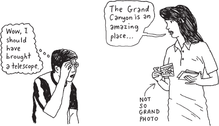
- Test the size of visual aids. Make sure each visual aid is large enough to be seen by everyone in your audience. Remember: the bigger your audience, and the farther they are from you and your visual aid, the larger the aid should be.
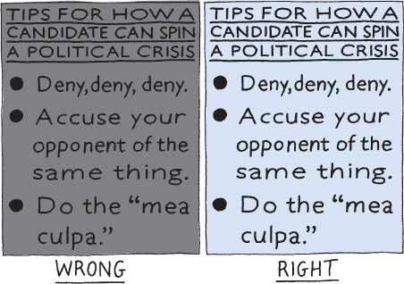
- Create contrast. On visual aids, contrast increases readability. To create contrast, place dark colors against a light background or light colors against a dark background. On a poster, for example, place dark text against a lighter background.
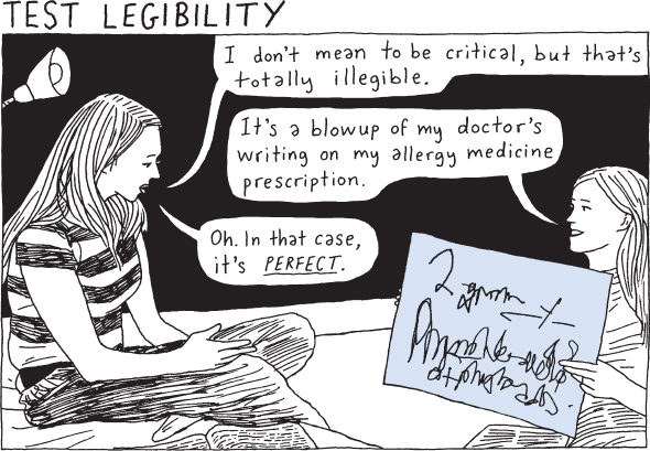
- Test the legibility of visual aids. Be sure to check whether all the numbers, letters, words, sentences, and graphics in your visual aids are legible—that is, easily distinguished at a distance. For instance, ask a classmate, friend, or roommate to view a poster or projected slide from a distance and tell you whether he or she can see everything on it. If not, continue refining your aid—for example, by stepping up font size and adding white space between elements.
- Test the volume and clarity of audio aids. Be certain that your audio aids will be loud enough and clear enough (that is, free of static or other “noise”) for all your listeners to hear.
