Chapter 1. Tutorial: Correlation
Problem Statement
A dataset consists of the composition of 77 breakfast cereals – a portion of the dataset is shown below.
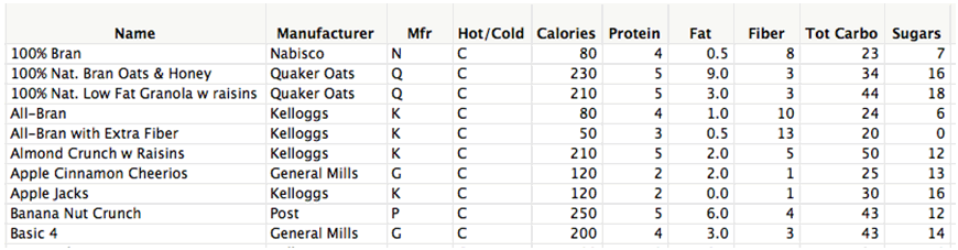
Calories – calories / serving;
Protein, Fat, Fiber, Total Carbohyrates, Sugars – grams/serving.
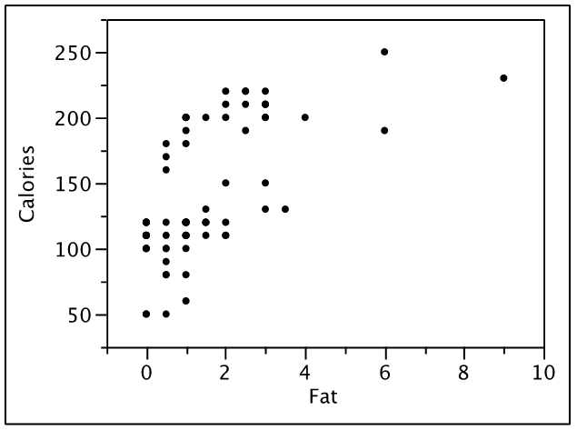
Here is plot of the relationship between the calories/serving and the number of grams of fat.
Step 1
questions
Question 1
Correlation measures the strength of the relationship between two variables.
Step 2
questions
Question 4
In the plot of breakfast cereals above, there appears to be correlation between the calories/serving and the grams of fat/serving.
Step 3
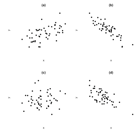
Consider the following plots of the correlation between two variables:
questions
Question 8
The correlation in (a) is about .
Step 4
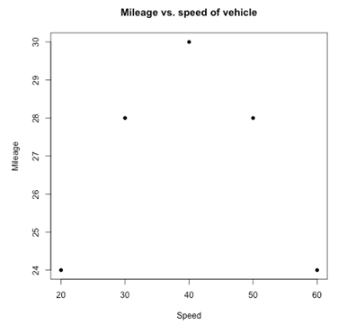
The following is a plot of the mileage of a vehicle (miles/gallon) vs. the average speed (miles/hour).
questions
Question 12
There is between the average speed and mileage obtained.
Step 5
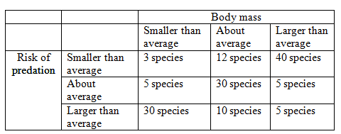
Sometimes it is hard to measure the actual values of variables, but it quite easy to give a qualitative assessment of the size. For example, consider the following table of the number of species classified by the risk of predation and typical body mass.
questions
Question 15
If you could measure the two variables “exactly”, the correlation between them would be about
| A. |
| B. |
| C. |
| D. |