How Hard the Wind Will Hit Your Area, and When, Tom Giratikanon and David Schutz
How Hard the Wind Will Hit Your Area, and When, Tom Giratikanon and David Schutz
Interactive Graphic
When they are designed effectively, graphs, charts, maps, and other visuals can convey numerical information quickly and effectively. Effective visuals help readers understand data and use it to make decisions. You have probably read graphs of data for a science class or created graphs of data to complete an assignment for a science lab class.
Interactive graphics present different views of information based on choices users make. They allow users to focus on the data that they are most interested in. They also provide an efficient way to present a lot of data. Interactive graphics are often created by a team of people: some team members will work on designing an attractive and usable interface, and others will use programming skills to connect the interface to the data.
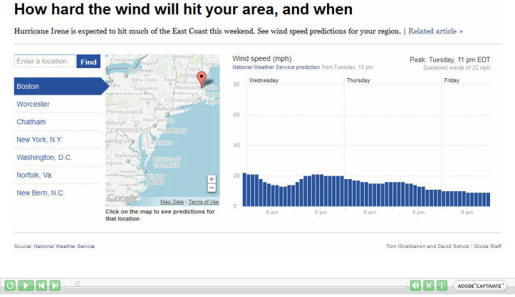
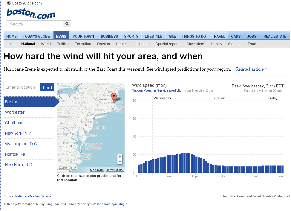
This interactive graphic was created by the Boston Globe newspaper for its Web site when Hurricane Irene hit the East Coast in 2011. The graphic is connected to a database of wind speed predictions provided by the National Weather Service. It allows users to see how high the winds are expected to be where they live, and how wind speeds will change over time. They can then use this information to track a storm and decide whether to stay in their homes or to move to a safer location.
From The Boston Globe, August 26, 2011, © 2011 Boston Globe. All rights reserved. Used by permission and protected by the Copyright Laws of the United States. The printing, copying, redistribution, or retransmission of this Content without express written permission is prohibited.
Explore the interactive graphic and consider the questions below. Then “submit” your response.
Question
1. What is significant about the arrangement of names of cities along the left side of the graphic below? What does this list of cities do?
Question
2. The range of wind speeds on the y-axis of the graph below goes from 0 to 80 miles per hour. What is significant about this range? Why not stop around 40 or go up past 100? Consider the specific purpose of this graphic when responding.
Question
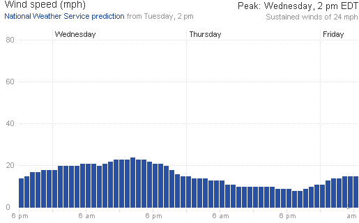
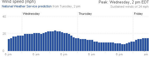
3. Below is an example showing how the graph would look if the y-axis showed maximum wind speeds of only 40 miles per hour rather than 80. How would this change affect the reader’s interpretation of the data?
Question
4. The creators of this graph chose to use few gridlines on either axis and few tick marks on the x-axis to show times. How helpful are these choices? How effective are the results?
Question
5. Why do you think the creators of this graph chose to make an interactive graphic rather than one or more static graphs? What are the advantages of interactivity in this case?
Question
6. What additional data or features could be added to the graphic to make it more helpful for use with other storms or hurricanes?