Global Forest Change, Hansen, Potapov, Moore, Hancher et al.
Global Forest Change, Hansen, Potapov, Moore, Hancher et al.
Informational Report Presented through an Interactive Graphic
When reporting information to a broad audience or to multiple audiences, you may determine that different readers are primarily interested in different sections of your document. Chapter 5 recommends writing modular reports, or reports broken into various components addressed to different readers, in such situations. If you are working with information that can be presented visually, you might also consider creating an interactive graphic that allows users to navigate to the specific information they seek.
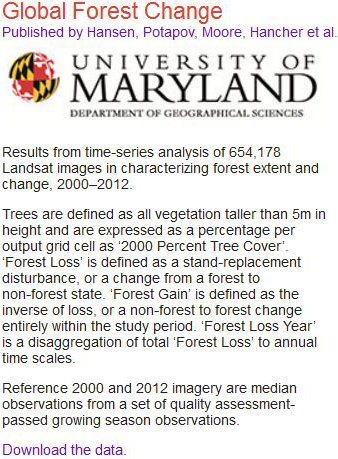
This interactive map, developed by researchers from the University of Maryland, Google, and the U.S. government, uses satellite data to illustrate changes in forest size over time and across the globe. The map is updated annually, and the data it draws on account for any and all possible causes of change in forest cover, from human-made disturbances such as logging to natural activity such as storms. The creators of the map wanted to provide a tool that would allow anyone anywhere to access data about forest change in the local region and in the world—data that were previously unavailable in many locations. This map collects global data in a single repository but gives users control over the nature and scope of what they view.
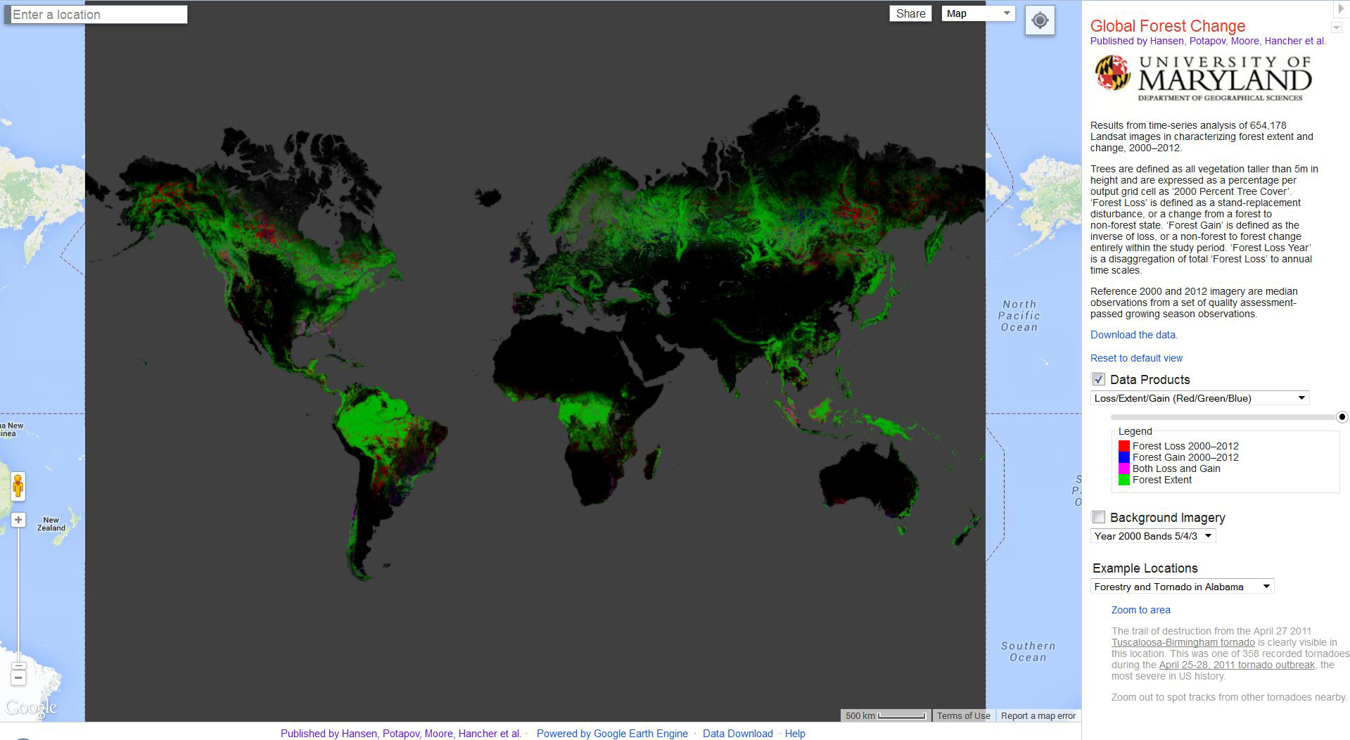
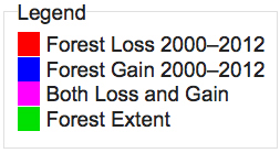
Watch the brief video demonstration below. You will see that the map’s home screen presents a global view of forest change. Forest loss, gain, and extent are represented by various colors explained in the map’s legend. From the home screen, users can navigate to specific locations for more detailed views of forest change in specific geographic areas. A dropdown menu in the panel to the right of the map allows users to view locations in which significant changes have recently occurred, such as the Tuscaloosa-Birmingham region of Alabama, where forests were devastated by a tornado in 2011. Users can also go directly to the search box in the upper left-hand corner of the map to view data for any location they wish.
Hansen/UMD/Google/USGS/NASA. Hansen, M. C., P. V. Potapov, R. Moore, M. Hancher, S. A. Turubanova, A. Tyukavina, D. Thau, S. V. Stehman, S. J. Goetz, T. R. Loveland, A. Kommareddy, A. Egorov, L. Chini, C. O. Justice, and J. R. G. Townshend. 2013. “High-Resolution Global Maps of 21st-Century Forest Cover Change.” Science 342 (15 November): 850–53. Data available on-line from: http://earthenginepartners.appspot.com/science-2013-global-forest.
Now that you’ve watched the video, answer the questions that follow.
[insertsized-down DAA 9.3.jpg above question #1]
Question
1. The map on the home screen is accompanied by the text shown at left. Click the thumbnail to read the text. You’ll notice that the passage includes terminology with which a general audience is likely to be unfamiliar. Rewrite the passage so that is more suitable for a nonscientific audience, ensuring that it serves as a helpful introduction to the tool for anyone who might encounter it.
Question
2. Watch the video above. You’ll see that users can adjust the transparency of the map so that they can see place names, major highways, and other identifying information. Do you think you would have known how to adjust the transparency just by perusing the various navigation tools? How could this particular feature of the map be better designed in order to make its purpose clearer to users?
Question
3. What organizational patterns can you identify in the mapping tool? How effective are they? Are there other patterns the creators of the tool might have used to organize this information? If so, which ones?
Question
4. Consider the color coding used in the map’s legend, shown at left. Do you find this color scheme useful and intuitive? Why or why not? Would you alter it in any way?
Question
5. Revisit the definition of “informational report” provided in the introduction to Chapter 17. In what ways does the Global Forest Change map tool meet this definition? In what ways does it differ from what you might expect from an informational report? Explain how the presentation medium—an interactive graphic—helps the researchers achieve their purpose.