Analyzing Several Online-Document Designs
Printed Page 289-290
Analyzing Several Online-Document Designs
The best way to learn about designing websites and their pages is to study them. Figures 11.28 to 11.30 offer examples of good web page design.
Nobody likes user agreements, and few people read them carefully. LinkedIn, the online professional network, uses a simple table design to make its user agreement a little easier to read.
In this excerpt, the left column presents a simple overview of a portion of the agreement. The right column presents the “small print”: the specific provision, including links to even more detailed information.
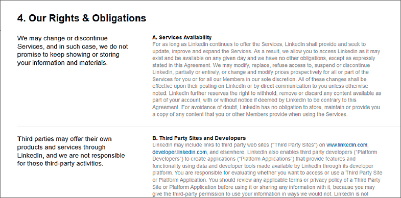
Figure 11.28 Making the Small Print a Little Larger
Source: LinkedIn, 2013: http://www.linkedin.com/legal/user-agreement.
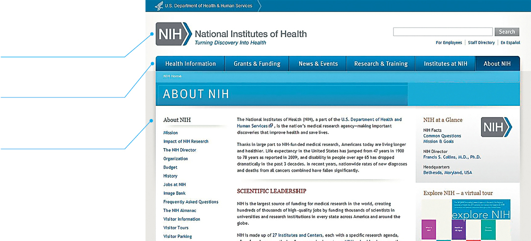
The About NIH page on the National Institutes of Health website conveys its message simply but effectively.
The top row is reserved for the name of this government agency.
Below the agency’s name is the main navigation pane, beginning with “Health Information.”
Below the main navigation pane is the navigation pane for the section in which this page appears: “About NIH.” The About NIH page has 18 sections, beginning with “Mission.”
All of the paintings presented in the app are shown on screens with the same design, making it easy for people to learn how to find the information they seek. Note that the design of the screen is simple and familiar icons are used for manipulating the size of the text and of the image and for playing the audio. Despite the small size of the screen, users will find it easy to navigate and use the app.
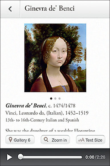
Figure 11.30 An App Designed for a Small Screen
Source: National Gallery of Art, 2013: http://www.usa.gov/mobileapps.shtml.