Chapter 1. Chapter 4
Step 1
Question
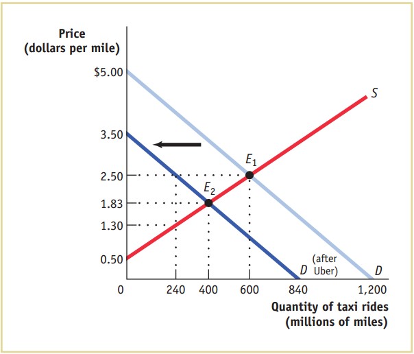
The accompanying diagram shows the demand and supply curves for taxi rides in New York City.

The accompanying diagram shows the demand and supply curves for taxi rides in New York City. On the Figure there are graphs of supply and demand. Horizontal axis corresponds to quantity of taxi rides (in millions miles). Vertical axis corresponds to price (in dollars per mile). Two straight lines are plotted in the first quadrant with a negative slope demand line passing through points with coordinates (0,5) and (1200,0), and positive slope supply line passing through (0, 0.5). Lines intersect at point E1 (600, 2.5). At E1 the market is at equilibrium with 600 million miles of rides transacted at an equilibrium price of 2.50 dollars.
A. At E1 the market is at equilibrium with 600 million miles of rides transacted at an equilibrium price of $2.50. Calculate each of the following (round to the nearest million):
Consumer surplus: Cna/muxNCTk= million
Question
Producer surplus: Y4X9gzy3nmw= million
Question
Total surplus: gofDAwe8FteLudMmdxMFhA== million
Step 2
Question
B. Uber’s entry into the market reduces the quantity of rides demanded from taxis by 30% at every price, shifting the demand curve leftward. Assume that New York City politicians respond by imposing a regulated price of $2.50 per mile. Calculate consumer surplus, producer surplus, and total surplus for the taxi market after Uber has entered the market.
Consumer surplus: pvKJC7e9Qj8= million
Question
Producer surplus: 7BeGhbEiu40= million
Question
Total surplus: 6iaqO0RNNxk= million
Step 3
Question
C. After complaints from riders, New York removes the regulated price of $2.50 per mile. What happens to the equilibrium price and quantity? How will taxi drivers and riders be affected?
Equilibrium price: GNugIXTwNgFDPl12hEiSiHRITFydLOMNBfkBjazKMjr27Tpok+vhag==.
Question
Equilibrium quantity: qjJcKnYH9P4sbvUqpQIMMH5lxeyP37WcAKkBKBrXaGsyrDu32L2B8g==.
Question
Taxi riders: 8odJxHZGKq5hcmCgs1NXc0wanzZ0Rvt6S2mwWLyRDvnvuMTh.
Question
Taxi drivers: o5F/n11CfYhRD6jsBVSc6aULFk/jxKPYHUlTmPVKbtrCD2uC.
Question
Society: 8odJxHZGKq5hcmCgs1NXc0wanzZ0Rvt6S2mwWLyRDvnvuMTh.