Chapter 2. Descriptive Statistics
Descriptive Statistics
Once an experiment has been repeated several times, how are the results presented and analyzed? Usually this is done by performing some type of statistical analysis. The starting point for almost all statistical analyses is to use descriptive statistics, which simply describe the population of data points that you have collected.
Mean
One descriptor of a population of data is the mean. The mean is the average of a series of data points. The mean describes the center of the population of data. The mean does not consider the range or variation of the numbers. For example, the raw values of data set 1 are quite different than set 2; however, both of these sets have the same mean.
Standard Deviation (std dev or S.D.)
Another descriptor is the standard deviation. This describes how far away from the mean the data points spread. The formula for the standard deviation is:

Since the standard deviation takes into account the variation of the data, it is a useful term for describing the data and also for comparing one data set to another. This value has the same units as the mean and is often represented as mean ± standard deviation. For set 1, it would be 5 ± 2.8.
In terms of the data, this means that about 2/3 (66.6%) of the sample values are expected to be between 2.2 to 7.8 (1 standard deviation away from mean in both directions) and 95% of the samples are expected to be between −0.4 to 10.6 (2 standard deviation). See bell curve.
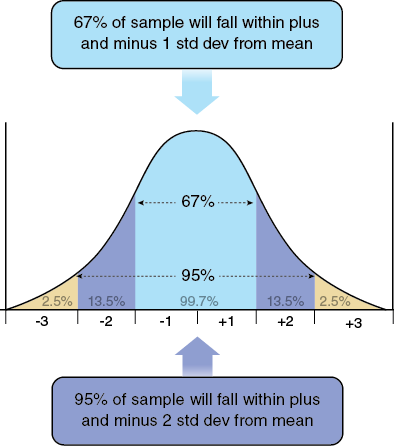
So basically, the standard deviation is an indication of how much variation occurs within the data. Therefore, as expected, the less the variation, such as in data set 2, the smaller the standard deviation.
Standard Error (std error or S.E.)
This is similar to standard deviation, except standard error allows some inference about how well your sample of data represents the total population of data values and the true population mean. The formula for std error is
Obviously, the larger your sample size, the more likely your standard error will be small. This makes sense because you will have a lot more confidence in your data if you did 20 replicates, instead of two replicates. This formula takes into account that level of confidence; thus, the standard error is more likely to be representative of the true mean of the population instead of just the mean of that particular set of data points. It is important to notice that the standard deviation is a better representative of the actual range of variation in all the possible data points, whereas standard error is an estimate of that variation.
Using the mean and one of the descriptors of data variation, two or more populations of data can be compared. This can also be useful for dealing with the replicates of experiments. Most spreadsheet programs, including Excel, include formulas for doing the calculations of descriptive statistics. Using the spreadsheet example from the Data Analysis and Presentation (Appendix D), an average of the concentrations of the three replicates for a single time point is shown below:
In cell B11 you can calculate the mean (or average) by clicking on the insert function feature (above the spreadsheet, shown highlighted). Type mean or average into the search feature of the function insert window and select the AVERAGE from the list and click OK. This will open a new window labeled Function Arguments. In the Number 1 space, choose the three cells that represent the three replicates. This will return the mean or average of the three replicates. Alternatively, you can simply type the formula into cell B11 using the format shown above.
Once a mean value for one set of replicates has been found you can copy (Ctrl + c) and paste (Ctrl + v) the B11 cell contents to the remaining cells in the spreadsheet mean row. The spreadsheet will now have mean values for each of the time points based on the three replicates.
The same approach that was used to determine the mean values can be used for generating the standard deviation values. In cell B12 you can calculate the S.D. by clicking on the insert function feature (above the spreadsheet, shown highlighted). Type standard deviation into the search feature of the function insert window and select the STDEV from the list and click OK. This will open a new window labeled Function Arguments. In the Number 1 space, choose the three cells that represent the three replicates. This will return the standard deviation of the three replicates.
Alternatively, you can simply type the formula into cell B12 using the format shown above. Once a standard deviation for one set of replicates has been found you can copy (Ctrl + c) and paste (Ctrl + v) the B12 cell contents to the remaining cells in the spreadsheet S.D. row. The spreadsheet will now have S.D. values for each of the time points based on the three replicates.
There is no function for Standard Error built into the Excel spreadsheet; however, you can find a square root function (=SQRT) to take the square root of the number of replicates and then divide the S.D. by that number. Alternatively, you can create your own function by entering the appropriate function descriptions in the cell where you want the standard error to show. For example, if in cell B13 you entered =(STDEV(B8:B10))/(SQRT(COUNT(B8:B10))) then the spreadsheet will calculate the S.E. for the three replicate data points for time 0.
In Appendix D (Data Analysis and Presentation), a graph showing all three replicates plotted together was shown and the result was a graph with a cluttered appearance.
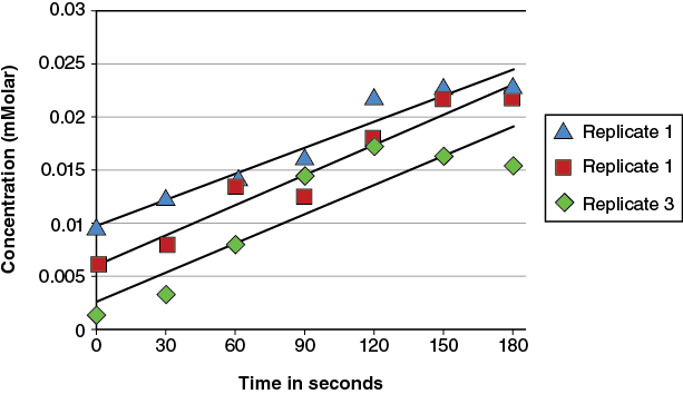
Instead, the means of the three replicates can be graphed and the result is a less cluttered graph.
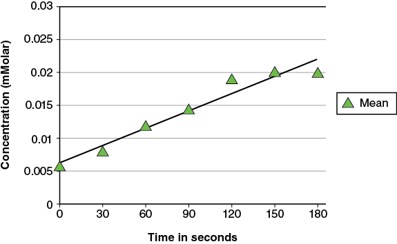
However, by only plotting the mean values for each time point we lose any sense of the variation in the data. To remedy this problem we need to include a descriptor of the data variability in the graph (either standard deviation or standard error). The graph of the mean values for each time point ± the S.D. now shows the variation in the data.
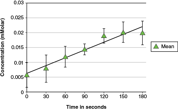
Standard deviation and standard error are both graphed in the same manner. When graphed, your data will basically look like an “I” on top of the data point.
A standard deviation of 0.5 would be graphed by going up 0.5 units above the mean and down 0.5 units below the mean. The variation plotted in this manner is often referred to as “error bars.”

The real benefit of using either standard deviation or standard error is you can tell if data sets truly represent different responses to the treatment or if they just represent random variation.
- If ± 1 standard deviation or standard error is plotted on both data sets and these error bars overlap, then these data sets are not “truly” statistically different. In other words, any difference that was observed could be due to random chance.
- If ± 1 standard deviation or standard error is plotted on both data sets and the error bars do not overlap, then you can be reasonably confident that these data sets are different.
- If ± 2 standard deviation or standard error are plotted on both data sets and the error bars still do not overlap, then you can be very confident that these data sets are different.
Smaller error bars represent greater precision in the data but not necessarily greater accuracy in the measurements.
The comparison of error bar method described above is a crude visual test. This sort of visual comparison in determining if groups of data are “significantly” different is possible with standard error.
The rules change slightly for standard deviation because the impact of sample size is not accounted for with standard deviation. A visual comparison of means does not take the place of a statistical test. However, this quick method can be used to avoid using a set of complex statistical tests, which are actually the more valid method of comparing means. Basically what is being done is determining if the variation of the data of individual treatment overlaps to conclude if data sets are truly different (that is, significantly different). As an example, consider the graph shown below using means ± standard error.
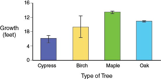
Notice that in a comparison of oak and maple that even though the mean growth rates are relatively close, the growth rates would be considered “significantly” different because even if you doubled the standard error values the bars would not overlap. In contrast, a comparison of birch and maple shows that even though the mean growth rate of the birch and maple is much further apart, the overall growth rate may not really be that different because of the variation in the growth of the birch. The confidence that these data sets are really different is not considered very strong. Lastly, in a comparison of birch and cypress there is really no difference in growth because of the overlap of standard error bars.
If the null hypothesis for this experiment was that all tree species will grow at the same rate and the alternative hypothesis was that tree species grow at different rates, then the data above would allow you to reject the null hypothesis and would therefore support the alternative hypothesis. Keep in mind that this does not prove the alternative hypothesis is correct, but that the alternative hypothesis is consistent with the data (i.e., it could be correct).