Chapter 2. Analyzing Enzymes and Enzyme Kinetics III
Learning Objectives
General Purpose
Conceptual
- Gain experience presenting the results and conclusions of an experiment to other individuals.
- Gain experience interpreting data and formulating conclusions of an experiment.
Procedural
- Organize your data in an Excel spreadsheet as described in the pre-lab section.
- Convert the absorbance values for the data that you collected in the last lab to benzoquinone concentration using the equation
- Calculate mean concentration of benzoquinone for each time point of each replicate for all treatments.
- Calculate the standard error for each of the mean values.
- Plot the mean benzoquinone concentration values vs. time for each of the treatments and add error bars (standard error) for each mean.
- Create a bar graph based on the 180-second time point mean for each of the treatments and add error bars (standard error) for each mean.
Procedure
Instructions for Preparing a Scatter Graph
Use the means and the standard error for each of the sets of replicates to make a scatter graph of your data. Select the data that corresponds to the time and mean values for one treatment, and from the tool bar in Excel select Insert and select the scatter graph.
You should now be viewing a scatter plot. To add a second data series to the graph (e.g., treatment 2), right-click on a data point for the first series and treatments, and choose Select Data. Select add and pick the series name and the X and Y values from the spreadsheet. Repeat this process until you have all of the mean benzoquinone concentration values for each of the treatments on the graph.
Next, add best-fit lines to the graph. Select the chart (graph). Right-click on a data point for one of the treatments and choose ADD TRENDLINE from the menu. Choose from the trendline options LINEAR (for a best-fit line). Repeat to add a best-fit line for the other treatments.
Next, you will add error bars to each of the data points for each line. In Chart Tools, click the Layout tab then select Error Bars with Standard Deviation (this just gives the right starting format for the error bars). At this point error bars have appeared on the graph. Click on the error bars and select Format Error Bars. In the window that opens, select Custom under Error Amount and then click Specify Value. This will allow you to select the Standard Error values as the Positive Error Value and the Negative Error Value. Repeat to add the error bars for the other treatments.
Instructions for Preparing a Bar Graph
Since the differences between treatments may be the greatest at the 180-second time point, it can be useful to create a bar graph that shows that data for the different treatment, with the appropriate standard error bars for each of the treatments.
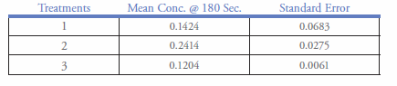
Create a table with Treatments in column 1, Mean Conc. @ 180 Sec in column 2, and Standard Error in column 3. If you are copying the data from your original table, make sure you paste the values, not the formula, into this new table. The table could look like the one below:
Select the Treatments column and the Mean Conc. column. From the tool bar, choose INSERT. From Charts, choose COLUMNS. Choose the upper left 2-D column.
To add error bars, select the chart (graph). In Chart Tools, click the Layout tab then select Error Bars with Standard Error (this just gives the right starting format for the error bars). At this point error bars have appeared on the graph. Click on the error bars and select Format Error Bars. In the window that opens select Custom under Error Amount and then click Specify Value. This will allow you to select the Standard Error values as the Positive Error Value and the Negative Error Value. Repeat to add the error bars for the other treatments.
If your chart does not have a label for each axis, in Chart Tools click the Layout tab, then select Axis Titles to add the appropriate title to each axis.
Presentation of Your Experiment
At the conclusion of lab, student groups will give a brief oral presentation explaining the results of their experiment and their conclusions about the interpretation of these results. Your group should be prepared to answer the following questions:
- Which of your hypotheses was rejected by your experiment? What criteria did you use to determine which hypothesis was supported by your results?
- Do your results/conclusions agree with the predictions you made originally?
- Do your results/conclusions agree with your basic understanding of how enzymes function?
- What were the major strengths of your experiment?
- What were the major weaknesses of your experiment?
- What is the next experiment that you would conduct?
As other groups present the results of their experiments you should sketch the pattern of their data in your laboratory notebook. Be sure to label the axes. This may be useful when preparing for the laboratory final exam.