Chapter 11. Inequality, Social Insurance, and Redistribution
Chapter 11: Inequality, Social Insurance, and Redistribution
Chapter objective: Understand how inequality, risk and redistribution shape our lives.
1) Describe the extent of economic inequality in the United States.
2) Assess the prevalence and implications of poverty.
3) Understand the rationale for publicly-provided social insurance.
4) Survey the important components of the social safety net.
5) Be prepared to join the debate about income redistribution.
Look around you, and you’ll see tall people and short people; fat people and thin people; folks who can run fast, and those who run slowly. Inequality is everywhere. Keep looking, and you’ll also see rich people and poor people. These economic differences—inequality in income, spending or wealth and your position in the pecking order—shape and constrain the different roles you will play in the economy.
Different views about inequality underpin our most contentious public policy debates, which often boil down to how much greater equality should be traded off for greater efficiency. Too often these debates yield heat rather than light. But beyond national politics, the same issues recur with both the workplace and our families, where we must balance competing pressures for equality and efficiency. This is a debate that you’ll have no choice but to join. Making the right tradeoff requires that you arm yourself with both the key facts about inequality and a framework for thinking about inequality.
Understanding inequality is also central to making sound financial decisions. Sure, you’ve probably seen statistics describing the healthy average incomes of college graduates. But few people actually earn the average income. Instead, some enjoy fabulous riches, while others battle poverty. Your economic life also involves enormous risk, and it’s likely that your career will involve both periods of plenty and periods of deprivation. As such, we’ll also examine how government social insurance and safety net programs help counter some of these risks and protect you against poverty.
11.1 Measuring Inequality and Poverty
Learning Objective #1
Describe the extent of economic inequality in the United States.
Many important political debates boil down to differences in opinion about the extent of inequality and poverty, and what to do about it. In order to have an informed opinion, you’ll need to have a deep understanding of just what the facts are. As we’ll see, these issues turn out to be surprisingly subtle.
11.1.1 U.S. Income Inequality
How much income inequality is there in the United States? And how has it been changing? Let’s go to the data.

The Distribution of Income
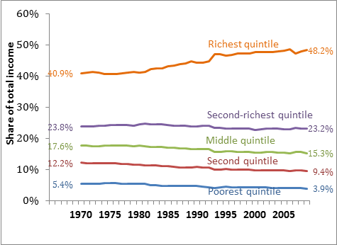
We begin by sorting the population from low to high income, and then divide them into five equal-sized groups, called quintiles. The left-most bar in Figure 11‑1 shows that the average family income of the poorest one-fifth of the population is only $15,289 per year. Taking these folks together, the bottom fifth only receive 3.9 percent of total income. At the other extreme, the right-most bar shows that the richest quintile has an average family income of $189,486, which amounts to nearly half (48.2%) of all income.
Income inequality is rising
Income inequality has been rising. Figure 11‑2 shows how the income share of each quintile has changed from 1970 to 2009. The starkest shift is at the top: The richest quintile have increased their share of income from 40.9% in 1970, to 48.2% in 2009. The share of income accruing to each of the other quintiles has declined. While the share of the poorest quintile doesn’t look like it has changed much, don’t let the compressed scale fool you—their share of total income has actually fallen from 5.4% to 3.9%, which is a decline of over one-fifth!
The rich are getting richer
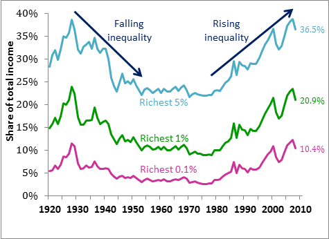
While the rich are only a small proportion of the population, they account for a remarkably large share of total income. In fact, the richest 5% of the population receive more than one-third of all income (36.5% to be exact). The richest 1% receive more than one-fifth, and the very richest 0.1% of all people earn over one-tenth of all income.
Figure 11‑3 tracks the income shares of the rich since 1920. While current levels of inequality are high relative to historical norms, they are not at unprecedented levels. Also, notice that while inequality has been rising since the 1980s, it also fell through the first part of this period.
Inequality in international perspective
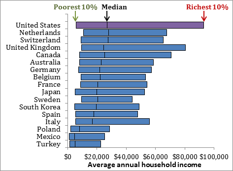
The United States has more income inequality than most other developed nations. Each bar in Figure 11‑4 runs from the average income among the poorest 10% in a country, through to the average among the richest 10%. Among these countries the gap between the richest and the poorest 10% is largest for the United States. Indeed, the United States is exceptional both because its rich are richer than in other countries, and the poor have less than the poor in many other comparable nations.
Global inequality
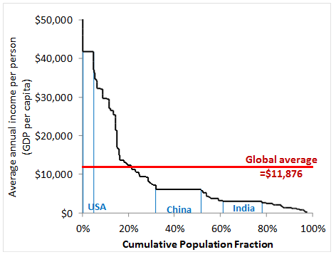
So far we’ve been focusing on the differences between rich and poor people within a country. But the differences between rich and poor countries are much larger. Figure 11 5 shows the global income distribution, plotting the proportion of the global population who come from countries whose average income is at or above each level. The average annual income of Americans is nearly the highest of any country the world, and it is close to four times higher than the global average income of $11,876. Even the very poor in the United States are well off compared to the billions of people scraping to get by in China, India and the developing world.
11.1.2 Alternative Measures of Inequality
Studying inequality reinforces an important theme that runs through much of economics: The meaning of any particular statistic needs to be closely scrutinized. So far we’ve examined inequality in annual income. But annual income is by no means the single best indicator of your living standards, your purchasing power, or your opportunities.
Permanent income
Your annual income is subject to transitory ups and downs that don’t really change your long-run economic situation. By saving when you are flush and borrowing when income is scarce, you can make sure that these transitory income changes don’t much affect your actual living standards. But these income fluctuations will raise measured inequality, because you’ll be counted as rich in those years when your income is temporarily high, and poor in those years when it is temporarily low.
Economists believe that your living standards largely reflect your permanent income—which is your average lifetime income—rather than your income this year. Consequently measuring average income over a longer time period—perhaps five or ten years—generally yields a better proxy for permanent income. There is less inequality in permanent income—and hence actual living standards—than in measured annual income.
Consumption and inequality of living standards An alternative approach suggests that because your living standards are largely determined by the goods and service you actually consume, inequality in living standards may be better measured by focusing on what we spend, rather than what we earn. In Figure 11‑1 we saw that the richest quintile of the population receives around 12 times as much income as the poorest quintile. But differences in spending are much less stark and the richest quintile spends only around four times as much as the poorest quintile. The reason is that people whose incomes are temporarily high or low drive much of the measured income inequality, but these folks maintain more moderate spending habits and so there is less consumption inequality.
Wealth and inequality of purchasing power
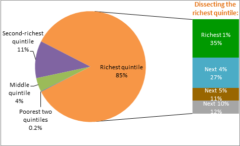
Your total purchasing power or your economic resources are better represented by your wealth than your income. And wealth is much more unequally distributed than income. To keep the concepts straight, notice that wealth is a stock—it’s the resources that you currently have—while income is a flow—the new resources that you get each year. Figure 11‑6 sorts all households in terms of their wealth. The bottom two quintiles, combined, hold only 0.2% of all wealth. At the opposite extreme, 85% of all wealth is held by the richest quintile. And even within this richest quintile, wealth is still extremely unequally distributed. In fact, the richest 1% of all households—folks who have an average wealth of over $18 million—hold 35% of all wealth. Adding in the next group, the richest 5% hold 62% of all wealth. All told, millionaires—the folks who make up the richest tenth—hold nearly 73% of all wealth. This inequality partly reflects the fact that wealth accumulates, and is passed from generation to generation.
Intergenerational immobility and inequality of opportunity
Inequality in income, consumption or wealth are all examples of inequality in outcomes. How might we measure inequality of opportunity? Many people believe that whether you are born into a poor, middle or upper class family, you should have the same opportunity to succeed. This suggests focusing on intergenerational immobility—the extent to which your economic circumstances follow those of your parents. Around half of the economic advantage or disadvantage enjoyed by your parents will be transmitted to you. For instance, if your father earns about 80% more than the typical dad, you will earn about 40% more than the typical child. Economic disadvantage is similarly transmitted from parents to children. So your parents do matter. But so does your own hard work, your investments, and luck.
You’ve probably heard the United States described as the “land of opportunity.” Yet despite this self-image, the United States has less intergenerational mobility than Australia, Canada, France, Germany or Sweden, and is at a level roughly comparable with the United Kingdom.

Interpreting the Data: Why do people disagree about inequality?
Congratulations on making it this far. You now have a robust understanding about the degree of economic inequality in the United States. And this understanding is crucial to resolving some of our fiercest political debates.
The top bar in Figure 11 7 shows the actual extent of wealth inequality, while the next bar shows the results of a survey asking people what they believe about this distribution. Comparing these, we learn that people don’t properly perceive the actual extent of wealth inequality. The same survey also asked about what the ideal distribution would be, and this bottom bar suggests that people would prefer wealth to be more even equally distributed. Taken together, we see that while some of the debate about inequality is driven by differences about what people want, much of it is driven by failing to understand the actual facts.
A meta observation: How economists collect facts
At this point, it should be clear that measuring inequality is no easy task. Worse still, many politicians will often cherry-pick their favorite statistics, so you can’t always trust what you read. Even so, we’ve arrived at a useful understanding, because we’ve followed a recipe that economists often use when trying to learn more about a new area:
• We examined the current levels of inequality.
• We dug deeper to see who was more or less affected by inequality.
• We analyzed how inequality has changed over time.
• We’ve compared inequality across countries.
• We re-examined the robustness of our conclusions to alternative ways of conceptualizing, defining and measuring inequality.
This is a recipe that you’ll find tremendously helpful throughout your career. Simply replace the word inequality in these bullet points with wages, international trade, taxes, or whatever issue you are trying to learn about, and you’ll quickly become an expert.
OK, so far we’ve been analyzing inequality. But inequality reflects two phenomena—the abundance of the rich, and the poverty of the poor. Many people argue that poverty is the more important phenomenon, and so let’s now apply our recipe to understanding the key facts about poverty.
11.2 Poverty
Learning objective #2
Assess the prevalence and implications of poverty.
What is poverty? Well, it’s being poor. But if we are going to measure it, we’ll need a more formal definition.
11.2.1 Defining Poverty
Officially, you are in poverty if your family income is below the poverty line. Currently, the poverty line for a family of four is a family income of $21,954, and the line varies to reflect the costs of supporting different sized families. While the poverty line is an arbitrary threshold, it is set at roughly three times the cost of buying a nutritionally adequate diet.
How many people are in poverty?
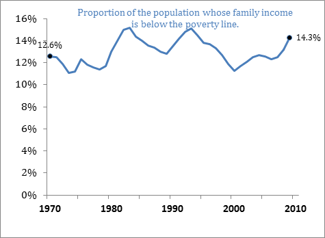
The poverty rate is the share of people whose family income falls below the poverty line. The poverty rate in 2009 was 14.3% of the population, meaning that roughly one-in-seven people are currently in poverty.
Everyday economics: Is the poverty line enough to get by on?
Is the poverty line really enough to get by on? Do you think you could raise a family of four on $21,954 per year—paying for housing, food, clothing, transport, childcare, medical and other needs on only $422 per week, before tax?
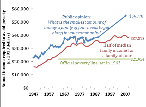
In public opinion surveys asking “What is the smallest amount of yearly income a family of four would need to get along in your community?” on average people [http://www.gallup.com/poll/26467/Public-Family-Four-NeedsEarn-Average-52000-Get.aspx]say that a family would need about $1,000 per week—to get along. How much do you think a family of four needs?
Poverty through time
The poverty line was originally calculated in mid-1960s, and since then, has only been adjusted to take account of rising prices. This means that today’s notion of poverty is the same absolute standard as it was several decades ago. Given the dramatic changes in the economy since—including a doubling of average incomes since 1970—you might expect poverty to have been virtually eliminated. Yet Figure 11‑8 shows that the poverty rate has actually risen over time. Unfortunately the poor have not shared in the rising prosperity of the past four decades.
11.2.2 Absolute versus Relative Poverty
So far we’ve described the official definition of poverty used by the U.S. government. But that’s not the only way of thinking about it.
Two views of poverty
The idea of absolute poverty is to judge the adequacy of your resources relative to an absolute or unchanging standard. By this view, the poverty measures whether your basic needs are met. And because basic needs are universal, the poverty line should be the same in the United States as in Zambia, and the same today as in prehistoric times. The alternative view of relative poverty suggests that the adequacy of your resources should be judged relative to the standards of your contemporary society. By this view, poverty is not just about physical measures of need, but also social inclusion. Let’s examine each of these approaches, in turn.
Absolute poverty in a global perspective

Think about what it means to get by on this.
The United Nations and the World Bank focus on an absolute poverty line of $1.25 per day. They calculate that this is the minimum needed for human survival. By this standard, the poverty rate in the United States is effectively zero. But globally, 1.4 billion people—around one quarter of all people in the developing world—are below this poverty line. Under an alternative poverty line of $2 per day, the global ranks of the poor rise to 2.6 billion people, or slightly more than half of all people in the developing world.
Interpreting the Data: The Lives of the Poor
What does it mean to be this poor? Let’s investigate the economic lives of Anuperna and Raja, a couple who are roughly representative of the poor in Udaipur in India. Both Anuperna and Raja work cultivating their land. Raja also works as a laborer; when there’s no work nearby he will migrate for a few months and send his meager wages home. Anuperna is also an entrepreneur, making and selling sari’s. Neither of them are literate. They live with their three kids and Raja’s mother in a small two-room house with no electricity, toilets or tap water. Food accounts for two-thirds of their household spending, leaving little for anything else. They own a bed, but no chairs or tables. While their better-off neighbors have a radio or a bicycle, they do without. Hunger is a key concern, and when income is scarce, they will do without food for an entire day. More often, they can make do by just eating smaller meals. Of all of the deprivations of poverty, this is the hardest, and Anuperna says that she finds it hard to stay in good spirits when she’s hungry. Like most of her neighbors, Anuperna is underweight and also anemic. She, Raja and the kids are also frequently sick, or weak, but they rarely seek treatment because it is expensive. Instead of complaining, Raja is grateful for the health of her children as around one-eighth of all children in her village die before the age of five.
The U.S. poor are not members of the global poor
The global poverty line of $1.25 per day is so low as to be effectively irrelevant to the United States—there just aren’t any Americans getting by on less. Even if the global poverty line were ten times higher—and the U.S. poverty line is even higher still—it would still capture very few Americans. Indeed, most of the world’s population would consider the U.S. poverty line to be luxurious, and more than 95% of the developing world get by on less. Moreover, throughout most of human history, nearly everyone—even those in rich countries—lived on less than the official U.S. poverty line. That is, when considered in either a global or historical context, even the American poor are rich. This suggests that in the United States it makes more sense to focus on relative poverty.
Is the U.S. poverty line an absolute or relative standard?
The official U.S. poverty line has features of both a relative and an absolute standard. It’s relative, in that it is set at a level that is only poor relative to the fact that the U.S. is a rich country. But technically it’s an absolute poverty line, because—as Figure 11‑9 shows—it’s set at an absolute level, and doesn’t change. The standard of living represented by the official U.S. poverty line has not risen through time even as American living standards have risen. The advantage of this approach is that it tracks through time how many people are below an unchanging standard. The disadvantage is that the poverty line was set in 1963, and has become decreasingly relevant as our society has become increasingly prosperous.
Relative poverty in the United States
How then might we set a relative poverty line that kept up with our rising prosperity? One common measure of relative poverty says that you are poor if your family income is below half the median family income. Indeed as Figure 11‑9 shows, when the official poverty line for a family of four was established, it was set roughly equal to half of median family earnings. While the official poverty line is stuck at a level that made sense in 1963, this alternative benchmark has risen to over $37,000.
Another approach to measuring relative poverty involves surveying the public about what they think is an adequate income to “get along.” Figure 11‑9 shows that the average responses shown have risen as our society has gotten richer. This suggests that most people think about income needs as being relative to the contemporary standards of their society.
Which of these alternative poverty lines do you think makes most sense?
Work it Out
Question Work it Out
If you believed that the poverty line should be based on public opinion about what is required to “get along,” does this suggest that the poverty problem is better or worse than suggested by the official statistics?
| A. |
| B. |
11.3 The Incidence of Poverty in the United States
As we now turn to examining just who is poor in the United States, we’ll see that poverty has a surprisingly broad reach.
Temporary and long-term poverty
Despite what you may see portrayed in the popular media, it’s a mistake to view the poor as a fixed underclass. Instead, millions of people both enter and escape poverty each year. To figure out the role of temporary versus long-term poverty, it is important to distinguish between a spell of poverty, and currently poor people. Most spells of poverty are temporary, and around half last only one year. However, at any point in time, long-term poverty is an important problem, and more than half of all currently poor people are in the midst of a spell of poverty which will last eight years or more. That is, people in long-term poverty are both a small proportion of those who enter poverty, and a large share of the poor at any point in time. Even if you aren’t at risk of long-term poverty, you are still at risk of falling into poverty temporarily. The distinction between temporary and long-term poverty is further complicated by the fact that poverty is often recurrent, and over half of all people who escape poverty will return to poverty within five years.