Phillip Johnson, “Scholarship Remixed” Final Report
Phillip designed the “Scholarship Remixed” flyer shown in Figure 8.10 (p. 133). This is his full final report.
Preproduction process
For this project, I started out thinking about what ideas or images the words might evoke. I gravitated towards the “Scholarship Remixed: Publishing in Virtual Spaces” title because the ideas of remixing and spaces open up lots of possibilities. [Students had three titles to choose from for this project.—Ed.]
Before I opened Photoshop, I spent some time surfing around my favorite design sites, mainly to look at typefaces and color schemes. I also scribbled a few pencil sketches to work out the density and hierarchy of the information and to work through a few layout ideas. I decided fairly early on this would be a typographic layout and that I wanted it to be bold in order to stand out from the clutter of a bulletin board.
In the end, I did four designs, three of which are shown below.

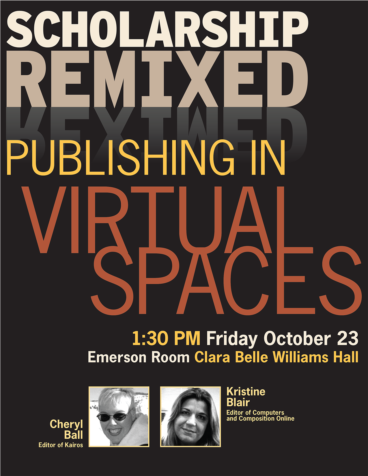
This design is the first one I came up with and the most polished of all the drafts. I played around with the “remixed” idea by remixing the letters in the reflection of the word REMIXED. I also pushed the letters in “VIRTUAL SPACES” close together in order to enclose spaces between the letters and words.

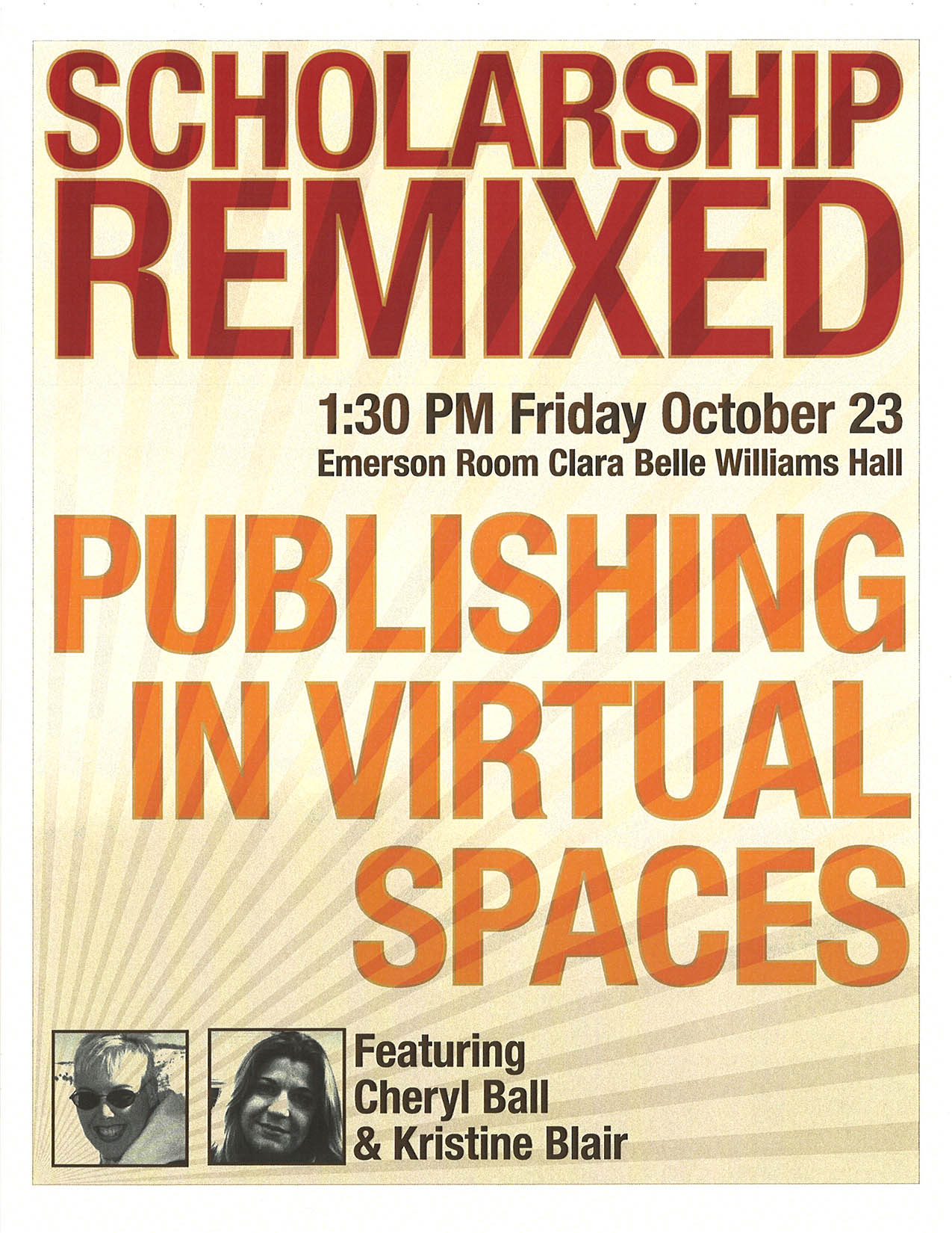
With this design, I was looking to see how far I could push big, bold letters to the edges of the page. The ray pattern emanating from the bottom left of the page was my attempt to have some kind of unifying element. In the end, I thought the layout looked more like a book cover than a flyer.

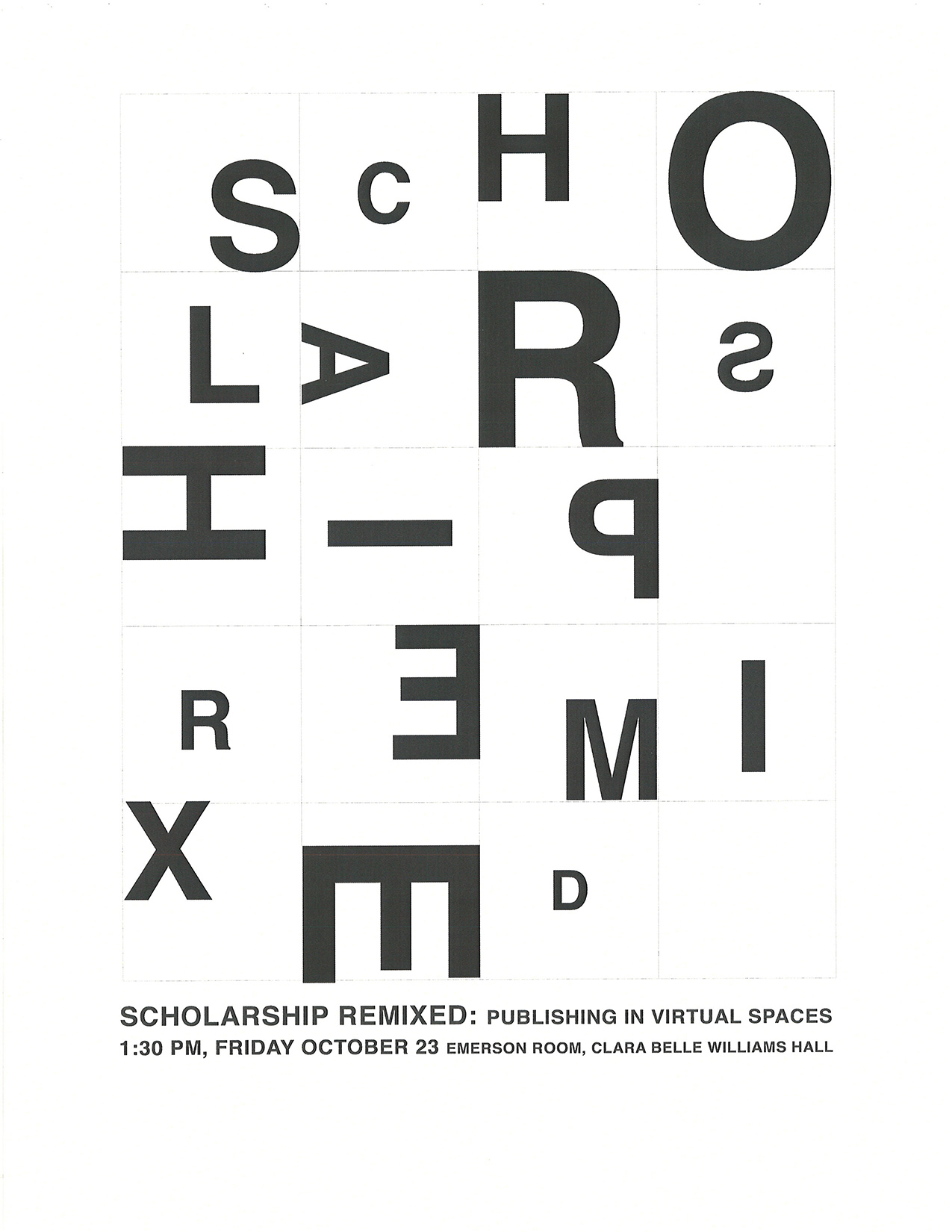
The third design was a complete experiment. It’s basically a mixed up eye chart. My main goal was to see if by arranging the letters like I did, I could spell out something clever. I couldn’t.
Ultimately, I chose the first (black background) design. The rest of the discussion will focus on the choices I made with that particular design.
Rhetorical choices
I suppose the decision to focus on producing a typographic layout is the main rhetorical choice I made. Given that the audience for this presentation is mainly English students, it seemed appropriate to focus on the words and try to find ways to make them interesting without losing readability or clarity. For me, the purpose of a flyer like this is to convince people to show up by focusing on the what, along with the where and when. Towards that end, I made sure that the time and place information is not hidden or ambiguous.
Design principles
I think this design makes good use of all the basic design principles: contrast, repetition, alignment and proximity.
I like the bold (without being too vibrant) foreground colors in contrast to the black background. I also like the contrast in the style and weight of the typefaces. Repetition is present in the design, most apparent in the treatment of the photos and the accompanying text, even though the elements are not exact repeats. Colors also repeat to help unify and balance the design. Alignment is working on a number of levels with the various type elements. Proximity is most obvious in the relationship of the photos to each other and with their accompanying text.
Informationally, the hierarchy is fairly simple, the main title is the boldest element, the subtitle takes up a similar amount of space, but the thinner typeface gives that area of the design more air or negative space. The time and place information, along with the presenter information, rounds out the design, with another level of hierarchy, as the date and time are larger than the rest of the information.
Type
As this was always intended to be a typographic design, I spent a lot of time picking out the typefaces. I used Interstate for the bolder typeface at the top of the design, along with a few variants of News Gothic for everything else. I like the contrast between the two typefaces.
It should be noted that I slightly modified the M and X in the title element, making them the same width. I did this so I could switch the position of these letters in the reflection of the word REMIXED. This was my attempt to play on the “remixed” idea. I think it was somewhat lost in the draft version of the design. In the final version, I increased the contrast between the reflection and the background to help it stand out. Even so, it’s still pretty subtle.
Final questions
What was your experience with the software you used?
I’ve been using Photoshop since 1996 so my experience using it might be somewhat different than others in the class. I am by no means a Photoshop expert. I can do most of what I want to do, but I still struggle with certain features, and I’m constantly awed by the work that many artists and designers do in Photoshop. Along with Photoshop, I did a few things in Illustrator and imported them into Photoshop—most notably the ray pattern used in the second design I did. Making things like that is just easier in an illustration program.
What gave you the most difficulty and why?
The thing that I probably struggled with the most was making the photos of the presenters seem unified in some way. The photos were very different in terms of their resolution and overall feel. Removing the competing foreground objects from Cheryl Ball’s photo and eventually settling on a fairly tight, square-shaped crop of each photo gave them some degree of consistency. Making them both black and white, and balancing out the contrast as much as possible also helped.
What about the project are you happiest about and why?
I think what makes me the happiest about this project was the process itself. At work I do design and layout, but it’s always constrained in some way by branding considerations. It was nice to not have to worry about that stuff and just go through the steps of turning some words and a couple of photos into something with a pleasing and purposeful arrangement.