Fonts for college and workplace documents
Easy-to-read, professional fonts are appropriate for writing in school and the workplace.
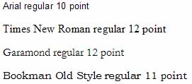
For print documents, the following fonts are good choices:

Notice that all these fonts look about the same size even though their point sizes are different. When you design a document, you need to think about how fonts actually display on screen or in print as you make your choices.
Small differences in the ways the fonts are designed contribute to the effect of your document on your readers. Some fonts are tight (Times New Roman, Arial) and allow you to print more information in less space. Some fonts are more open and airy (Verdana, Century Gothic).
Serif fonts (such as Times New Roman, Garamond and Bookman Old Style) are readable for long documents, such as student papers and business reports. Sans serif fonts work well for headings and other places where a small amount of type is needed for emphasis. Some people simply prefer sans serif fonts for extended text, too.
A typical, effective design for print documents is to set headings in a bold sans serif font (like Arial) with paragraphs set in a serif font (like Times New Roman).
Related topics: