Features: What do the words look like?
We’re so used to gathering meaning from written words simply by reading them that it may seem strange at first to analyze what the words look like. Words can, however, appear in a variety of sizes, shapes, colors, styles, and static or animated configurations. One of the first things to note is the font (or typeface) in which the words appear. Graphic designers often talk about fonts as the “voice” of the page.
When considering the effect that font choice has on a text, think about what adjectives you might associate with a particular font. For instance, you might describe Comic Sans as fun, childish, and handwritten. Even if you have never seen Comic Sans before, the scrawled feeling of the irregular shapes and angles of the letters will call such adjectives to mind. Understanding the visual aspects of written texts requires that we pay attention to the shape and the feel of the typeface itself.
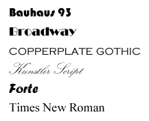
What adjectives would you associate with the following typefaces?
As you consider the font, think about any treatment or formatting applied to it. For example, how has capitalization been applied? Are the words in sentence case (standard capitalization for a sentence) or some other case?
Sentence case appears with an initial capital letter and a period at the end.
all lowercase is written in all lowercase letters.
ALL CAPS IS WRITTEN IN ALL CAPITAL LETTERS.
mIxED cAsE iS a mIxTuRe oF cApItAL aNd LoweRCaSe leTterS.
What do you associate with each of these capitalization styles? In academic writing, sentences are usually presented in sentence case, and all caps is usually used only for headings or subheadings. In informal, creative, or multimodal texts, all caps might be used for emphasis or to signify “yelling” or some other strong emotion.
When considering the features of words, check for typographic elements, such as text set in bold, italics, quotation marks, color, or different sizes or text set with strikethrough or highlighting. Each of these elements shapes the way readers interact with the text. Words that convey a warning, for example, might be set in red, a color associated with fire and stop signs. If different font sizes are used in a text, readers will assume that larger words are more important than smaller ones.
Related topics:
Genre: In what kind of document do the written words appear?
Purpose and audience: Why and for whom are the words created?