Sample line graph

Line graph showing trends

Figure. Line graph. The graph shows data points by year from 1973 to 2004. The data are students's scores at different ages. The graph demonstrates that math scores for elementary and middle school students improved, while scores for high school students remained relatively constant from the 1970s into the twenty-first century. (The source is Achieve, Inc.)

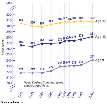
This line graph shows that math scores for elementary and middle school students improved, while scores for high school students remained relatively constant from the 1970s into the twenty-first century.

Go to related page: Types of visuals to suit your purpose