11.2 Two Key Concepts: Marginal Cost and Average Cost
We’ve just learned how to derive a firm’s total cost curve from its production function. Our next step is to take a deeper look at total cost by deriving two extremely useful measures: marginal cost and average cost. As we’ll see, these two measures of the cost of production have a somewhat surprising relationship to each other. Moreover, they will prove to be vitally important in Chapter 12, where we will use them to analyze the firm’s output decision and the market supply curve.
Marginal Cost
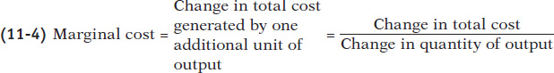
We defined marginal cost in Chapter 9: it is the change in total cost generated by producing one more unit of output. We’ve already seen that the marginal product of an input is easiest to calculate if data on output are available in increments of one unit of that input, all other things equal. Similarly, marginal cost is easiest to calculate if data on total cost are available in increments of one unit of output. When the data come in less convenient increments, it’s still possible to calculate marginal cost. But for the sake of simplicity, let’s work with an example in which the data come in convenient one-
Selena’s Gourmet Salsas produces bottled salsa and Table 11-1 shows how its costs per day depend on the number of cases of salsa it produces per day. The firm has fixed cost of $108 per day, shown in the second column, which represents the daily cost of its food-
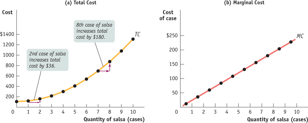
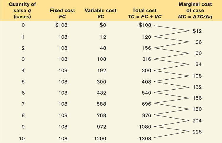
The significance of the slope of the total cost curve is shown by the fifth column of Table 11-1, which calculates marginal cost: the additional cost of each additional unit, all other things equal. The general formula for marginal cost is:
or

As in the case of marginal product, marginal cost is equal to “rise” (the increase in total cost) divided by “run” (the increase in the quantity of output). So just as marginal product is equal to the slope of the total product curve, marginal cost is equal to the slope of the total cost curve.
Now we can understand why the total cost curve gets steeper as we move up it to the right: as you can see in Table 11-1, marginal cost at Selena’s Gourmet Salsas rises as output increases. Panel (b) of Figure 11-8 shows the marginal cost curve corresponding to the data in Table 11-1. Notice that, as in Figure 11-2, we plot the marginal cost for increasing output from 0 to 1 case of salsa halfway between 0 and 1, the marginal cost for increasing output from 1 to 2 cases of salsa halfway between 1 and 2, and so on.
Why does the marginal cost curve slope upward? Because there are diminishing returns to inputs in this example. All other things equal, as output increases, the marginal product of the variable input declines. This implies that more and more of the variable input must be used to produce each additional unit of output as the amount of output already produced rises. And since each unit of the variable input must be paid for, the additional cost per additional unit of output also rises.
In addition, recall that the flattening of the total product curve is also due to diminishing returns: the marginal product of an input falls as more of that input is used if the quantities of other inputs are fixed. The flattening of the total product curve as output increases and the steepening of the total cost curve as output increases are just flip-
The inverse relationship between productivity and costs is discussed in greater detail in Appendix 11A. We will return to marginal cost in Chapter 12, when we consider the firm’s profit-
Average Total Cost
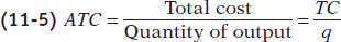
In addition to total cost and marginal cost, it’s useful to calculate another measure, average total cost, often simply called average cost. The average total cost is total cost divided by the quantity of output produced; that is, it is equal to total cost per unit of output. If we let ATC denote average total cost, the equation looks like this:
Average total cost, often referred to simply as average cost, is total cost divided by quantity of output produced.
Average total cost is important because it tells the producer how much the average or typical unit of output costs to produce. Marginal cost, meanwhile, tells the producer how much one more unit of output costs to produce. Although they may look very similar, these two measures of cost typically differ. And confusion between them is a major source of error in economics, both in the classroom and in real life, as illustrated by the upcoming Economics in Action.
Table 11-2 uses data from Selena’s Gourmet Salsas to calculate average total cost. For example, the total cost of producing 4 cases of salsa is $300, consisting of $108 in fixed cost and $192 in variable cost (from Table 11-1). So the average total cost of producing 4 cases of salsa is $300/4 = $75. You can see from Table 11-2 that as quantity of output increases, average total cost first falls, then rises.
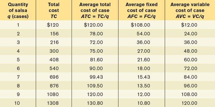
Figure 11-9 plots that data to yield the average total cost curve, which shows how average total cost depends on output. As before, cost in dollars is measured on the vertical axis and quantity of output is measured on the horizontal axis. The average total cost curve has a distinctive U shape that corresponds to how average total cost first falls and then rises as output increases. Economists believe that such U-shaped average total cost curves are the norm for producers in many industries.
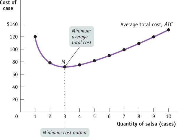
A U-shaped average total cost curve falls at low levels of output, then rises at higher levels.
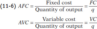
Average fixed cost is the fixed cost per unit of output.
To help our understanding of why the average total cost curve is U-
Average variable cost is the variable cost per unit of output.
Average total cost is the sum of average fixed cost and average variable cost. It has a U shape because these components move in opposite directions as output rises.
Average fixed cost falls as more output is produced because the numerator (the fixed cost) is a fixed number but the denominator (the quantity of output) increases as more is produced. Another way to think about this relationship is that, as more output is produced, the fixed cost is spread over more units of output; the end result is that the fixed cost per unit of output—the average fixed cost—
Average variable cost, however, rises as output increases. As we’ve seen, this reflects diminishing returns to the variable input: each additional unit of output incurs more variable cost to produce than the previous unit. So variable cost rises at a faster rate than the quantity of output increases.
So increasing output has two opposing effects on average total cost—
The spreading effect. The larger the output, the greater the quantity of output over which fixed cost is spread, leading to lower average fixed cost.
The diminishing returns effect. The larger the output, the greater the amount of variable input required to produce additional units, leading to higher average variable cost.
At low levels of output, the spreading effect is very powerful because even small increases in output cause large reductions in average fixed cost. So at low levels of output, the spreading effect dominates the diminishing returns effect and causes the average total cost curve to slope downward. But when output is large, average fixed cost is already quite small, so increasing output further has only a very small spreading effect. Diminishing returns, however, usually grow increasingly important as output rises. As a result, when output is large, the diminishing returns effect dominates the spreading effect, causing the average total cost curve to slope upward. At the bottom of the U-
Figure 11-10 brings together in a single picture four members of the family of cost curves that we have derived from the total cost curve for Selena’s Gourmet Salsas: the marginal cost curve (MC), the average total cost curve (ATC), the average variable cost curve (AVC), and the average fixed cost curve (AFC). All are based on the information in Tables 11-1 and 11-2. As before, cost is measured on the vertical axis and the quantity of output is measured on the horizontal axis.

Let’s take a moment to note some features of the various cost curves. First of all, marginal cost slopes upward—
Finally, notice that the marginal cost curve intersects the average total cost curve from below, crossing it at its lowest point, point M in Figure 11-10. This last feature is our next subject of study.
Minimum Average Total Cost
The minimum-cost output is the quantity of output at which average total cost is lowest—
For a U-
In Figure 11-10, the bottom of the U is at the level of output at which the marginal cost curve crosses the average total cost curve from below. Is this an accident? No—
At the minimum-
cost output, average total cost is equal to marginal cost. At output less than the minimum-
cost output, marginal cost is less than average total cost and average total cost is falling. At output greater than the minimum-
cost output, marginal cost is greater than average total cost and average total cost is rising.
To understand these principles, think about how your grade in one course—
Similarly, if marginal cost—
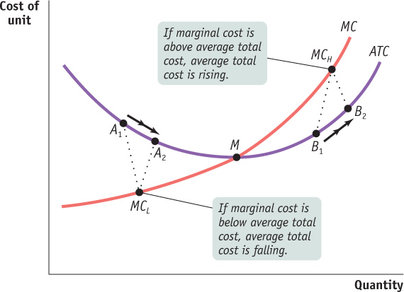
But if your grade in physics is more than the average of your previous grades, this new grade raises your GPA. Similarly, if marginal cost is greater than average total cost, producing that extra unit raises average total cost. This is illustrated by the movement from B1 to B2 in Figure 11-11, where the marginal cost, MCH, is higher than average total cost. So any quantity of output at which marginal cost is greater than average total cost must be on the upward-
Finally, if a new grade is exactly equal to your previous GPA, the additional grade neither raises nor lowers that average—
Does the Marginal Cost Curve Always Slope Upward?
Up to this point, we have emphasized the importance of diminishing returns, which lead to a marginal product curve that always slopes downward and a marginal cost curve that always slopes upward. In practice, however, economists believe that marginal cost curves often slope downward as a firm increases its production from zero up to some low level, sloping upward only at higher levels of production: they look like the curve MC in Figure 11-12.
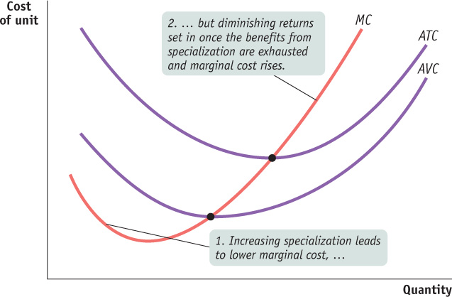
This initial downward slope occurs because a firm often finds that, when it starts with only a very small number of workers, employing more workers and expanding output allows specialization to take place. This specialization leads to increasing returns to the hiring of additional workers (i.e., the marginal product of labour curve begins by sloping upward) and results in a marginal cost curve that initially slopes downward. But once the benefits of specialization have been exhausted, diminishing returns to labour set in (i.e., the marginal product of labour curve begins sloping downward) and the marginal cost curve changes direction and slopes upward. So typical marginal cost curves actually have the “swoosh” shape shown by MC in Figure 11-12. For the same reason, average variable cost curves typically look like AVC in Figure 11-12: they are U-shaped rather than strictly upward sloping. The appendix of this chapter uses mathematics to investigate the relationship between marginal product and marginal cost, and between average product and average cost.
However, as Figure 11-12 also shows, the key features we saw from the example of Selena’s Gourmet Salsas remain true: the average total cost curve is U-shaped, and the marginal cost curve passes through the point of minimum average total cost.
DON’T PUT OUT THE WELCOME MAT
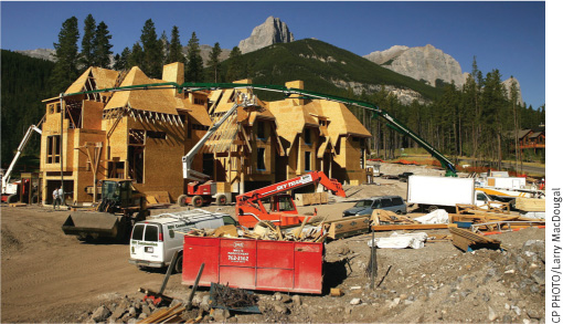
Housing developments play an important role in the Canadian economy; directly and indirectly, such development provides thousands of jobs to Canadian workers. With our abundant supply of undeveloped land, real estate developers have long found it profitable to buy big parcels of land, build a large number of homes, and create entire new communities. But what is profitable for developers is not necessarily good for the existing residents.
In the past few years, real estate developers have encountered increasingly stiff resistance from local residents because of the additional costs—the marginal costs—imposed on existing homeowners from new developments. Let’s look at why.
In Canada, a large percentage of the funding for local services such as roads, transit, water and sewer infrastructure, community centres, and fire and police facilities comes from taxes paid by local homeowners. For many cities, property taxes are the largest source of revenue: representing 39% of Toronto’s revenues, 41% of Calgary’s revenue, 54% of Edmonton’s revenue, and 57% of Vancouver’s revenue. In a sense, the municipal government uses those taxes to “produce” municipal services for the city. The overall level of property taxes is set to reflect the costs of providing those services.
The local tax rate that new homeowners pay on their new homes is the same as what existing homeowners pay on their older homes. That tax rate reflects the current total cost of services, and the taxes that an average homeowner pays reflect the average total cost of providing services to a household. The average total cost of providing services is based on the town’s use of existing facilities, such as the existing school buildings, the existing number of teachers, the number of community centres and libraries, and so on.
But when a large development of homes is constructed, those facilities are no longer adequate: new schools must be built, new teachers hired, and so on. The quantity of output increases. So the marginal cost of providing municipal services per household associated with a new, large-scale development turns out to be much higher than the average total cost per household of existing homes. As a result, new developments and facilities cause everyone’s local tax rate to go up, just as you would expect from Figure 11-12. To cover the cost of building this new infrastructure, cities in Ontario and in other provinces impose development charges on the construction of new homes. These development charges vary from city to city. For example, the average development charges for a similar unit vary significantly between Toronto and its surrounding municipalities. In early 2014, development charges for a large apartment unit ranged from about $13 000 in Toronto to $45 000 in nearby Brampton, Ontario. Although the development charges are lower in Toronto, the city government is considering a proposal to almost double them to cover the rising costs of providing services to residents. Toronto is not alone. As a result of the rising average cost of providing municipal services in many cities across Canada, potential new housing developments and newcomers are now facing a distinctly chilly reception.

Quick Review
Marginal cost is equal to the slope of the total cost curve. Diminishing returns cause the marginal cost curve to slope upward.
Average total cost (or average cost) is equal to the sum of average fixed cost and average variable cost. When the U-shaped average total cost curve slopes downward, the spreading effect dominates: fixed cost is spread over more units of output. When it slopes upward, the diminishing returns effect dominates: an additional unit of output requires more variable inputs.
Marginal cost is equal to average total cost at the minimum-cost output. At higher output levels, marginal cost is greater than average total cost and average total cost is rising. At lower output levels, marginal cost is lower than average total cost and average total cost is falling.
At low levels of output there are often increasing returns to the variable input due to the benefits of specialization, making the marginal cost curve “swoosh”-shaped: initially sloping downward before sloping upward.
Check Your Understanding 11-2
CHECK YOUR UNDERSTANDING 11-2
Question 11.2
Alicia’s Apple Pies is a roadside business. Alicia must pay $9.00 in rent each day. In addition, it costs her $1.00 to produce the first pie of the day, and each subsequent pie costs 50% more to produce than the one before. For example, the second pie costs $1.00 × 1.5 = $1.50 to produce, and so on.
Calculate Alicia’s marginal cost, variable cost, average total cost, average variable cost, and average fixed cost as her daily pie output rises from 0 to 6. (Hint: The variable cost of two pies is just the marginal cost of the first pie, plus the marginal cost of the second, and so on.)
Indicate the range of pies for which the spreading effect dominates and the range for which the diminishing returns effect dominates.
What is Alicia’s minimum-cost output? Explain why making one more pie lowers Alicia’s average total cost when output is lower than the minimum-cost output. Similarly, explain why making one more pie raises Alicia’s average total cost when output is greater than the minimum-cost output.
As shown in the accompanying table, the marginal cost for each pie is found by multiplying the marginal cost of the previous pie by 1.5. Variable cost for each output level is found by summing the marginal cost for all the pies produced to reach that output level. So, for example, the variable cost of three pies is $1.00 + $1.50 + $2.25 = $4.75. Average fixed cost for Q pies is calculated as $9.00/Q since fixed cost is $9.00. Average variable cost for Q pies is equal to variable cost for the Q pies divided by Q; for example, the average variable cost of five pies is $13.19/5, or approximately $2.64. Finally, average total cost can be calculated in two equivalent ways: as TC/Q or as AVC + AFC.
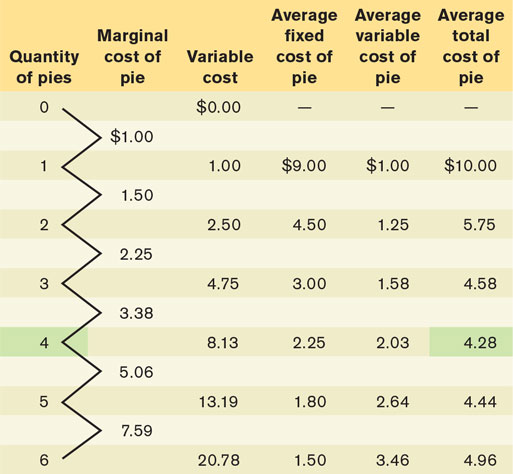
The spreading effect dominates the diminishing returns effect when average total cost is falling: the fall in AFC dominates the rise in AVC for pies 1 to 4. The diminishing returns effect dominates when average total cost is rising: the rise in AVC dominates the fall in AFC for pies 5 and 6.
Alicia’s minimum-cost output is 4 pies; this generates the lowest average total cost, $4.28. When output is less than 4, the marginal cost of a pie is less than the average total cost of the pies already produced. So making an additional pie lowers average total cost. For example, the marginal cost of pie 3 is $2.25, whereas the average total cost of pies 1 and 2 is $5.75. So making pie 3 lowers average total cost to $4.58, equal to (2 × $5.75 + $2.25)/3. When output is more than 4, the marginal cost of a pie is greater than the average total cost of the pies already produced. Consequently, making an additional pie raises average total cost. So, although the marginal cost of pie 6 is $7.59, the average total cost of pies 1 through 5 is $4.44. Making pie 6 raises average total cost to $4.96, equal to (5 × $4.44 + $7.59)/6.