3.2 The Demand Curve
How many pounds of cotton, packaged in the form of blue jeans, do consumers around the world want to buy in a given year? You might at first think that we can answer this question by looking at the total number of pairs of blue jeans purchased around the world each day, multiply that number by the amount of cotton it takes to make a pair of jeans, and then multiply by 365. But that’s not enough to answer the question, because how many pairs of jeans—
When the price of cotton rises, as it did in 2010–2011, some people will respond to the higher price of cotton clothing by buying fewer cotton garments or, perhaps, by switching completely to garments made from other materials, such as synthetics or linen. In general, the quantity of cotton clothing, or of any good or service that people want to buy, depends on the price. The higher the price, the less of the good or service people want to purchase; alternatively, the lower the price, the more they want to purchase.
So the answer to the question “How many pounds of cotton do consumers want to buy?” depends on the price of a pound of cotton. If you don’t yet know what the price will be, you can start by making a table of how many pounds of cotton people would want to buy at a number of different prices. Such a table is known as a demand schedule. This, in turn, can be used to draw a demand curve, which is one of the key elements of the supply and demand model.
The Demand Schedule and the Demand Curve
A demand schedule shows how much of a good or service consumers will want to buy at different prices.
A demand schedule is a table showing how much of a good or service consumers will want to buy at different prices. At the right of Figure 3-1, we show a hypothetical demand schedule for cotton. It’s hypothetical in that it doesn’t use actual data on the world demand for cotton and it assumes that all cotton is of equal quality.
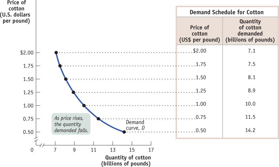
The quantity demanded is the actual amount of a good or service consumers are willing and able to buy at some specific price.
According to the table, if a pound of cotton costs $1, consumers around the world will want to purchase 10 billion pounds of cotton over the course of a year. If the price is $1.25 a pound, they will want to buy only 8.9 billion pounds; if the price is only $0.75 a pound, they will want to buy 11.5 billion pounds; and so on. The higher the price, the fewer pounds of cotton consumers will want to purchase. So, as the price rises, the quantity demanded of cotton—
A demand curve is a graphical representation of the demand schedule. It shows the relationship between quantity demanded and price.
The graph in Figure 3-1 is a visual representation of the information in the table. (You might want to review the discussion of graphs in economics in Appendix 2A.) The vertical axis shows the price of cotton and the horizontal axis shows the quantity of cotton. Each point on the graph corresponds to one of the entries in the table. The curve that connects these points is a demand curve. A demand curve is a graphical representation of the demand schedule, another way of showing the relationship between the quantity demanded and price.
PAY MORE, PUMP LESS
For a real-
Prices aren’t the only factor affecting fuel consumption, but they’re a significant cause of the difference between European and North American fuel consumption per person.
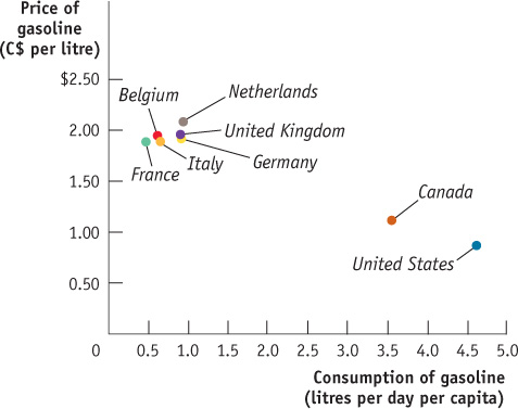
Sources: U.S. Energy Information Administration; Natural Resources Canada, 2010.
The law of demand says that a higher price for a good or service, other things equal, leads people to demand a smaller quantity of that good or service.
Note that the demand curve shown in Figure 3-1 slopes downward. This reflects the general proposition that a higher price reduces the quantity demanded. For example, jeans makers know that they will sell fewer pairs when the price of a pair of jeans is higher, reflecting a $2 price for a pound of cotton, compared to the number they will sell when the price of a pair is lower, reflecting a price of only $1 for a pound of cotton. Similarly, someone who buys a pair of cotton jeans when its price is relatively low will switch to synthetic or linen when the price of cotton jeans is relatively high. So in the real world, demand curves almost always do slope downward. (The exceptions are so rare that for practical purposes we can ignore them.) Generally, the proposition that a higher price for a good, other things equal, leads people to demand a smaller quantity of that good is so reliable that economists are willing to call it a “law”—the law of demand.
Shifts of the Demand Curve
Although cotton prices in 2010 and 2011 were higher than they had been in 2007, total world consumption of cotton was higher in 2010. How can we reconcile this fact with the law of demand, which says that a higher price reduces the quantity demanded, other things equal?
The answer lies in the crucial phrase other things equal. In this case, other things weren’t equal: the world had changed between 2007 and 2010, in ways that increased the quantity of cotton demanded at any given price. For one thing, the world’s population, and therefore the number of potential cotton clothing wearers, increased. In addition, the growing popularity of cotton clothing, as well as higher incomes in countries like China that allowed people to buy more clothing than before, led to an increase in the quantity of cotton demanded at any given price. Figure 3-2 illustrates this phenomenon using the demand schedule and demand curve for cotton. (As before, the numbers in Figure 3-2 are hypothetical.)
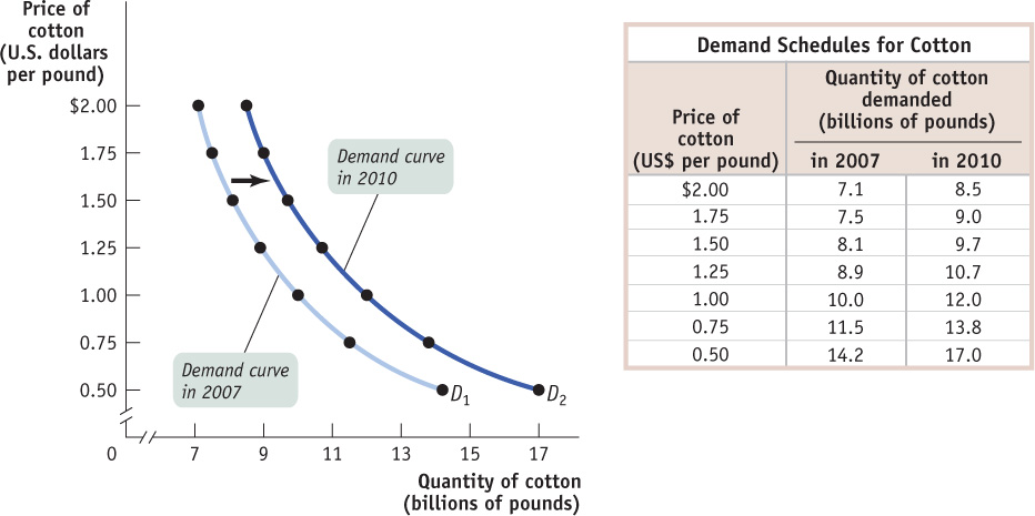
The table in Figure 3-2 shows two demand schedules. The first is the demand schedule for 2007, the same as shown in Figure 3-1. The second is the demand schedule for 2010. It differs from the 2007 demand schedule due to factors such as a larger population and the increased popularity of cotton clothing, factors that led to an increase in the quantity of cotton demanded at any given price. So at each price the 2010 schedule shows a larger quantity demanded than the 2007 schedule. For example, the quantity of cotton consumers wanted to buy at a price of $1 per pound increased from 10 billion to 12 billion pounds per year, the quantity demanded at $1.25 per pound went from 8.9 billion to 10.7 billion, and so on.
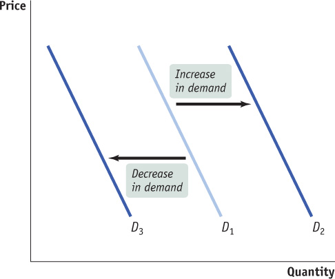
A shift of the demand curve is a change in the quantity demanded at any given price, represented by the change (shift) of the original demand curve to a new position, denoted by a new demand curve.
What is clear from this example is that the changes that occurred between 2007 and 2010 generated a new demand schedule, one in which the quantity demanded was greater at any given price than in the original demand schedule. The two curves in Figure 3-2 show the same information graphically. As you can see, the demand schedule for 2010 corresponds to a new demand curve, D2, that is to the right of the demand schedule for 2007, D1. This shift of the demand curve shows the change in the quantity demanded at any given price, represented by the change in position of the original demand curve D1 to its new location at D2.
A movement along the demand curve is a change in the quantity demanded of a good arising from a change in the good’s price.
It’s crucial to make the distinction between such shifts of the demand curve and movements along the demand curve, changes in the quantity demanded of a good arising from a change in that good’s price. Figure 3-3 below illustrates the difference.
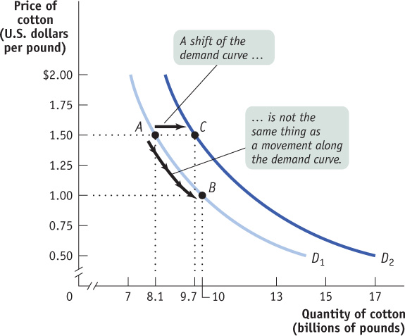
The movement from point A to point B is a movement along the demand curve: the quantity demanded rises due to a fall in price as you move down D1. Here, a fall in the price of cotton from $1.50 to $1 per pound generates a rise in the quantity demanded from 8.1 billion to 10 billion pounds per year. But the quantity demanded can also rise when the price is unchanged if there is an increase in demand—a rightward shift of the demand curve. This is illustrated in Figure 3-3 by the shift of the demand curve from D1 to D2. Holding the price constant at $1.50 a pound, the quantity demanded rises from 8.1 billion pounds at point A on D1 to 9.7 billion pounds at point C on D2.
When economists say “the demand for X increased” or “the demand for Y decreased,” they mean that the demand curve for X or Y shifted—
DEMAND VERSUS QUANTITY DEMANDED
When economists say “an increase in demand,” they mean a rightward shift of the demand curve, and when they say “a decrease in demand,” they mean a leftward shift of the demand curve—
It’s okay to be a bit sloppy in ordinary conversation. But when you’re doing economic analysis, it’s important to make the distinction between changes in the quantity demanded, which involve movements along a demand curve, and shifts of the demand curve (see Figure 3-3 for an illustration). Sometimes students end up writing something like this: “If demand increases, the price will go up, but that will lead to a fall in demand, which pushes the price down …” and then go around in circles. If you make a clear distinction between changes in demand, which mean shifts of the demand curve, and changes in quantity demanded, you can avoid a lot of confusion.
Understanding Shifts of the Demand Curve
Figure 3-4 illustrates the two basic ways in which demand curves can shift. When economists talk about an “increase in demand,” they mean a rightward shift of the demand curve: at any given price, consumers demand a larger quantity of the good or service than before. This is shown by the rightward shift of the original demand curve D1 to D2. And when economists talk about a “decrease in demand,” they mean a leftward shift of the demand curve: at any given price, consumers demand a smaller quantity of the good or service than before. This is shown by the leftward shift of the original demand curve D1 to D3.
What caused the demand curve for cotton to shift? We have already mentioned two reasons: changes in population and a change in the popularity of cotton clothing. If you think about it, you can come up with other things that would be likely to shift the demand curve for cotton. For example, suppose that the price of polyester rises. This will induce some people who previously bought polyester clothing to buy cotton clothing instead, increasing the demand for cotton.
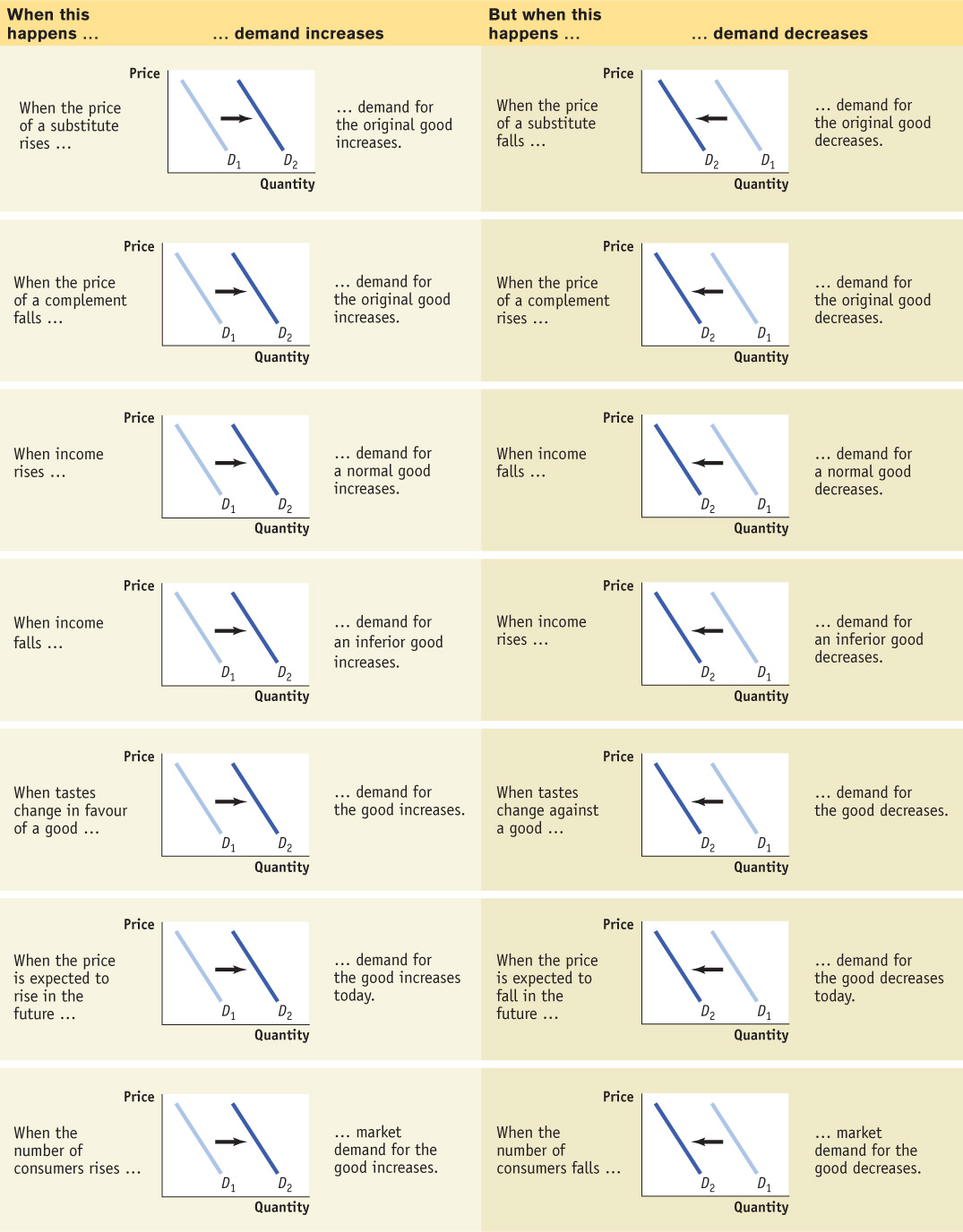
Economists believe that there are five principal factors that shift the demand curve for a good or service:
Changes in the prices of related goods or services
Changes in income
Changes in tastes
Changes in expectations
Changes in the number of consumers
Although this is not an exhaustive list, it contains the five most important factors that can shift demand curves. So when we say that the quantity of a good or service demanded falls as its price rises, other things equal, we are in fact stating that the factors that shift demand are remaining unchanged. Let’s now explore, in more detail, how those factors shift the demand curve.
Changes in the Prices of Related Goods or Services Although there’s nothing quite like a comfortable pair of all-cotton blue jeans, for some purposes khakis—generally made from polyester blends—aren’t a bad alternative. Khakis are what economists call a substitute for jeans. Two goods are substitutes if a rise in the price of one good (jeans) makes consumers more willing to buy the other good (khakis). Substitutes are usually goods that in some way serve a similar function: coffee and tea, muffins and doughnuts, train rides and air flights. A rise in the price of the alternative good induces some consumers to purchase the original good instead of it, shifting demand for the original good to the right.
Two goods are substitutes if a rise in the price of one of the goods leads to an increase in the demand for the other good.
But sometimes a rise in the price of one good makes consumers less willing to buy another good. Such pairs of goods are known as complements. Complements are usually goods that in some sense are consumed together: computers and software, cappuccinos and cookies, cars and gasoline. Because consumers like to consume a good and its complement together, a change in the price of one of the goods will affect the demand for its complement. In particular, when the price of one good rises, the demand for its complement decreases, shifting the demand curve for the complement to the left. So, for example, when the price of gasoline rose in 2007–2008, the demand for gas-guzzling cars fell.
Two goods are complements if a rise in the price of one good leads to a decrease in the demand for the other good.
Changes in Income When individuals have more income, they are normally more likely to purchase a good at any given price. For example, if a family’s income rises, it is more likely to take that long-anticipated summer trip to Disney World—and therefore also more likely to buy plane tickets. So a rise in consumer incomes will cause the demand curves for most goods to shift to the right.
Why do we say “most goods,” not “all goods”? Most goods are normal goods—the demand for them increases when consumer income rises. However, the demand for some products falls when income rises. Goods for which demand decreases when income rises are known as inferior goods. Usually an inferior good is one that is considered less desirable than more expensive alternatives—such as a bus ride versus a taxi ride. When they can afford to, people stop buying an inferior good and switch their consumption to the preferred, more expensive alternative. So when a good is inferior, a rise in income shifts the demand curve to the left. And, not surprisingly, a fall in income shifts the demand curve to the right.
When a rise in income increases the demand for a good—the normal case—it is a normal good.
When a rise in income decreases the demand for a good, it is an inferior good.
One example of the distinction between normal and inferior goods that has drawn considerable attention in the business press is the difference between so-called casual-dining restaurants such as Swiss Chalet or White Spot and fast-food chains such as Harvey’s and McDonald’s. When Canadians’ incomes rise, they tend to eat out more at casual-dining restaurants. However, some of this increased dining out comes at the expense of fast-food venues—to some extent, people visit Harvey’s or McDonald’s less once they can afford to move upscale. So casual dining is a normal good, whereas fast-food consumption appears to be an inferior good.
Changes in Tastes Why do people want what they want? Fortunately, we don’t need to answer that question—we just need to acknowledge that people have certain preferences, or tastes, that determine what they choose to consume and that these tastes can change. Economists usually lump together changes in demand due to fads, beliefs, cultural shifts, and so on under the heading of changes in tastes or preferences.
For example, once upon a time men routinely wore undershirts (or vests). But then came a dramatic moment—American actor Clark Gable removed his shirt in Frank Capra’s classic film It Happened One Night (1934)—revealing bare skin rather than an undershirt! Reportedly, the sales of vests immediately plummeted. Fashion had changed overnight, and the demand for men’s undershirts never recovered.
Economists have relatively little to say about the forces that influence consumers’ tastes. (Although marketers and advertisers have plenty to say about them!) However, a change in tastes has a predictable impact on demand. When tastes change in favour of a good, more people want to buy it at any given price, so the demand curve shifts to the right. When tastes change against a good, fewer people want to buy it at any given price, so the demand curve shifts to the left.
Changes in Expectations When consumers have some choice about when to make a purchase, current demand for a good is often affected by expectations about its future price. For example, savvy shoppers often wait for seasonal sales—say, buying next year’s holiday gifts during the post-holiday markdowns. In this case, expectations of a future drop in price lead to a decrease in demand today. Alternatively, expectations of a future rise in price are likely to cause an increase in demand today. For example, as cotton prices began to rise in 2010, many textile mills began purchasing more cotton and stockpiling it in anticipation of further price increases.
Expected changes in future income can also lead to changes in demand. If you expect your income to rise in the future, you will typically borrow today and increase your demand for certain goods; if you expect your income to fall in the future, you are likely to save today and reduce your demand for some goods.
Changes in the Number of Consumers As we’ve already noted, one of the reasons for rising cotton demand between 2007 and 2010 was a growing world population. Because of population growth, overall demand for cotton would have risen even if the demand of each individual wearer of cotton clothing had remained unchanged.
Let’s introduce a new concept: the individual demand curve, which shows the relationship between quantity demanded and price for an individual consumer. For example, suppose that Darla is a consumer of cotton blue jeans; also suppose that all pairs of jeans are the same, so they sell for the same price. Panel (a) of Figure 3-5 shows how many pairs of jeans she will buy per year at any given price. Then DDarla is Darla’s individual demand curve.
An individual demand curve illustrates the relationship between quantity demanded and price for an individual consumer.
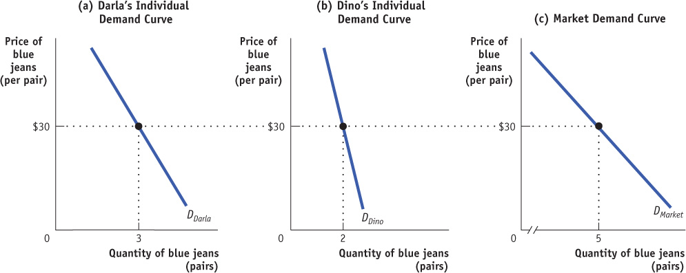
The market demand curve shows how the combined quantity demanded by all consumers depends on the market price of that good. (Most of the time, when economists refer to the demand curve, they mean the market demand curve.) The market demand curve is the horizontal sum of the individual demand curves of all consumers in that market. To see what we mean by the term horizontal sum, assume for a moment that there are only two consumers of blue jeans, Darla and Dino. Dino’s individual demand curve, DDino, is shown in panel (b). Panel (c) shows the market demand curve. At any given price, the quantity demanded by the market is the sum of the quantities demanded by Darla and Dino. For example, at a price of $30 per pair, Darla demands 3 pairs of jeans per year and Dino demands 2 pairs per year. So the quantity demanded by the market is 5 pairs per year.
Clearly, the quantity demanded by the market at any given price is larger with Dino present than it would be if Darla were the only consumer. The quantity demanded at any given price would be even larger if we added a third consumer, then a fourth, and so on. So an increase in the number of consumers leads to an increase in demand.
There are several ways the number of consumers can change on a large scale. For example, demographic trends have seen senior citizens represent a growing percentage of Canada’s population, increasing the overall demand for the goods and services seniors tend to demand more than younger people (for example, prescription medicine and assisted care residences). Changes to access to international markets also affect the number of consumers. The demand for Canadian softwood lumber increased after the United States made it easier for Canadians to export lumber to U.S. markets. Conversely, an embargo would reduce the number of consumers.
For a review of the factors that shift demand, see Table 3-1.
BEATING THE TRAFFIC
All big cities have traffic problems, and many local authorities try to discourage driving in the crowded city centre. If we think of a car trip to the city centre as a good that people consume, we can use the economics of demand to analyze anti-traffic policies.
One common strategy is to reduce the demand for car trips by lowering the prices of substitutes. Many Canadian municipalities subsidize bus and rail service, hoping to lure commuters out of their cars. An alternative is to raise the price of complements: several Canadian municipalities impose high taxes on commercial parking garages and impose short time limits on parking meters, both to raise revenue and to discourage people from driving into the city.
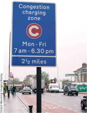
A few major cities—including Singapore, London, Oslo, Stockholm, and Milan—have been willing to adopt a direct and politically controversial approach: reducing congestion by raising the price of driving. Under “congestion pricing” (or “congestion charging” in the United Kingdom), a charge is imposed on cars entering the city centre during business hours. Drivers buy passes, which are then debited electronically as they drive by monitoring stations. Compliance is monitored with automatic cameras that photograph licence plates. Moscow is currently contemplating a congestion charge scheme to tackle the worst traffic jams of all major cities, with 40% of drivers reporting traffic jams exceeding three hours.
The current daily cost of driving in London ranges from £9 to £12 (about $14 to $19). And drivers who don’t pay and are caught pay a fine of £120 (about $189)for each transgression.
Not surprisingly, studies have shown that after the implementation of congestion pricing, traffic does indeed decrease. In the 1990s, London had some of the worst traffic in Europe. The introduction of its congestion charge in 2003 immediately reduced traffic in the city centre by about 15%, with overall traffic falling by 21% between 2002 and 2006. And there was increased use of substitutes, such as public transportation, bicycles, motorbikes, and ride-sharing.
In Canada, some cities have contemplated imposing similar charges. In Vancouver, commuters pay a toll to cross the new Port Mann Bridge. Officials believed the toll would help reduce congestion there, one of the worst traffic bottlenecks in British Columbia. In Toronto, city council has debated the use of tolls and congestion charges. The most common proposal was for the imposition of a road toll on some of the city’s busiest roads, such as the Gardiner Expressway and the Don Valley Parkway. At the time of writing, no such charges have been imposed within Toronto.

Quick Review
The supply and demand model is a model of a competitive market—one in which there are many buyers and sellers of the same good or service.
The demand schedule shows how the quantity demanded changes as the price changes. A demand curve illustrates this relationship.
The law of demand asserts that, all other things equal, a higher price reduces the quantity demanded (and vice versa). Thus, demand curves normally slope downward.
An increase in demand leads to a rightward shift of the demand curve: the quantity demanded rises for any given price. A decrease in demand leads to a leftward shift: the quantity demanded falls for any given price. A change in price results in a change in the quantity demanded and a movement along the demand curve.
The five main factors that can shift the demand curve are changes in (1) the price of a related good, such as a substitute or a complement, (2) income, (3) tastes, (4) expectations, and (5) the number of consumers.
As income increases, the demand for normal goods increases and the demand for inferior goods decreases.
The market demand curve is the horizontal sum of the individual demand curves of all consumers in the market.
Check Your Understanding 3-1
CHECK YOUR UNDERSTANDING 3-1
Question 3.1
Explain whether each of the following events represents (i) a shift of the demand curve or (ii) a movement along the demand curve.
A store owner finds that customers are willing to pay more for umbrellas on rainy days.
When XYZ Telecom, a long-distance telephone service provider, offered reduced rates on weekends, its volume of weekend calling increased sharply.
People buy more long-stem roses the week of Valentine’s Day, even though the prices are higher than at other times during the year.
A sharp rise in the price of gasoline leads many commuters to join carpools in order to reduce their gasoline purchases.
The quantity of umbrellas demanded is higher at any given price on a rainy day than on a dry day. This is a rightward shift of the demand curve, since at any given price the quantity demanded rises. This implies that any specific quantity can now be sold at a higher price.
The quantity of weekend calls demanded rises in response to a price reduction. This is a movement along the demand curve for weekend calls.
The demand for roses increases the week of Valentine’s Day. This is a rightward shift of the demand curve.
The quantity of gasoline demanded falls in response to a rise in price. This is a movement along the demand curve.