4.2 Producer Surplus and the Supply Curve
Just as some buyers of a good would be willing to pay more for their purchase than the price they actually pay, some sellers of a good would be willing to sell it for less than the price they actually receive. So just as there are consumers who receive consumer surplus from buying in a market, there are producers who receive producer surplus from selling in a market.
Cost and Producer Surplus
Consider a group of students who are potential sellers of used textbooks. Because they have different preferences, the various potential sellers differ in the price at which they are willing to sell their second-
An individual seller’s cost is the lowest price at which he or she is willing to sell a good.
The lowest price at which a potential seller is willing to sell has a special name in economics: it is called the seller’s cost. So Andrew’s cost is $5, Bahira’s is $15, and so on.
Using the term cost, which people normally associate with the monetary cost of producing a good, may sound a little strange when applied to sellers of used textbooks. The students don’t have to manufacture the books, so it doesn’t cost the student who sells a used textbook anything to make that book available for sale, does it?
Yes, it does. A student who sells a book won’t have it later, as part of his or her personal collection. So there is an opportunity cost to selling a used textbook, even if the owner has completed the course for which it was required. And remember that one of the basic principles of economics is that the true measure of the cost of doing something is always its opportunity cost. That is, the real cost of something is what you must give up to get it.
So it is good economics to talk of the minimum price at which someone will sell a good as the “cost” of selling that good, even if he or she doesn’t spend any money to make the good available for sale. Of course, in most real-
Individual producer surplus is the net gain to an individual seller from selling a good. It is equal to the difference between the price received and the seller’s cost.
Getting back to the example, suppose that Andrew sells his used book for $30. Clearly he has gained from the transaction: he was willing to sell for only $5, so he has gained $25. This net gain, the difference between the price he actually gets and his cost—
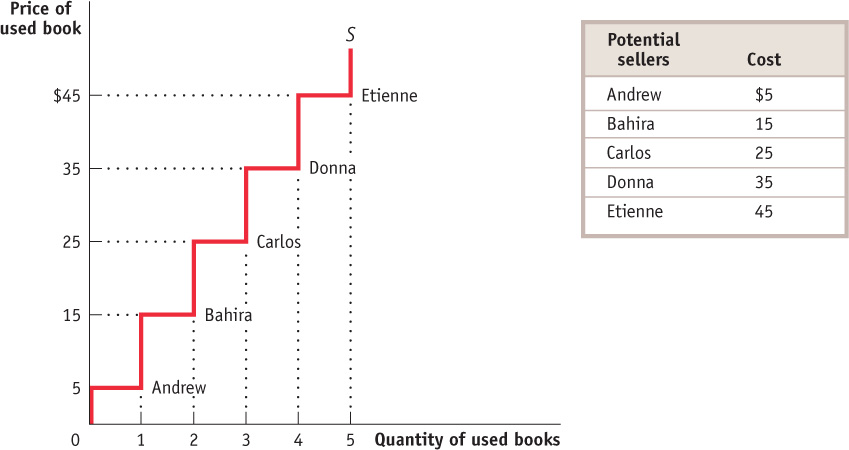
Just as we derived the demand curve from the willingness of different consumers to pay, we can derive the supply curve from the cost of different producers. The step-
Total producer surplus is the sum of the individual producer surpluses of all the sellers of a good in a market.
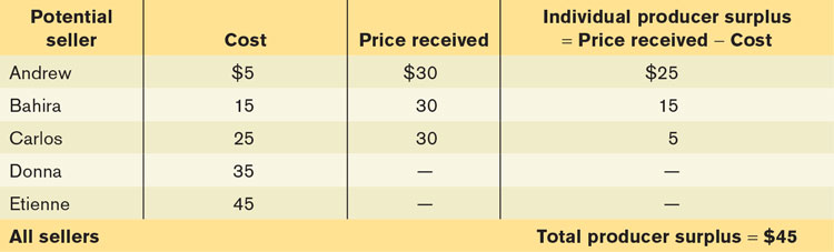
As in the case of consumer surplus, we can add the individual producer surpluses of sellers to calculate the total producer surplus, the total net gain to all sellers in the market. Economists use the term producer surplus to refer to either individual or total producer surplus. Table 4-2 shows the net gain to each of the students who would sell a used book at a price of $30: $25 for Andrew, $15 for Bahira, and $5 for Carlos. The total producer surplus is $25 + $15 + $5 = $45.
Economists use the term producer surplus to refer both to individual and to total producer surplus.
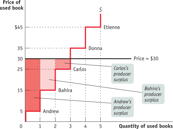
As with consumer surplus, the producer surplus gained by those who sell used books can be represented graphically. Figure 4-7 reproduces the supply curve from Figure 4-6. Each step in that supply curve is one used book wide and represents one seller. The height of Andrew’s step is $5, his cost. This forms the bottom of a rectangle, with $30, the price he actually receives for his book, forming the top. The area of this rectangle, ($30 – $5) × 1 = $25, is his producer surplus. So the producer surplus Andrew gains from selling his book is the area of the dark red rectangle shown in the figure.
Let’s assume that the campus bookstore is willing to buy all the used copies of this book that students are willing to sell at a price of $30. Then, in addition to Andrew, Bahira and Carlos will also sell their books. They will also benefit from their sales, though not as much as Andrew, because they have higher costs. Andrew, as we have seen, gains $25. Bahira gains a smaller amount: since her cost is $15, she gains only $15. Carlos gains even less, only $5.
Again, as with consumer surplus, we have a general rule for determining the total producer surplus from sales of a good: The total producer surplus from sales of a good at a given price is the area above the supply curve but below that price.
This rule applies both to examples like the one shown in Figure 4-7, where there are a small number of producers and a step-
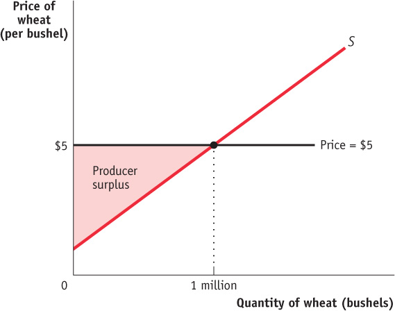
Consider, for example, the supply of wheat. Figure 4-8 shows how producer surplus depends on the price per bushel. Suppose that, as shown in the figure, the price is $5 per bushel and farmers supply 1 million bushels. What is the benefit to the farmers from selling their wheat at a price of $5? Their producer surplus is equal to the shaded area in the figure—
All other things equal, a shift in the supply curve will lead to a change in the producer surplus. For example, after an increase in the supply of wheat (i.e., a rightward shift of the supply curve), the producer surplus increases.
How Changing Prices Affect Producer Surplus
As with the case of consumer surplus, a change in price alters producer surplus. But the effects are opposite. While a fall in price increases consumer surplus, it reduces producer surplus. And a rise in price reduces consumer surplus but increases producer surplus.
To see this, let’s first consider a rise in the price of the good. Producers of the good will experience an increase in producer surplus, though not all producers gain the same amount. Some producers would have produced the good even at the original price; they will gain the entire price increase on every unit they produce. Other producers will enter the market because of the higher price; they will gain only the difference between the new price and their cost.
Figure 4-9 is the supply counterpart of Figure 4-5. It shows the effect on producer surplus of a rise in the price of wheat from $5 to $7 per bushel. The increase in producer surplus is the $2.5 million sum of the shaded areas, which consists of two parts. First, there is a dark red rectangle corresponding to the $2 million in gains to those farmers who would have supplied wheat even at the original $5 price. Second, there is an additional light red triangle that corresponds to the $500 000 in gains to those farmers who would not have supplied wheat at the original price but are drawn into the market by the higher price.
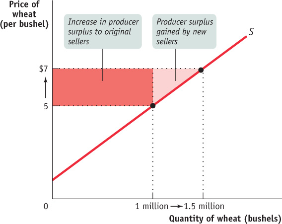
If the price were to fall from $7 to $5 per bushel, the story would run in reverse. The sum of the shaded areas would now be the decline in producer surplus, the decrease in the area above the supply curve but below the price. The loss would consist of two parts, the loss to farmers who would still grow wheat at a price of $5 (the dark red rectangle) and the loss to farmers who cease to grow wheat because of the lower price (the light red triangle).
HIGH TIMES DOWN ON THE FARM
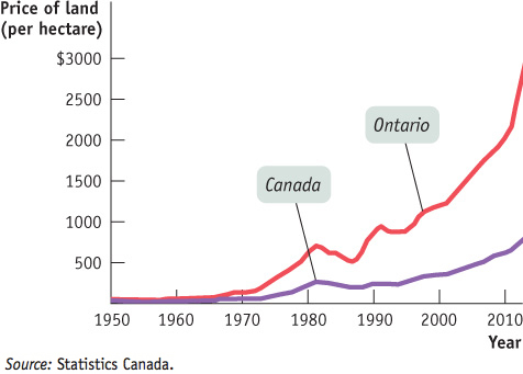
According to Statistics Canada, the average value of farmland in Ontario hit a record high in 2012, surging by 19.6% for the year. Figure 4-10 shows the significant increase in the price of Ontario farmland from 1950 to 2012. The average price of a hectare of Ontario farmland doubled from 2002 to 2012. The recessions in the early 1980s and in the early 1990s caused average prices to fall for a few years, but remarkably the Great Recession, that began in 2008, did not have the same effect. It only temporarily slowed the upward trend. And there was no mystery as to why: it was all about the high prices being paid for wheat, corn, and soybeans. In 2010, the price of corn jumped by 52%; soybeans, by 34%; and wheat, by 47%.
Why were Ontario farm products commanding such high prices? There are three main reasons: ethanol, rising incomes in countries like China, and poor weather in other foodstuff-producing countries like Australia and Ukraine.
Ethanol—a product made from corn and the same kind of alcohol that’s in beer and other alcoholic drinks—can also fuel automobiles. And in recent years U.S. government policy, at both the federal and state levels, has encouraged the use of gasoline that contains a percentage of ethanol. There are a couple of reasons for this policy, including some benefits in fighting air pollution and the hope that using more ethanol will reduce U.S. dependence on imported oil. Since ethanol comes from corn, the shift to ethanol fuel has led to an increase in the demand for corn.
But Ontario farmers have also benefitted greatly from events beyond North America. As in the case of cotton, which we studied in Chapter 3, changes in the demand for and supply of foodstuffs in world markets have led to rising prices for Canadian corn, soybeans, and wheat. Rising incomes in countries like China have led to increased food consumption and increased demand for foodstuffs. Simultaneously, very bad weather in Australia and Ukraine has led to a fall in supply. Predictably, increased demand coupled with reduced supply has led to a surge in foodstuff prices and a windfall for Ontario farmers.
What does this have to do with the price of land? A person who buys a farm in Ontario buys the producer surplus generated by that farm. And higher prices for corn, soybeans, and wheat, which raise the producer surplus of Ontario farmers, make Ontario farmland more valuable. According to the RE/MAX Market Trends Report: Farm Edition, between 2010 and late 2013, the average price of a hectare of prime farmland in southern Ontario increased by as much as 140% depending on location, well above the national average. Land prices continued to climb in 2013, even though the price of corn decreased by 38%, soybeans by 19%, and wheat by 22% in that year. Land buyers clearly expected these price decreases to be either smaller or temporary.

Quick Review
The supply curve for a good is determined by the cost of each seller.
The difference between the price and cost is the seller’s individual producer surplus.
The total producer surplus is equal to the area above the market supply curve but below the price.
All other things equal, when the price of a good rises, producer surplus increases through two channels: the gains of those who would have supplied the good at the original price and the gains of those who are induced by the higher price to supply the good. A fall in the price of a good similarly leads to a fall in producer surplus.
Check Your Understanding 4-2
CHECK YOUR UNDERSTANDING 4-2
Question 4.2
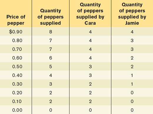
Consider again the market for cheese-stuffed jalapeno peppers. There are two producers, Cara and Jamie, and their marginal (or incremental) costs of producing each pepper are given in the accompanying table. (Neither is willing to produce more than 4 peppers at any price.) Use the table (i) to construct the supply schedule for peppers for prices of $0.00, $0.10, and so on, up to $0.90, and (ii) to calculate the total producer surplus when the price of a pepper is $0.70.
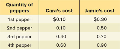
A producer supplies each pepper if the price is greater than (or just equal to) the producer’s cost of producing that pepper. The supply schedule is constructed by asking how many peppers will be supplied at any price. The table in the question illustrates the supply schedule.
When the price is $0.70, Cara’s producer surplus from the first pepper is $0.60, from her second pepper $0.60, from her third pepper $0.30, from her fourth pepper $0.10, and she does not supply any more peppers. Cara’s individual producer surplus is therefore $1.60. Jamie’s producer surplus from his first pepper is $0.40, from his second pepper $0.20, from his third pepper $0.00 (since the price is exactly equal to his cost, he sells the third pepper but receives no producer surplus from it), and he does not supply any more peppers. Jamie’s individual producer surplus is therefore $0.60. Total producer surplus at a price of $0.70 is therefore $1.60 + $0.60 = $2.20.