Analyzing Several Print-Document Designs
Figures 7.18, 7.19, 7.20, and 7.21 show typical designs used in print documents.
181
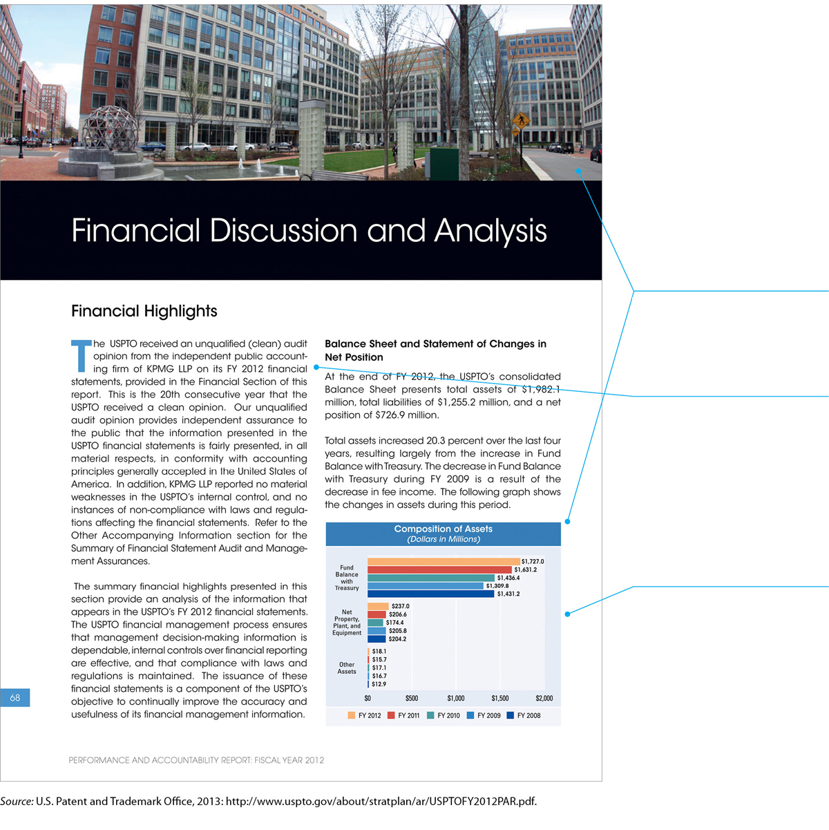
A multicolumn design enables you to present a lot of text and graphics of different sizes.
Notice how the designer has used the whole width of the page for one graphic and a single column for a smaller graphic.
Note that the alley—the space between the two columns of text need not be wide. Nor do you need to include a vertical rule to keep the columns separate. The human brain easily understands that each column is a separate space.
In this sample, the bar graph is exactly the width of the column in which it appears. But it doesn’t have to be. It could break the shape of the column and extend into the other column or even into the margin. Or it could be narrower than its column, with the text wrapping around it. The design you see here looks neat and professional. If the graph were wider or narrower than the column, the design might appear somewhat more creative.
182
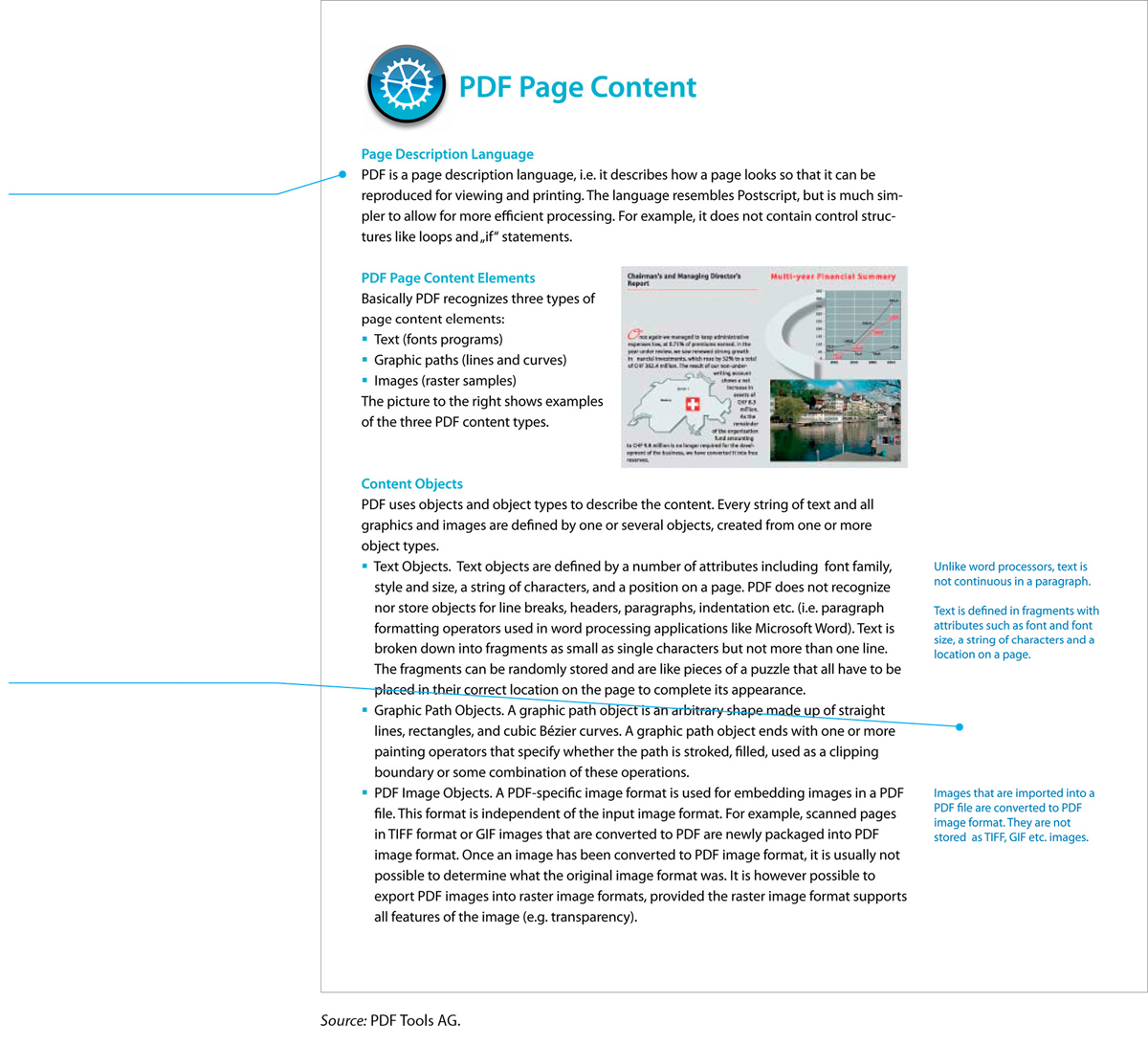
This page from a software company’s white paper—a marketing document usually distributed on the web—shows one approach to a one-column design.
The main text column is relatively narrow, making the line easy to read.
The right margin is wide enough to accommodate text boxes, small graphics, or other items.
183
One goal of document design is to reduce the number of pages needed—but when you design a page, you want to make the text inviting and easy to read. Figuring out how to balance these two priorities is one of the major challenges of designing a page.
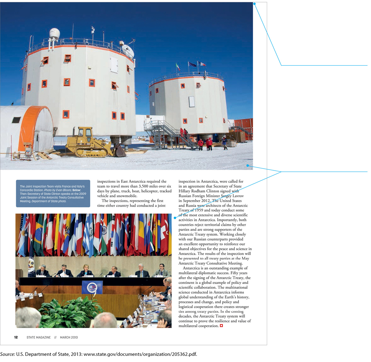
This is a page from State, the magazine for employees of the U.S. State Department. Magazines for people who work together tend to include a lot of photographs, including many showing people from that organization.
The large photograph extends to the top edge and the left edge of the page. Eliminating the margins in this way would be a mistake if the graphic were crammed with information that readers needed to study; a dense table of data, for instance, would be overwhelming. But in this case, the blue sky in the background acts as a decorative frame for the “information” in the bottom half of the photo.
Although this page uses a simple three-column design, note that one photo spans all three columns, another photo spans two columns, and the caption box spans one column. This creative use of the multicolumn design enables the designer to fill the page with content while keeping it visually interesting.
184
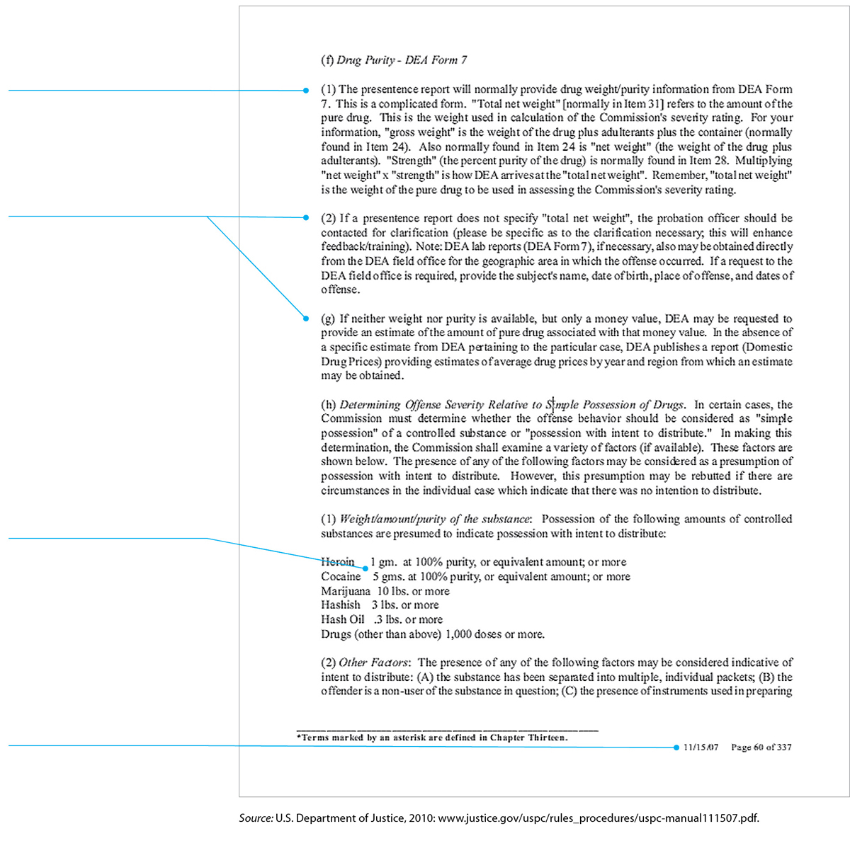
The writer of this document hasn’t designed the page. He or she has simply hit the Enter key repeatedly.
The full justification makes for a boxy appearance and irregular spacing between words.
The wide column results in long, difficult-to-read lines.
The two hierarchical levels — numbered and lettered — have the same design and therefore are difficult to distinguish from each other.
In the table, the second column is misaligned.
The footer, which includes the date and the page number, is a useful design feature, however.