Analyzing Several Online-Document Designs
The best way to learn about designing websites and their pages is to study them. Figures 7.28, 7.29, and 7.30 offer examples of good web page design.
192
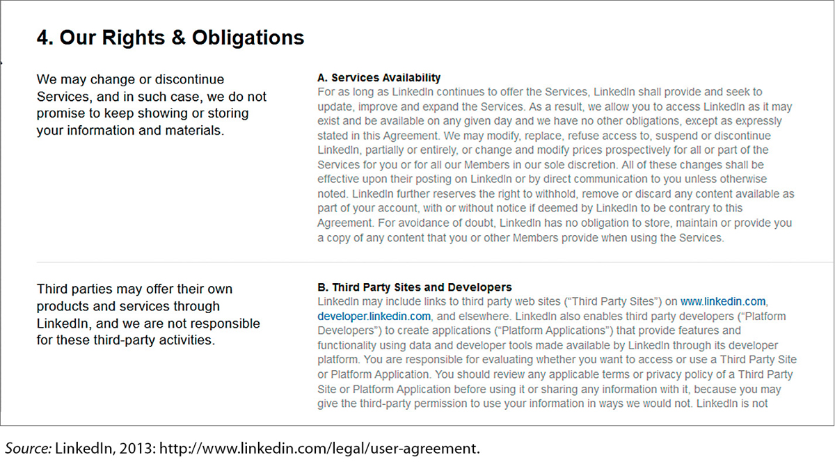
Nobody likes user agreements, and few people read them carefully. LinkedIn, the online professional network, uses a simple table design to make its user agreement a little easier to read.
In this excerpt, the left column presents a simple overview of a portion of the agreement. The right column presents the “small print”: the specific provision, including links to even more detailed information.
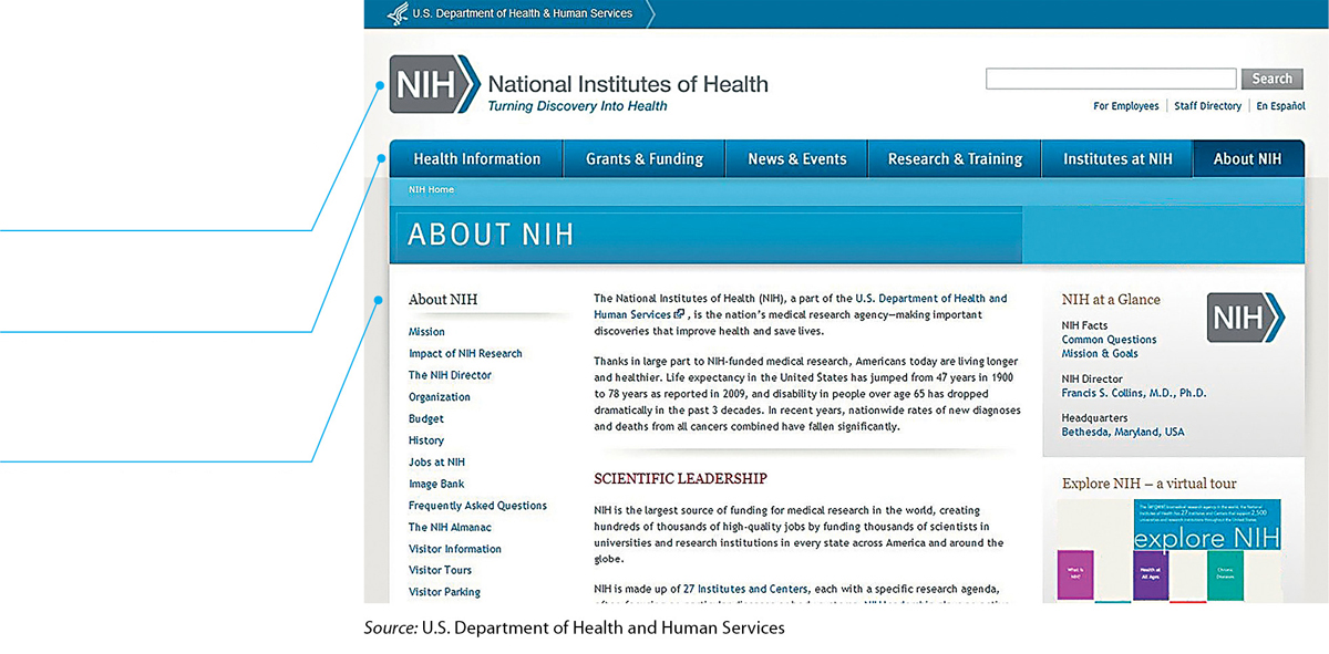
The About NIH page on the National Institutes of Health website conveys its message simply but effectively.
The top row is reserved for the name of this government agency.
Below the agency’s name is the main navigation pane, beginning with “Health Information.”
Below the main navigation pane is the navigation pane for the section in which this page appears: “About NIH.” The About NIH page has 18 sections, beginning with “Mission.”
Designing Simple, Clear Web Pages

Follow these eight suggestions to make your design attractive and easy to use.
Use conservative color combinations to increase text legibility. The greater the contrast between the text color and the background color, the more legible the text. The most legible color combination is black text against a white background. Bad idea: black on purple.
Avoid decorative graphics. Don’t waste space using graphics that convey no useful information. Think twice before you use clip art.
Use thumbnail graphics. Instead of a large graphic, which takes up space, requires a long time to download, and uses up your reader’s data-download allotment, use a thumbnail that readers can click on if they wish to open a larger version.
Keep the text short. Poor screen resolution makes reading long stretches of text difficult. In general, pages should contain no more than two or three screens of information.
Chunk information. When you write for the screen, chunk information to make it easier to understand. Use frequent headings, brief paragraphs, and lists.
Make the text as simple as possible. Use common words and short sentences to make the information as simple as the subject allows.
Structure your sentences as if there were no links in your text.
AWKWARD Click here to go to the Rehabilitation Center page, which links to research centers across the nation. SMOOTH The Rehabilitation Center page links to research centers across the nation. Indicate what information a linked page contains. Readers get frustrated if they wait for a web file to download and then discover that it doesn’t contain the information they expected.
UNINFORMATIVE See the Rehabilitation Center. INFORMATIVE See the Rehabilitation Center’s hours of operation.
193
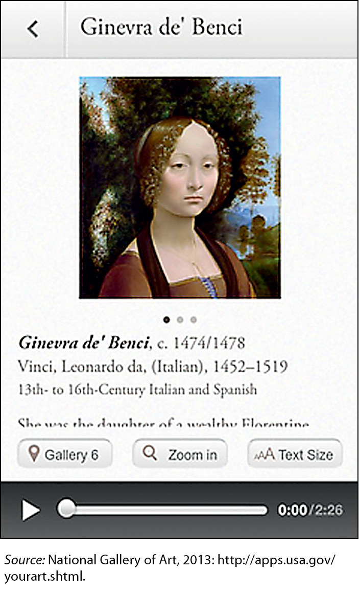
Figure 7.30 An App Designed for a Small Screen
Your Art, an app from the U.S. National Gallery of Art, enables museum visitors—and anyone with an Internet connection—to see and learn about many of the art treasures displayed in the museum. The app includes numerous features, including news about exhibitions, textual commentary, and audio commentary.
All of the paintings presented in the app are shown on screens with the same design, making it easy for people to learn how to find the information they seek. Note that the design of the screen is simple and familiar icons are used for manipulating the size of the text and of the image and for playing the audio. Despite the small size of the screen, users will find it easy to navigate and use the app.