Using Visuals in Your Own Paper
Every paper uses some degree of visual persuasion, merely in its appearance. Consider these elements of a paper’s “look”: title page; margins (ample, but not so wide that they indicate the writer’s inability to produce a paper of the assigned length); double-spacing for the reader’s convenience; headings and subheadings that indicate the progression of the argument; paragraphing; and so on. But you may also want to use visuals such as pictures, graphs, or pie charts. Keep a few guidelines in mind as you work with visuals, “writing” them into your own argument with as much care as you would read them in others’ arguments:
Consider your audience’s needs and attitudes, and select the type of visuals — graphs, drawings, photographs — likely to be most persuasive to that audience.
Consider the effect of color, composition, and placement within your document. Because images are most effective when they appear near the text that they supplement, do not group all images at the end of the paper.
Remember especially that images are almost never self-supporting or self-explanatory. They may be evidence for your argument (e.g., Ut’s photograph of napalm victims is very compelling evidence of suffering), but they aren’t arguments themselves.
170
Be sure to explain each visual that you use, integrating it into the verbal text that provides the logic and principal support behind your thesis.
Be sure to cite the source of any visual that you paste into your argument.
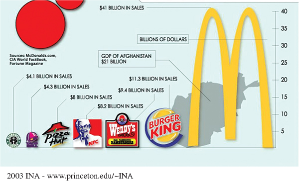
Be alert to common ways in which graphs can be misleading:
Vertical axis doesn’t start at zero or skips numbers.
Scale is given in very small units to make changes look big.
Pie charts don’t accurately divide on scale with percentages shown.
Oversized graphics don’t match the numbers they represent.